Category Archives: Panoramic

Bae Bien-U 2002 Artsonje Exhibit Catalog

The best kimchi I have ever eaten was in Yeosu nearly a decade ago. Dolsan Gat-Kimchi is made with mustard leaves and is amazing–or at least the batch I had at a local Yeosu seafood (obviously) restaurant was sublime. What does this have to do with photography? Nothing. It’s just a lead in for the fact that Yeosu is Bae Bien-U’s hometown.

Bae has been discussed previously on this blog. And, he will be discussed again, eventually, as I have a third book of his work on my shelf awaiting a review and he is one of the most iconic figure in Korean photography.

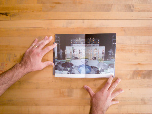
The subject of this review is a small perfect bound exhibition catalog published in conjunction with an exhibit at the Art Sonje Center in 2002. It’s focus is not on Bae’s pine trees but rather is on four other series of photographs: Seascapes, Mountainscapes, Skyscapes and Rockscapes. These are series that I am less familiar with–and probably for good reason. This isn’t a masterful book, but an interesting one nonetheless. Continue reading

The Tedious Landscape II, Kim Yunho

KoreanPhotographyBooks-146

Workroom does good design. Every photobook I’ve come across that was designed by them feels right. Kim Yunho’s The Tedious Landscape is from Workroom’s Lájka Series. In Korean, the name reads phonetically as “Lah Ee Ca Series”; Leica Series. I’m not sure how or why it has re-transliterated to “Lajka.” Odd.

Moving on.

The Tedious Landscape II is, as might be obvious, the second in a series of projects. In The Tedious Landscape, Kim explored the outskirts. What does the country look like outside of the major cities?

The photographs in this book are of pageants, which often have the underlying goal of celebrating and promoting local specialty products. As most of these products are natural products or produce, these pageants tend to be put on in more rural regions or smaller towns or villages. As Kim Kyewon notes in the essay that closes the book, “Major cities do not have particular specialty products, and if they did, they would not need to promote them in such a way.” The Tedious Landscape II, then, extends Kim’s exploration of the periphery.

Another astute observation in Kim Kyewon’s essay is that though these photographs are of beauty pageants (whether the contestants are female, male, old or young), there are no beauties in the photographs. The scenes are photographed from a distance. In each, there is the whole stage filled with the full complement of contestants as well as other participants in the pageants–judges, audience members, photographers and assorted hangers-on. There is little action; the contestants in most of the photographs seem to be simply standing there, waiting.

In an earlier post, I spoke about the challenge of writing about work that I can’t fully understand as an outsider. There will always be aspects that are not apparent to me. An essay like Kim Kyewon’s can be invaluable in coming to a more complete understanding of a photographer’s intentions. I note this because I am going to steal (but attribute) an idea from Kim’s essay that is important to the work but that I would not have come up with myself.
KoreanPhotographyBooks-148

The goal of these pageants is to promote the local specialty good. The contestants become double symbols not only as the most beautiful but also as a stand in for the local product. The pageant winners from one region are indistinguishable from the pageant winner from the next region. “The form in which they serve as symbols is repeated nationwide and results in a tedious [landscape].” (Kim uses the word “destiny” here, but as he earlier invoked the idea of topography, I think “landscape” is more appropriate.)

KoreanPhotographyBooks-151

KoreanPhotographyBooks-153

While in total the photographs may describe a tedious landscape, the individual images are rich with cultural detail, daily life and comedy. One of my favorite images is 395-800: 16 women stand on a rain slicked stage, one of them is speaking at the microphone, the others are standing in near identical poses and watching with a smile. The audience is hidden by their scrum of umbrellas. In another image, #355-601, 10 bodybuilders stand around on stage while a photographer and video crew record the winner being awarded his trophy. The non-winners stand around more or less awkwardly; the scene has ended but they’ve not been released from it yet. The audience here is only an ajashi with a camera and a handful of children fascinated by the spectacle before them. In #534-801 the audience is again huddled in the rain, this time wearing ponchos. On stage, six older women stand before drums as part of a traditional performance; a photographer crouches stage right. The front of the stage is draped with a mural of a field of flowers; at the image’s horizon line we are suddenly onto the stage. The top of the frame is kaleidoscopic tumble of lights, trusses and risers.

The book itself is roughly octavo sized, perfect bound with plain board covers glued front, rear and on the spine, and with a 3/4 height dust jacket with a panoramic image that wraps the book (technically this might be a belly band, but it feels more like a short dust jacket). The pages are heavyweight, nearly cardstock, which combined with the perfect binding allows them to lay flat but puts stress on the binding. The layouts are a mix of paired images across from one another and double truck spreads. Both layouts push the images right to the top where they bleed off of the page. Kyewon Kim’s essay comes after the plates and is on a different lighter paper stock. It is in both Korean and English. After the essay comes a list of plates and the artist’s C.V..

This is a tightly designed book of well considered and well made photographs. The clear and concise essay that gives context and added meaning to the photographs is a welcome bonus.

The Tedious Landscape II
Kim Yunho
Published by workroom press
Edited and Designed by workroom
Essay by Kim Kyewon
Translation by Kim Jeimin
First published 1 August 2008
Printed in Korea

Two Faces, Lee Duegyoung

Sometimes, the answers are all right in front of you. And at other times, small things obscure them.

An aside before the actual review: Lee Duegyoung’s Two Faces includes a list of notes by critic Lim Geun-jun that give detailed descriptions of his previous projects and working methods. Lim’s very clear description of Lee’s “Teheranno” as panoramic composites made from photographs taken from a helicopter with a downward facing camera to mimic satellite imagery clarifies for me the images I mentioned last week as a stand out in the 2012 Seoul Photo Festival. I had not connected them in my mind to Two Faces because Lee’s name was transliterated differently in the SPF catalog. For my part, I have always transliterated names as they are transliterated in the publication and will continue to do so despite the obvious possibility for missed connections. On to the review.

Lee Duegyoung maintains an incredible consistency of good ideas coupled with masterful execution and high-quality book design. Given his past exhibits and publications, it is little wonder that Two Faces is such a strong book. I may be faulted for wearing my heart on my sleeve here, but so be it. I like this book. Two Faces is one of the most engaging Korean photo books I have acquired recently. Both the content and design are outstanding; as a bonus the texts are clearly written and available in both Korean and English.

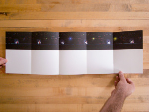
Two Faces comprises two panoramic photographs of the north and south banks of the Han River as it runs through Seoul. Lee composited roughly 13,000 photographs taken over four days from multiple river boats into two panoramic images. The two panoramas run essentially unbroken opposite from one another, top and bottom, across the accordion pages of the book. The book places the reader almost in the prow of a boat from which he can look left and right at the two banks of the Han. The “accordion” is perfect bound along one edge preventing the reader from opening it up to peruse long stretches of the panoramas.

Due to the inevitable perspective shifts caused by shooting from a moving platform, some tall buildings away from the river’s banks appear multiple times in slightly shifted positions. This gives an experiential edge to the photographs. Just as an actual viewer on a river cruise might espy the same edifice from multiple angles over the course of the journey, so too is the reader treated to this experience. Any sense of an absolute recording of the river is broken, the panoramas present a view that is spatial and temporal and hint at a continuum of possible views.

Lim notes that one of Lee’s influences is Ed Ruscha’s trilogy of artists books: Every Building on the Sunset Strip, Twenty-Six Gasoline Stations and Thirty-Four Parking Lots. This makes perfect sense to me, though the incredible breadth of Lee’s effort brings to my mind another project: Eugene Smith’s Pittsburgh. in Two Faces Lee has taken an equally ambitious target but rather than get bogged down in endless possibility has brought the work to a magnificent completion through a tightly focused conceptual framework and equally tight physical form. I’m sure there’s a jazz metaphor here, but I’m not a jazz guy.

The physical form effectively contributes to the conclusion of Lee’s Hangang trilogy by referencing the previous projects. The cover presents us with a complete foreshadowing of the work within: the panoramas have been compressed into the length of the wraparound cover. This calls to mind the time compressed video that accompanied the exhibition of Lee’s Hangang Project II – 25 Bridges. Lim notes the video, and I take take his note a step further to explicitly make the connection with Two Faces‘s cover. So too would I point out the somewhat obvious connection of the book’s accordion form to his 69 Snack Booths catalog which also employed an accordion form. These small formal and technical echoes that tie project to project create a sense of structured completeness.

I’ll end with a small personal detail that I enjoy: in the panorama that tracks the north bank of the Han, Lee has photographed my mother-in-law’s apartment building under construction shortly before she would have moved in.

Singular concept.
Tight design.
A work fully thought through.

Two Faces
Lee Duegyoung
Written by: Lim Guen-jun and Rhee Z-Won
Translated by: Choi S. Min and Kim Sung
Edited and Designed by: Suki and Min
Specter Press, Seoul
Edition of 700
2010

Sacred Wood, Bae Bien-U

My first introduction to Korean photography was Bae Bien-U. Korean photography didn’t exist for me before Bae. I’m now not sure how Korean photography fell into a blind spot, though, as I write that, I wonder how many other photographic traditions do not exist in my mind? Until traveling to Turkey in 2011, I never really considered Turkish photography. Without a point of introduction, how is one to know that something exists?

I first encountered Bae’s work at the Asian Art fair held at the Javitz Center in New York a number of years ago. The photographs were, as I am now aware, his most recognizable: black and white, panoramic and very large photographs of groves of pine trees surrounding the royal tombs in Kyung-Ju. They were beautiful, but the scale and presentation turned me off. Bae’s pine trees ought to have made an electric connection. The pine tree is nearly as culturally freighted in Maine, where I grew up, as it is in Korea.

It is a pleasant surprise then that Sacred Wood connects with me in a way that the large prints in a white cube setting didn’t. The private interaction with the book is intimate, nearly spiritual. These photographs, taken over the past 25 years, are luminous and lyrical. They are a kind of twisting visual poetry. Having been to several of the groves depicted in these pine trees, I can attest that these are not simple snapshots. Bae has imposed himself upon the scene. These are not unguarded or unsung places. The kings of Silla have many visitors. I can’t imagine that any aside from Bae has made photographs as moving. (I am sad to say that the photographs I took there do not measure up.)

The light, especially in the earlier photographs, is diffuse and soft. It spreads between the trees like fog. The trees seem to be melting into the morning mist. One is tempted to place them in the Western context of the landscape photographs of Adams or Weston. I think this impulse is wrong: though there might be superficial aesthetic similarities, the path is different. Bae makes his approach through the spiritual. (Hatje Cantz in the blurb for the book calls the photographs meditative.) Whatever technical prowess Bae has, and he has plenty, it is not what drives the photographs. Whereas the F64 group turned to straight photographs as a reactive break from pictorialism, Bae’s photographs represent a continuation of cultural tradition. The pine tree is a revered symbol in Korea; the very format of the photographs–the narrow panoramic aspect ratio, harkens back to brush and ink scroll paintings. Unlike a younger photographer such as Seung Woo Back with his visual and political rabble rousing, Bae is extending existing cultural traditions through photography.

The physical book is quite nice. It is a roughly 11×14 horizontal slab with a printed cover and 2 piece cardboard slipcase. The book opens with two essays, the first by Wonkyung Byun and the second by Thomas Wagner. These are followed by 71 illustrations, 12 of them in color. The printing is very good, as is to be expected from Hatje Cantz. Most of the spreads have two opposing panoramic images, though there are roughly a dozen spreads with either full bleed double truck panoramas or multiple vertical panoramas on a page. Each image is captioned with an archive number and a year. Had I been the editor, I would have cut the color images: only a couple of them have the power and beauty of the black and white photographs. They feel out of place. Likewise, I do not feel that the captions add to the book; they, too, feel out of place. (There must be a reason for this captioning though, as Bae uses it in another book of his that I have.) These two design miscues make the book feel like an exhibition catalog, which is what it is: published in conjunction with exhibits by Phillips de Pury & Company, London and BOZAR Center for Fine Arts, Brussels. I would have preferred that if it were to be a catalog, it not have been treated as a sales catalog.