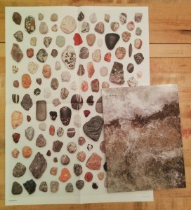
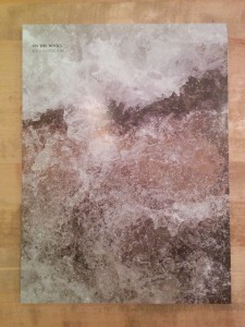
 Let’s start with the conclusion: Kyoungtae Kim’s On the Rocks is an amusing, clever and honest book but not a grand one. That conclusion can be drawn from its subject matter: close-up macro photographs of small, everyday stones–roughly 2cm to 10cm in length. The bulk of the book is single pages in which each stone, floating in studio limbo, is enlarged to fill the page. Every singular stone is richly textured, wonderfully abstract and evocative–and yet humdrum.
A single paragraph of text provides the following three facts: 1. The stones come from South Korea, Italy, France, Spain and Switzerland. 2. They were collected between 2005 and 2013. 3. Kim made these photographs in May and July of 2013.
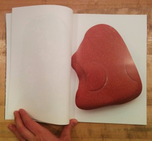 Those three facts make me think the book came out of two questions: 1. When I travel to Europe, what can I bring back with me? 2. Now that I’ve got all these stones and pebbles sitting around, what can I do with them?
The photographs are precise. The stones are sharp top to bottom and front to back. They’re so sharp, in fact, that it is apparent that the line screen of the book’s printing is the limiting factor in the detail that can be read of their surfaces. One is tempted to see the photographs as some kind of geological survey or ancillary research outcome, though there are no captions to identify where each stone came from specifically or what type of rock they are comprised of nor an essay to give any context to support such a notion. The stones are just objects, and the photographs are just pretty pictures.
There are two additional ways that these photographs are presented. The wrap around cover, first page and last page crop the images to full bleed extreme micrographic close-ups. Scale dissolves and it is hard to tell if one is looking at rock or an aerial image. The stone in the cover image appears to be encased by a thin layer of ice–though it’s just its crystalline surface.
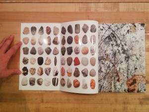 The photographs are also placed in grids in which the stones are seen relative to one another. On the inside covers, the stones are scaled to a single uniform size and printed in grids. In a nice touch, one must open the inside flap of the cover (onto which the full bleed cover image does not extend) to reveal the grids. A similar gridded spread follows the colophon page; on this grid the stones are scaled relative to one another and there is a scale so that one can determine how large each stone is in reality. This grid is repeated on a pull out poster on which the stones are printed life size (at 1:1 scale).
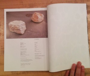 There is one outlier image. At the top of the colophon page is a photograph of two rocks sitting heavily on a paved street. These are rocks not stones. They’re large, roughly a meter square. This is entirely unlike any other photograph in the book and yet this photograph is the key stone supporting the entire structure or the rosetta stone that rearranges our understanding of the preceding photographs. We have spent the book looking and looking at these small stones as aesthetic objects divorced from any context. In this one image we are brought back into the world. We are shown two rocks. They have not been made by the photograph into anything more than they are. And yet one’s first impulse is to lean in close to look at them, to examine them. What magic is hidden in these most quotidian of objects?
On the Rocks isn’t grand or ostentatious but it is wonderful nonetheless. It is full of the wonder that is the reward of close looking. It reminds us, in the closing image, that we can find such rewards through examining closely our banal every day world.
On the Rocks
Photographer and Designer: Kyoungtae Kim
Publisher: Your-Mind
2013
