Category Archives: workroom

Pegasus 10000 Miles; Lee Young Jun

Pegasus10000Miles_01

Sometimes the most interesting photography books aren’t photography centric at all. One of the first books I wrote about on this blog was Seoul Essay, which used photography to illustrate and expand the written essays that were its core content. The photographs were nonetheless fascinating. Similarly, photography is only part of Pegasus 10000 Miles; written essays (in Korean only) are the primary content of the book. (I am, as ever, treading on thin ice writing about a book which I cannot read a significant portion of.)

Pegasus 10000 Miles tracks the journey of the CMA CGM Pegasus as it makes its way around the world from Dalian to Southampton (there is a handy map that shows both the route of the Pegasus and the route of the author). This ship functions as the central narrative, but the photographs and essays are not slavishly tied to it. The ship is simply an access point allowing for the entirety of sea borne global trade–historical and contemporary, to be examined and critiqued.

Since the text is lost on me, I will confine this review to a small selection of photographs and the workmanship of workroom’s design.

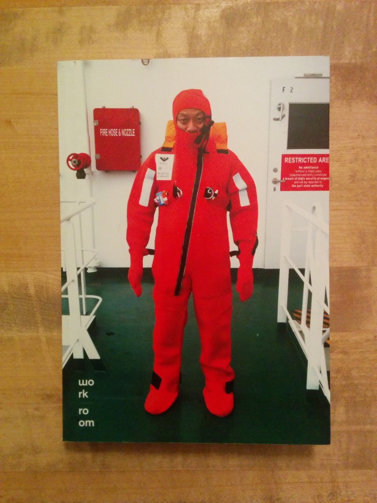
I bought this book, unopened, shrink wrapped and sight-unseen because of the promise of the cover photograph. A man in a red survival suit stands stiffly on a ship’s green steel deck. Behind him are a red cabinet containing a “fire hose & nozzle” and a red “Restricted Area” sign. The railings beside him and the wall behind him are stark white. It is a classic contemporary portrait redolent of adventure and modern mitigated risk. On opening the book, the promise is largely unfulfilled. There are few photographs as starkly clean as this portrait or as technically proficient. The greatest bulk of the photographs appear to be snapshots by an amateur with a unique amount of access.

There are four photographs that sum up the book. The first is a nearly abstract view of the ship heading into the sun. The sea’s undulating surface is dappled with light and looks almost like static on a television screen. In the curved wake behind the ship the surface undulates at a lower frequency and we can see the route the ship has sailed. The ship may be the subject of the photograph, but it is the metadata left in its wake that gives us the most information.
Pegasus10000Miles_02

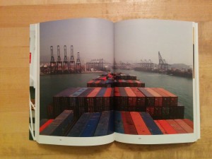
The second image is taken from the ship’s bridge looking out across the rows of stacked shipping containers. The ship is coming into a port. Along the waterfront there are no less than 22 cranes for loading and unloading cargo. Several ships are already docked and being either loaded or unloaded. There are clearly many such ships plying the world’s waters and a complex high-tech infrastructure built around them.
Pegasus10000Miles_03

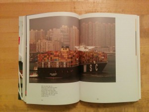
On the next spread we see another cargo ship, the MSC Savona, chartered out of Monrovia, coming into port in Hong Kong (or perhaps Xiamen). This ship is even larger than the CMA CGM Pegasus–it is twenty container columns across rather than eighteen. The ship takes up nearly the entire foreground of the photograph, one can barely see the sea to either side of it. Its stacks of cargo containers neatly echo the apartment towers in the background. Two related readings of this photograph that spring immediately to mind: The city as we know it today is directly tied to the global commerce embodied in these ships. Modern life–particularly modern urban life, is significantly defined by the consumer culture represented by these ships. Without global trade, modern life would not exist as we know it.
Pegasus10000Miles_04

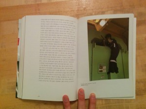
The fourth photograph I want to talk about is of a man repairing some piece of machinery. He is perched awkwardly on a ledge and reaching into an oblong opening, which does not seem intended to be an access point. What at first appears to be blue wiring is actually nylon rope. To this point, nearly the entire focus of the photographs has been on the physical enormity of the ship, its advanced technological aspects and the complex system of ports and shipping lanes of which it is a part. Here we are seeing that for all of its marvels, it is still men who make these ships go (and who built them, for that matter). When something breaks, someone has to fix it. The photograph is one of only half a dozen or so photographs of the ship’s crew and the only one in which someone is actively doing something.

Even without the text, Pegasus 10000 Miles is a fascinating and charming glimpse into global shipping. If one were interested in shipping primarily and wanted facts rather than photographs, being unable to understand the text would be a greater concern.

Pegasus 10000 Miles
Lee Young Jun
workroom
2012

xyZ City, workroom

As I’ve noted in the past, I’m a bit of an urban planning geek. It comes from my grandfather who was involved with local government. I find the urban space endlessly fascinating. A proper city is always in a state of flux. Blink and the city changes. This interest is reflected on my bookshelves and my personal photographic archive. I dig cities.

It’s no wonder then that I was drawn to workroom’s xyZ City, though I’m not entirely clear what the book is. An illustrated treatise? An exhibition catalog? An exhibition in book form? There is no English text, so I’m left with the title, layout and photographs themselves to decipher it.
Continue reading

The Tedious Landscape II, Kim Yunho

KoreanPhotographyBooks-146

Workroom does good design. Every photobook I’ve come across that was designed by them feels right. Kim Yunho’s The Tedious Landscape is from Workroom’s Lájka Series. In Korean, the name reads phonetically as “Lah Ee Ca Series”; Leica Series. I’m not sure how or why it has re-transliterated to “Lajka.” Odd.

Moving on.

The Tedious Landscape II is, as might be obvious, the second in a series of projects. In The Tedious Landscape, Kim explored the outskirts. What does the country look like outside of the major cities?

The photographs in this book are of pageants, which often have the underlying goal of celebrating and promoting local specialty products. As most of these products are natural products or produce, these pageants tend to be put on in more rural regions or smaller towns or villages. As Kim Kyewon notes in the essay that closes the book, “Major cities do not have particular specialty products, and if they did, they would not need to promote them in such a way.” The Tedious Landscape II, then, extends Kim’s exploration of the periphery.

Another astute observation in Kim Kyewon’s essay is that though these photographs are of beauty pageants (whether the contestants are female, male, old or young), there are no beauties in the photographs. The scenes are photographed from a distance. In each, there is the whole stage filled with the full complement of contestants as well as other participants in the pageants–judges, audience members, photographers and assorted hangers-on. There is little action; the contestants in most of the photographs seem to be simply standing there, waiting.

In an earlier post, I spoke about the challenge of writing about work that I can’t fully understand as an outsider. There will always be aspects that are not apparent to me. An essay like Kim Kyewon’s can be invaluable in coming to a more complete understanding of a photographer’s intentions. I note this because I am going to steal (but attribute) an idea from Kim’s essay that is important to the work but that I would not have come up with myself.

KoreanPhotographyBooks-148

The goal of these pageants is to promote the local specialty good. The contestants become double symbols not only as the most beautiful but also as a stand in for the local product. The pageant winners from one region are indistinguishable from the pageant winner from the next region. “The form in which they serve as symbols is repeated nationwide and results in a tedious [landscape].” (Kim uses the word “destiny” here, but as he earlier invoked the idea of topography, I think “landscape” is more appropriate.)

KoreanPhotographyBooks-151

KoreanPhotographyBooks-153

While in total the photographs may describe a tedious landscape, the individual images are rich with cultural detail, daily life and comedy. One of my favorite images is 395-800: 16 women stand on a rain slicked stage, one of them is speaking at the microphone, the others are standing in near identical poses and watching with a smile. The audience is hidden by their scrum of umbrellas. In another image, #355-601, 10 bodybuilders stand around on stage while a photographer and video crew record the winner being awarded his trophy. The non-winners stand around more or less awkwardly; the scene has ended but they’ve not been released from it yet. The audience here is only an ajashi with a camera and a handful of children fascinated by the spectacle before them. In #534-801 the audience is again huddled in the rain, this time wearing ponchos. On stage, six older women stand before drums as part of a traditional performance; a photographer crouches stage right. The front of the stage is draped with a mural of a field of flowers; at the image’s horizon line we are suddenly onto the stage. The top of the frame is kaleidoscopic tumble of lights, trusses and risers.

The book itself is roughly octavo sized, perfect bound with plain board covers glued front, rear and on the spine, and with a 3/4 height dust jacket with a panoramic image that wraps the book (technically this might be a belly band, but it feels more like a short dust jacket). The pages are heavyweight, nearly cardstock, which combined with the perfect binding allows them to lay flat but puts stress on the binding. The layouts are a mix of paired images across from one another and double truck spreads. Both layouts push the images right to the top where they bleed off of the page. Kyewon Kim’s essay comes after the plates and is on a different lighter paper stock. It is in both Korean and English. After the essay comes a list of plates and the artist’s C.V..

This is a tightly designed book of well considered and well made photographs. The clear and concise essay that gives context and added meaning to the photographs is a welcome bonus.

The Tedious Landscape II
Kim Yunho
Published by workroom press
Edited and Designed by workroom
Essay by Kim Kyewon
Translation by Kim Jeimin
First published 1 August 2008
Printed in Korea

Commercial Photography & the Birth of Consumer, Kim Han-Yong

On the shelves of the library at The Educational Alliance Art School, where I used to teach, were several photography annuals from the 1940s and 1950s of photographs ranging across all genres. I looked through these on many days before classes. It was amazing to me how some of the photographs looked incredibly dated, even older than they actually were, while others remained fresh, vital, vibrant.

Kim Han Yong’s Commercial Photography & the Birth of Consumer is similarly fascinating time capsule from the past. A big difference is that this is a contemporary retrospective reconsidering the historical context of Kim’s advertising photography from the 1950s through early 1980s.

Kim Han-Yong, Commercial Photography & the Birth of Consumer*

Kim Han-Yong’s photographs are inextricably linked with the ads to which they belong. With a few exceptions, Kim’s photographs, if taken out of the contextual space of their resident advertisements, would fall flat. (In all truth, some of the images fall flat even within the context of the ads and others are saved only be their social or pictorial weirdness.) Regardless of how each works as a photograph, Within the context of the ads, the photographs as a whole become a rich trove of historical suggestion and cultural foundation. This is one aspect of the origin of the South Korean consumer state.

Commercial Photography & the Birth of Consumer [sic] presents a cross section of Kim’s advertising work along with three essays (in both Korean and English) placing that work into a social historical context. Each section of the book has introductory text pulled from an interview with Kim (in Korean only). The book’s format is very much in keeping with the nature of the advertising posters and photographs being presented. The cover is bright and glossy–like a textbook from middle school. The book is large without being oversize. Posters are generally presented one on each right hand page with captioning info on the opposite page, though those in the section titled “Charm of the Non-Real” are run across the gutter which ruins them. Several posters have outtakes from the shoots presented as a contrast to the retouched ads. Captioned information for each poster includes client, designer, model, technical photographic information and other project information as available. This is not the finest Korean photo book I have seen, but its design is very finely considered–workroom has really hit the nail on the head here.

The book is broken into four chapters: Classic Beauty, Discovery of Consumer, Portrait of Consumer, Charm of the Non-real and Erotic. They are not based on chronology so much as they are on typology. We begin in Classic Beauty with the model as spokes-person. These simple ads associates a product with a beautiful and/or famous person, but we are not given a dream that to aspire to beyond that association. In Discovery of Consumer we have a narrative suggestion but remain in an abstract space. These ads implies that this product will make us happy or beautiful or desired or fulfilled or whatever; though the narrative remains simple and relational. In the Portrait of Consumer we are shown the black and white world of reality in which these ads operated. These are the earliest photographs in the book, primarily from the 1950s and early 1960s. The shift from the color advertising to the black and white documentary photography effectively presents the challenges and opportunities that existed for advertising in building a consumer society during this time (as well as shows that in some ways things are what they ever were). Charm of the Non-Real is contemporary advertising: here narrative is complex within certain cliched advertising tropes–sex, money, love, happiness, and we are presented with an entire environment and an entire lifestyle in which the product exists. There remains plenty of weirdness in the photographs, but these are modern advertisements that could be from any western society at that time if we changed the type face. Erotic is a handful of suggestive but chaste photographs of beautiful (and natural) women wrapped around phallic stacks of oil cans or wearing bikinis and holding gas pumps… these look more cute than erotic to present day sensibilities. My favorite from this chapter is of a woman in a bikini kneeling on a beach, leaning forward, mouth half open in either ecstasy or anticipation and she is facing… a young boy who is holding out a garland of flowers to put around her neck. What is the suggestion here and to whom is it directed? It is a weird and a somewhat discomfiting photograph. It’s a good weird, though. And in general, that is what most of the photographs are: a good weird.

The essays at the end are a mixed bag. It’s possible that poor translations contribute to this.

Lee Young June’s essay is the most astute of the three and the most specifically about Kim’s photography and the advertising posters of which they are a part. The central ideas running through her essay are that “the feature of [Kim’s] photography more important than indexicality is that it trains the viewer sensually” and that “…it is senseless to compare commercial photography to reality. Commercial photography is like futures trading in that it is a preview to the beauty and fantasy that do not exist yet.” I especially like that second description of advertising photography. This idea of the image as aspiration follows through into Her Boyoon’s essay. Seo Dong-Jin’s writing is more political and is about Kim’s photographs only in as much as they are a convenient jumping off point to speak about economic topics, though towards the end he describes Kim’s “Photography Research Lab” as a place where objects were not photographed but instead are imbued with added representational value to make them into “the real thing”. This section of his essay, which mostly leaves quotable name checking theory behind, is the most relevant to the subject at hand and the most clearly understandable. (I suspect that Seo’s essay suffers the most from translation and that reading it in Korean I would have a more favorable view of it.)

Overall, this is not the book that I would suggest as a point of entry to Korean photography. The work is more historical than personal and is presented as such. It feels like a lesson teaching us how the world became what it is and the importance of this figure. For those interested in the development of advertising, the building of a consumer society or the economics of consumption, though, this is a fascinating book. It doesn’t just look like a textbook, it is a textbook.

Title: Commercial Photography & the Birth of Consumer
Author: Kim Han-Yong
Contributors: Lee Young June (Profound Circumstances Commercial Photography Had to Cope With), Her Boyoon (Object of Dream, Dream of Object), Seo Dong-Jin (Memory of Commodities: Kim Han-Yong’s Photographs, the Images of Material Culture of Korean Captialsim)
Publisher: The Museum of Photography, Seoul (Ga-Hyeon Foundation of Culture)
Design: workroom
Copyright 2011

* Cover Image from The Book Society website. The Book Society is one of my favorite book shops in Seoul. I’ll post at some point about where to find photo books in Seoul another time.