Five Views From Korea @ Noorderlicht Photo Gallery

The Noorderlicht Photogallery will be showing Five Views from Korea February 8th through April 13th. Work from Seung Woo Back, Jaegu Kang, Insook Kim, Suntag Noh and Xuezhe Shen is brought together to examine “the discomfort and nagging feeling of an unending cold war since the division of the Korean peninsula.”

From Guest Curator Sujong Song:

Every day, the papers are flooded with news heralding tension on the Korean Peninsula. Perhaps because they are in the eye of the storm, but the people living in the southern half are largely skeptical of an outbreak of war. The feeling closest to fear they experience is annoyance, as if they’ve been reminded of a particularly stubborn splinter that might never be removed. Guest curator Sujong Song presents with Five Views from Korea five projects from photographers, which are the result of these frustrations felt in everyday life by this reality.
‘Ultimately, these are narratives regarding five perspectives on either the nations tied to the divided Korean Peninsula or the identity of those who live within the countries’ influences. Invisible ideologies attempt to control us in whatever way possible, while we struggle to overcome that restraint. It is the things unseen that dig most deeply into our everyday lives, irrevocably bore into our skin.’

On this blog we’ve looked at some of the photographers included in the exhibit, and reviews of books that include work of at least one of the others are in the works. This looks like an interesting show. Too bad I won’t be able to get to Groningen to check it out. Hopefully there will be a catalog or accompanying book available.

More info.

Commentary: Context, Approach and Bias

A.D. Coleman’s observations on photography are always acutely astute. His blog, Photocritic International, is a must read.

In a recent post, Across the Great Divide (1), he recounts a misreading by Penny Coisneau-Levine of a review he wrote in 1974 about a Canadian photographer’s book. She uses the misreading to set him up as a straw man in order to criticize a “monolithic approach” in which “universal” terms serve to hide work that does not conform to this mode of criticism.

“The problem is, of course, that this monolithic approach almost guarantees that enormous chunks of the work under consideration will slip through the critical cracks, that whatever exists in the work that cannot be mediated through the ‘universal’ terms of discourse the critic employs risks being missed altogether. And if not much in the work does lend itself to being discussed in these critical terms, the work may be barely seen at all, with the conclusion that nothing exists in the work to be seen.”

Leaving aside the poor choice of straw man, Coisneau-Levine’s point is a valid one, and one that I am aware of here on Korean Photography Books. The locus of this blog is books from a culture that is not my own. I am not Korean, do not have any formal schooling on Korean history or culture and do not speak the language. The risk is ripe for falling back onto generalized universal terms that demean, distort or diminish the work under review.

My goal in writing these reviews is the opposite: to make the work in these books accessible to a Western audience while doing what little I can to promote the photographers behind the work. Two key role models for my approach to writing this blog have been Coleman and John Berger. In the introduction to Berger’s Understanding a Photograph, Geoff Dyer quotes D.H. Lawrence’s poem “Thought” to describes Berger’s approach: “Thought is a man in his wholeness wholly attending.”

Their similar approaches of closely attending to the work under review seems to me a valid means of minimizing the risk of losing chunks or not truly seeing the work. Furthermore, there are rich veins of potential meaning where cultures come together. What is ordinary and obvious within a given context becomes strange and obscured when it runs up against a foreign work of art. A particular meaning might be lost, but new meanings are created. When any work of art is finished by the artist and comes in front of a viewer the viewer brings a new set of experiences and assumptions to the work and finds his own meaning within it.

While there is the risk in cross cultural criticism of applying a universal standard to all works regardless of cultural context, one must have a standard of some sort. I can only apply a personal standard through closely attending to the work itself, my reaction to it and the cross cultural connections these suggest.

On the Clouds, Boomoon

Boomoon was the first Korean photographer I encountered.

Before I left for NYU fifteen years ago, my parents bought me a subscription to Lightwork, which included a print and a book. (The book was Todd Hido’s Outskirts.) This subscription also landed me on Nazraeli‘s catalog, which is where I encountered Boomoon’s Naksan and later his One Picture Book #26, On the Clouds. Nazraeli describes Boomoon as “one of Korea’s greatest contemporary photographers.” Though I purchased neither, both Naksan and OPB #26: On the Clouds are touchstones of my earliest interest in photo books.

When I went to Korea for the first time, one of the first books of Korean photography that I came across and purchased was Boomoon’s On the Clouds, the same photographs as OPB #26: On the Clouds and the same title but a different book. It must have been fate.

This is neither here nor there in regards to the book itself.

On the Clouds comprises photographs of the sliver of sky above the cloud horizon and below space as seen from commercial airliners. The photographs are a slope of blue above cloud white. The last several plates in the book are taken in evening light in which the clouds form a dark gradient with the sky above drifting into the dark of space.

The book’s physical form is a simple folded signature with exposed stitching and board covers. The cover is a slightly ghosted photograph with the title and photographer’s name in white lettering. On the rear cover is the same ghosted image with the publisher’s name in white lettering. The book opens with a title page followed by the first plate and then a short text by Taro Amano in English and Korean. The plates begin in earnest after this text with a gate fold spread of three images. Most spreads are pairs of images, though a double gate fold is tucked into the layout. There are 23 plates in total. The plates are followed by the artist’s CV (in English and Korean), an index of the plates and the book’s colophon page.

This is a simple book of simple photographs that offer complex possibility for reflection. What on first examination appears to be a straightforward formula becomes photographs full of nuance, spatial and chromatic. The viewers eyes hover between the compositional emptiness of the foreground clouds and the dark physical emptiness of space pressing in above the clouds. I find this meeting of voids, compositional and subject, to be powerfully evocative. Boomoon has pared these images back to an absolute minimum of information and yet they suggest much meaning.

On the Clouds
Boomoon
Published by Nabizang / Choi Woong Lim
Essay “The Ever Changing Sky” by Taro Amano
Translation by Yun Ki Eun (Korean) and Sumiko Yamakawa (English)
Designed by Design Seed, Kim Mee Jin and Lee Jae Hyun
Printed by GG Communications
2006, edition of 1000

Two Faces, Lee Duegyoung

Sometimes, the answers are all right in front of you. And at other times, small things obscure them.

An aside before the actual review: Lee Duegyoung’s Two Faces includes a list of notes by critic Lim Geun-jun that give detailed descriptions of his previous projects and working methods. Lim’s very clear description of Lee’s “Teheranno” as panoramic composites made from photographs taken from a helicopter with a downward facing camera to mimic satellite imagery clarifies for me the images I mentioned last week as a stand out in the 2012 Seoul Photo Festival. I had not connected them in my mind to Two Faces because Lee’s name was transliterated differently in the SPF catalog. For my part, I have always transliterated names as they are transliterated in the publication and will continue to do so despite the obvious possibility for missed connections. On to the review.

Lee Duegyoung maintains an incredible consistency of good ideas coupled with masterful execution and high-quality book design. Given his past exhibits and publications, it is little wonder that Two Faces is such a strong book. I may be faulted for wearing my heart on my sleeve here, but so be it. I like this book. Two Faces is one of the most engaging Korean photo books I have acquired recently. Both the content and design are outstanding; as a bonus the texts are clearly written and available in both Korean and English.

Two Faces comprises two panoramic photographs of the north and south banks of the Han River as it runs through Seoul. Lee composited roughly 13,000 photographs taken over four days from multiple river boats into two panoramic images. The two panoramas run essentially unbroken opposite from one another, top and bottom, across the accordion pages of the book. The book places the reader almost in the prow of a boat from which he can look left and right at the two banks of the Han. The “accordion” is perfect bound along one edge preventing the reader from opening it up to peruse long stretches of the panoramas.

Due to the inevitable perspective shifts caused by shooting from a moving platform, some tall buildings away from the river’s banks appear multiple times in slightly shifted positions. This gives an experiential edge to the photographs. Just as an actual viewer on a river cruise might espy the same edifice from multiple angles over the course of the journey, so too is the reader treated to this experience. Any sense of an absolute recording of the river is broken, the panoramas present a view that is spatial and temporal and hint at a continuum of possible views.

Lim notes that one of Lee’s influences is Ed Ruscha’s trilogy of artists books: Every Building on the Sunset Strip, Twenty-Six Gasoline Stations and Thirty-Four Parking Lots. This makes perfect sense to me, though the incredible breadth of Lee’s effort brings to my mind another project: Eugene Smith’s Pittsburgh. in Two Faces Lee has taken an equally ambitious target but rather than get bogged down in endless possibility has brought the work to a magnificent completion through a tightly focused conceptual framework and equally tight physical form. I’m sure there’s a jazz metaphor here, but I’m not a jazz guy.

The physical form effectively contributes to the conclusion of Lee’s Hangang trilogy by referencing the previous projects. The cover presents us with a complete foreshadowing of the work within: the panoramas have been compressed into the length of the wraparound cover. This calls to mind the time compressed video that accompanied the exhibition of Lee’s Hangang Project II – 25 Bridges. Lim notes the video, and I take take his note a step further to explicitly make the connection with Two Faces‘s cover. So too would I point out the somewhat obvious connection of the book’s accordion form to his 69 Snack Booths catalog which also employed an accordion form. These small formal and technical echoes that tie project to project create a sense of structured completeness.

I’ll end with a small personal detail that I enjoy: in the panorama that tracks the north bank of the Han, Lee has photographed my mother-in-law’s apartment building under construction shortly before she would have moved in.

Singular concept.
Tight design.
A work fully thought through.

Two Faces
Lee Duegyoung
Written by: Lim Guen-jun and Rhee Z-Won
Translated by: Choi S. Min and Kim Sung
Edited and Designed by: Suki and Min
Specter Press, Seoul
Edition of 700
2010

Nakgol Project, Architectural Photographers of Korea

The city of Seoul holds an annual Seoul Photo Festival. In 2012 the festival’s theme was “A Thousand Villages, A Thousand Memories.” Given my interest in the ways that urban planning, urban infrastructure, daily routine, memory and image making intersect this show was hard to resist.

The intermingling of professional works with personal snapshots was handled with aplomb. Rather than reduce the personal work by elevating it to professional stature, these private documents were treated as vernacular ephemera and presented as such. In fact, while there was much good professional work in the exhibit, the tight spaces that the Seoul Art Museum’s first floor was carved up into made its presentation cramped. In comparison, the vernacular snapshots held up very well in the small rooms.

Among the standouts in the 2012 show: Dueg Young Lee’s satellite composites (or aerial photographs?) of Seoul street grids; Se Kown Ahn’s photographs of the excavation of Cheonggyecheon; Ki Chan Kim’s black and white photographs of Seoul in the early 80’s full of fun and energy; and Han Chungshik’s documentary photographs from the 70’s. The Dream Flower Factory and Union of Workers for Producing Non Waste community projects were also wonderful. (I’m a year late in noting all of this as now even the 2013 Seoul Photo Festival has concluded…)

There was one standout, in particular, for me: the Nakgol Project by the Architectural Photographers of Korea. This was an unassuming, slim, softbound book of rough halftones. The book was presented in the show as a book: one could flip through the book itself, mounted to a shelf, or follow the book’s spreads mounted on the wall. The book’s dense, tightly composed photographs depict Nakgol, an area of unlicensed shacks in an isolated hilly Seoul neighborhood, as it existed in 2001. The photographs are like an extension of Yong Kim’s photos from the 60’s (not his advertising work) or Han Chungshik’s photos from the 70’s, both of which were earlier in the exhibition.

The photographs in the catalog are dated 2001-2002, though the book appeared to have been published in 2001. Between 2002 and 2006, the neighborhood (which one might also have described as a “squatter settlement”) was redeveloped into a series of apartment blocks. Having witnessed the extreme rate of change in Seoul, this book reads both like a document meant to save the memory of the place and as one meant to hasten the process of redevelopment. The book preserves the place while simultaneously presaging its doom or rebirth depending on one’s particular vantage point.

One might consider this book in relation to Se Kown Ahn’s photographs of Cheonsgyecheon’s “re-development.” The Nakgol Project depicts an “old” Seoul about to be replaced with a modern Seoul, which in this case means a developed Seoul. In Ahn’s photographs, the process is reversed: the concrete and rebar of previous decades’ development are being removed to renew an ancient public waterway. Modern in this case is what once was. I ought to note that the comparison isn’t perfect as Cheongsyecheon is very much a modern space designed and utilized with contemporary values; but, its essence and origin is ancient.

Nakgol Project is the 2012 Seoul Photo Festival’s theme in compact form. It presents multiple ways of seeing a place. We can read into it the memory of a place that once was; a living space engaged by its inhabitants; or, an opportunity to advance the city forward. It is quite an achievement.

Nakgol Project
Architectural Photographers of Korea
2001 or 2002

(I have no other information; no link to the book, no link to the APoK… if anyone knows where I can find a copy of this publication or a link to the creators, I would very much appreciate either.)

Like a Program; Kim Sang-Gil

Good photography. Dark, rough printing. Off white paper. Small design flourishes. Wonderful object-ness.

Given my predilections I ought to like this book. I don’t.

My impression is that more and more photo books being made in Korea lately are exquisite objects that mirror and enhance the photography contained within. (Next week’s review will be of one of these.) In the past, I found that many photo books in Korea were simply exhibition catalogs (often beautifully made but still catalogs). Like a Program on a cursory examination appears to be a wonderful object, and it is, but this object-ness is out of whack to the photography within and overwhelmed by the all you can eat buffet of an exhibition catalog that it truly is.

It may be unfair to judge an exhibition catalog for failing as a photo book. Oh well.

Kim Sang-Gil’s photographs limn a porous boundary between artifice and sincerity. Like a Program contains three of Kim’s projects that approach this boundary from different directions and a fourth that is about something (else). The moments in “Motion Picture” appear to be caught from life, but their captions reveal them to be staged. The subjects are models and actors between or in the midst of takes. “Off-line” depicts communities that have come together around shared interests. These interests can be as simple or shallow as brand affiliation and yet the group identity or sense of community is no less sincere than in any other group or community. “Re-model” is photographs of empty commercial interior spaces either waiting to be used or in the process of being made ready for use but that lack the qualities that actually being used will embue them with. An empty space might be intended as an office, but until it is used it is little different than an unused mall interior. The final series in the book is “Display.” This is comprised of details of building design features: a handicap lift rail; an elevator door; a revolving door; a parking elevator system. I do not know how these four photographs relate to the previous three series.

The work in the book, while having a loosely unifying theme, is too broad. Moving from one project to the next is jarring.

The choice to print all of the work in the book in low contrast black and white is odd given that Kim Sang-Gil works in color. The printing is actually quite beautiful in its way, but it is wrong for almost all of the work.

“Off-line_burberry internet community” offers the opportunity for a direct comparison between Like a Program’s grayscale printing and a color presentation. The image appears in glorious glossy color on the cover (and in the interior) of the 2009 exhibition catalog Chaotic Harmony (Museum of Fine Arts Houston and the Santa Barbara Museum of Art, 2009).The flat gray tones in Like a Program dull the image, make it boring.

The images from “Motion Picture” are similarly dulled to death by the monotone printing. These images have subtle color and a cinematic presence–which makes sense given how they were made. Looking at these photographs I am reminded of Philip-Lorca Dicorcia’s Hustlers with their seemingly natural light that bathes everything in the frame with a kind of heightened sense of being real. This heightened sense of the real is at the heart of what “Motion Picture” is about. It is a physical trace of Kim’s capital “I” Idea. Why strip that from the photographs?

This is not a knock on the photography or the photographer (though the buck has to stop somewhere). Motion Picture_inquiry and Motion Picture_the message and Motion Picture_hand clapping are all weirdly wonderful. Off-line_burberry internet community, Off-line b&w sneakers internet community and Off-line_the sound of music internet community are likewise beautifully bizarre. I imagine that large prints from Re-Model would have an amazing presence on the wall. This is good work.

This is a knock on the book: There was obvious care made in the design and printing and yet somehow the design choices are mismatched to the content. The design and printing are good (in and of themselves at least); the photography is good; the combination is not good.

If one has nothing nice to say, we are often told, say nothing at all. Ah… Well. I don’t think my writing this criticism of a book published eight years ago will put any kind of dent in Kim’s reputation. I’m just some dude and he’s an internationally known artist. I have no ax to grind here; I like Kim’s photographs and bought the book because I wanted to like it. It is disappointing that Like a Program occupies the no man’s land that it does: it has lovely object qualities and yet is primarily an exhibition catalog.

Like a Program
Kim Sang-Gil
Project Space Sarubia, Seoul
2005

SSE Project and SSE Zine; Young Pil Yoo

A package arrived from Korea yesterday. New SSE Zines! And stickers and postcards to boot.

SSE Project is an online gallery; each exhibit is also printed as SSE Zine. Given that SSE-P and SSE Zine are a single project in their own right I’m writing this review of the whole venture. While I certainly might have my favorite issues, it is the overarching consistency of SSE-P that I am enamored of. This review, then, is of Young Pil Yoo’s efforts to “offer a wide perspective to the public and help communication between artist and audience.”

In the New York Times a couple of days ago, Holland Cotter had a piece describing “a collection of complaints and a few (very few) ideas for change” that he has regarding the arts in New York City. In his view, big money (the art industry) has again come to the fore in the art world (though one could certainly argue that it is always at the fore) and is distorting the art world in terms of “what kind of art is made, and how art is presented in the media and in museums.” He closes his article with this:

But when the rents get too high, or the economy fails, or art buying falls out of fashion, and the art industry decides to liquidate its overvalued assets and leave? Artists, the first and last stakeholders, will have themselves to fall back on. They’ll learn to organize and agitate for what they need, to let City Hall know, in no uncertain terms, that they’re there. They’ll learn to share, not just on special occasions, but all the time. They’ll learn that art and politics are inseparable, and both can be anything and everything. They’ll learn to bring art back from the brink of inconsequence.

As someone long on questions and short on answers, let me ask: Why not start now?

YP (as Young Pil presents himself in SSE-P and his social media channels) started SSE Project six years ago. He understood Cotter’s concerns (though without the New York City specifics) in 2008 and has created a platform through which young artists can share their work. SSE-P strikes a fine balance between the new world flattening of distribution opportunities presented by the web and old school print media that exists as objects in the real world. YP is putting artists into the world. He is helping them to share all of the time.

SSE-P is a distant less commercial cousin of Jen Bekman’s 20×200. While Bekman’s endeavor aims to make art accessible by way of affordability, YP is looking to make art simply accessible. The website presents each exhibit in full. Social media channels trumpet the exhibits in conjunction with real world launch parties. Artists are linked to directly from the SSE-P site. The only thing SSE-P sells is the zine (and SSE-P stickers and postcards…), and these are priced so cheaply that I suspect they simply cover the cost of printing the next zine. (In Seoul bookstores the zines are generally priced between $6 and $10; online ordering with international shipping is slightly pricier.)

Without a clear metric, it is hard to evaluate how successfully SSE-P is fulfilling its mission–and that isn’t my job, really. However, so as not to be one of those critics writing only to “broadcast names and contribute to fame,” I’ll make a go of it anyway.

“Wide perspective” seems like a good place to start. The latest issue is #48; I have 12 issues on hand. I’ve acquired issues dealing primarily with photography, though of those on hand two are painting and another illustration. The remaining 36, many of which I’ve seen in person and others which I’ve seen only online, are a mixture of painting, drawing, illustration and multimedia. The artists are mostly Korean, though a number of western artists have also worked with SSE-P. The aesthetic range of the presented work is, well, wide: black and white grit from Novo and Yourim Kim documenting tattoo culture; young women in the flush of life from Yina Kim; rough aggressive political paintings from VS; “simple and still” subtle color from Ye Rin Mok. Nam Ji Yeon’s paintings are fucking weird–I’m clearly missing something. Hasisi Park shows and conceals.Son Dong Joo photographs a love letter. SSE-P hits the wide mark.

It is harder to evaluate how well the projects is helping communication between audience and artists. YP has a following of nearly 800 on Twitter. The last opening drew nearly 100 yes RSVPs through Facebook and pictures show a well attended opening. Beyond that weak evidence, I can only guess based on anecdotal evidence: my experience is that the zines are everywhere, though often hard to find: many sell out quickly. My evaluation? Forget the numbers; it is the intent that is most important. YP is trying, and I would say (am saying) that trying is succeeding in this endeavor.

Once again, to no one’s surprise, I’m taken by a small publisher ( / online gallery). YP designs each (or at least most) of the zines himself. The zines are roughly 28 pages, well printed on matte paper, saddle stitched, either 5 3/4″ x 8 1/4″ or 5″ x 7 1/4″ and in an edition of either 500 or 1000. The design is understated, generally, so that the art is front and center. A couple include an accompanying poster.

Lest anyone think I’m gushing here, I’ll note that I skipped the two volumes of Boys on Film and Girls on Film. These publications didn’t do it for me. For completeness’ sake I ought to have simply purchased them through gritted teeth; but, they’re just empty photo calories, and I passed.

If you’re in Seoul, swing by The Book Society, Your Mind or the design shop on the ground floor of the Sangsang Madang building in Hongdae and check out a couple of the zines. Elsewhere in Korea, check in at your nearest hip art shop; you’ll probably find SSE Projects publications. If you’re not in Korea, check out the SSE-P site, follow Young Pil on Twitter (@yp_art) or have a couple of zines shipped to your door. SSE Projects is hot. I’m hooked. You will be too.
2011, 5, 24, Tuesday; Jo Hyo Joon

Tuesday

This book clearly illustrates the precipice along which this blog walks: sitting at the intersection of photographs and text, and as the text is only in Korean, it is beyond my full understanding. This is a flaw of this blog that I am all too aware of. Over-arching ideas, the photographs and physical books I understand. Korean Text and the nuance it might bring often eludes me. I note this because this is a book that I quite enjoy even with my understanding hobbled by my inability to fully appreciate the text. I don’t see this as a fatal flow but certainly one of which I am aware.

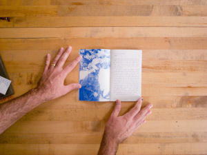
2011, 5, 24, Tuesday mines multiple perspectives of a single day. Each of the subjects in the book was in the same place, at the same time and doing the same task. The book is comprised of their individual accounts describing what happened that day; each account is accompanied by a portrait. Though I cannot read the text and despite the fact that the tasks were done for the military, the events described appear to be banal. It is (I assume) the small differences between their accounts that are meaningful.

KoreanPhotographyBooks-121

KoreanPhotographyBooks-127

Each text is accompanied by a portrait of the man who wrote it. The portraits are all snapshots: loose, familiar, affectionate but without affectation. I assume the photographs were made by Jo who designed the book and that they were shot with a point and shoot with a built in flash. They would be better considered alongside Nikki S. Lee’s “snapshots” rather than Terry Richardson’s. When a journal entry runs longer than a page, a photograph of the location sits across from the additional page of text. The opening and closing photographs are all of the location.

Published by Corners, it is no surprise that the printing is rough risograph. The photographs are all in a limited blue tonality. The clipped tones nonetheless convey much and suggest more. The next to last photograph in the book, one of the few that isn’t a portrait, is a broad sky above distant layered hills with a flash-lit fence in the foreground. The regularity of the fence–harshly lit by the flash, sets off the subtlety of the rows of hills and the glow of low clouds below a clear sky above. Where the blue ink blocks up in the dark tones of the hills there is wonderful play between the ink and the paper’s fibers. One can almost see trees, branches and pine needles.

As might be gleaned from the types of books that I have written about (and purchased before doing so) I like small books that delve into small ideas and I like quirky presses that make the most of their limits. Corners is just such a press, and this is just such a book.

2011, 24, 5, Tuesday
Jo Hyo Joon
Corners
2012, 3, 1

Site Notes: Back to Regular Scheduling

The last review posted, I Am Going to the Barbershop was late. It was supposed to have been published the week before Christmas. Year end craziness and holiday travel threw the blog’s schedule out of whack (to say nothing of my own schedule). With the holidays behind us, I will be redoubling my efforts to maintain the weekly posting schedule.

New posts should appear each Sunday for the foreseeable future.

Thanks for reading!