I began writing this review with the earth, several miles below me and lost in streams of white clouds. White noise from the jet’s engines enveloped the cabin in a haze of near silence. Yi Ilsup’s Images of Being seemed a good companion for a flight. After several days of consumer delight (Christmas gifts and post-holiday bargain hunting), the white space of the flight presented an optimal opportunity to concentrate and reflect upon Yi’s meditative paired photographs. Continue reading
Category Archives: Conceptual
Jeski ABC Book, Jeski.org
A quick review for a small book.
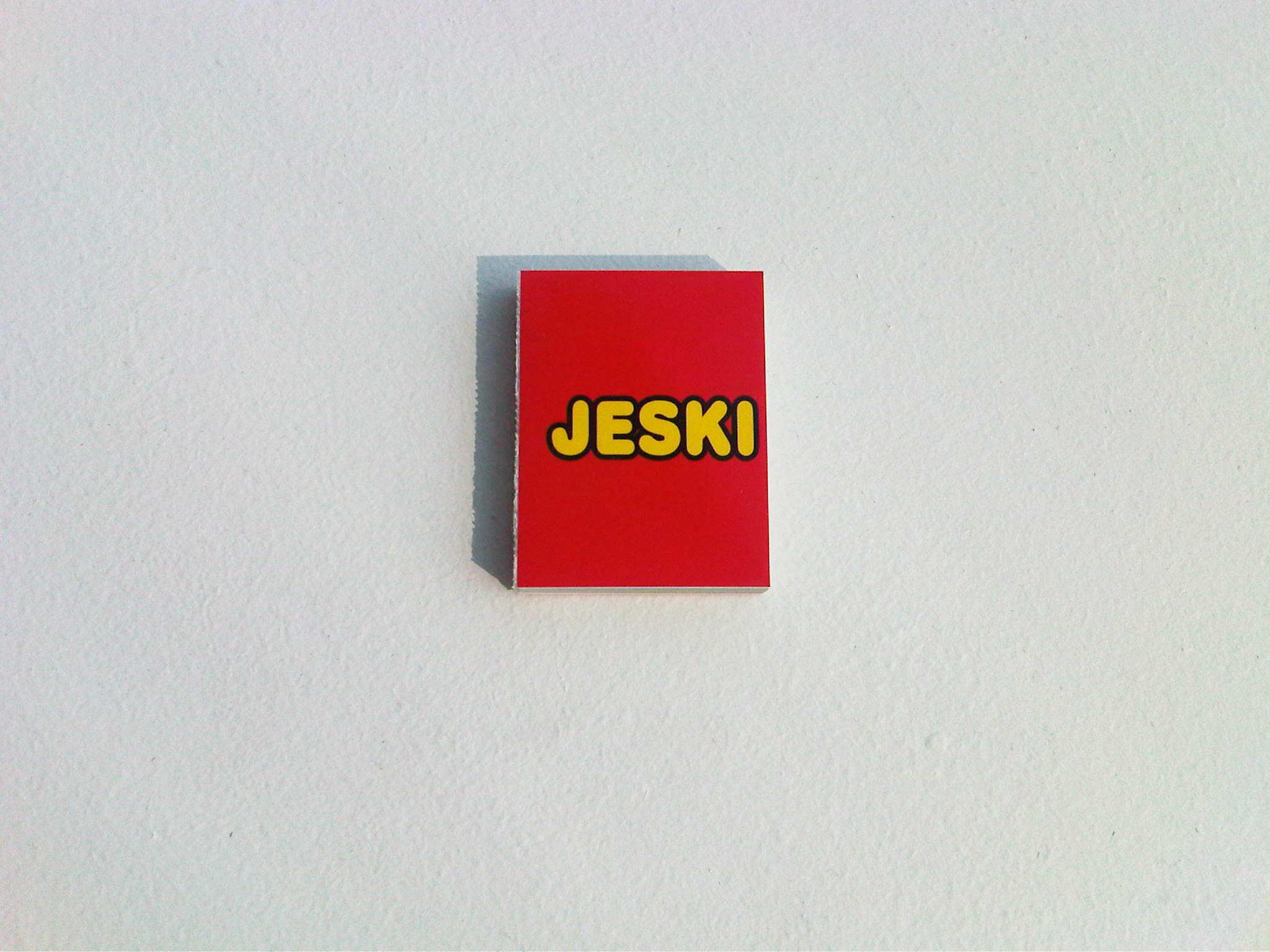
ABC Book is a miniature (~4cm x ~5.5cm) tome that uses bright colors and a bubbly font to present a potpourri of Jeski’s advertisements and public service announcements. It doesn’t actually contain the entire alphabet–English, Korean or otherwise. Selected words, which aren’t even in alphabetical order, are illustrated by images as a set up for presenting one of Jeski’s projects.
The projects playfully position the photographs in real world spaces making them into clever or humorous adverts or public service announcements: A pair of out stretched hands illustrates the word “Help;” turning the page we see these hands become a cafeteria tray liner exhorting a comfortable worker taking her lunch to donate to City Harvest. “God” is illustrated by the God of Michelangelo’s Creation of Adam. Turning the page God has been installed on an SVA elevator door; going one page further we see a student pressing the elevator button and meeting God’s finger. He becomes Adam at his creation, albeit an Adam in cargo shorts.
This is a clever and fun book full of clever and fun adverts, but in the end it is simply a clever and fun advert for Jeski’s quirky sensibility and envy inducing client list.
ABC Book
Jeski
2013
In Between Something and Nothing & inVisible / Suspended Landscape, Kyungja Jeong
In the Metropolitan Museum here in New York is a small and quirky room all done up in tromp l’oeil–and in wooden inlay no less. From the singular surface of each wall shape and color bring forth intricate, playful depth. The room is a wonder.
Photography works in the opposite manner. The lens takes light bouncing around three dimensional space and compresses it onto the single plane of the photographic surface. On the cover of In Between Something and Nothing, five surfaces intersect at seven joints. Light and shadow push and pull against the spatial compression of the photographic image.
Kyungja Jeong’s photographs “record the moment that she feels something that might be nothing from everyday life.” I don’t know quite what to make of this–and might take it in any number of opposite directions. The photographs are banal: corners where wall meets wall meets ceiling (and a handful with small objects set into such spaces). They contain soft light–gathered here and shadowed there. Though they are in color, the dominant tone is a monotone washed out cream.
Perhaps the room at the Met is not what most comes to mind with these photographs. In a previous apartment in which I lived, my bed was set into a bay window that overlooked the intersection of two busy streets. All night long cars would pass beneath this window, and their headlights would cast shadows across the ceiling. I would lay awake watching the light and shadows as they pushed and stretched across the ceiling before winking out. This might be exactly the knife edge of “something that might be nothing” that Jeong has in mind. The act of recording might make something out of nothing–or it might be that what we perceived as something is shown in the photograph to be merely nothing.
In the second volume in this pair, Jeong again plays with the photographic surface. In inVisible / Suspended Landscape the ostensible subject is consumed by the surface–droplets and smears of water on glass or reflections in water. This reflective or disruptive surface calls attention to the photographic surface–like in the room at the Met, our eyes our fooled into seeing depth within the hair thin surface of ink on paper. Not only do we perceive that the surface itself has depth, but we strain to look beyond it to the subject behind the surface.
Set stark in the middle of the photographs from “inVisible” are half a dozen photographs from Jeong’s series “Suspended Landscape” of green landscapes with a single lone human figure nearly lost in them. They are distinctly different than the photographs before and after. One can only assume that as readers we are being tested. The photographic surface is no less a distortion here in these photographs where we can see the subject clearly. The figures are as suspended in the landscapes as the landscapes are suspended in the photographic surface.
The design of the book by Yeoun Joo Park, founder of Hezuk Press, is worth noting. The saddle stitched pages of the two slim volumes are offset so that as one flips from page to page the images remain stationary but the edges of the pages float first up then down than back again. The photographs are suspended in the design. They are weightless in a way–perhaps we are again seeing the edge between something and nothing. Park’s design is extremely crafty and self-aware–it does not interfere with the photography but rather amplifies it. (The printing by Munsung, Seoul is also extremely good.)
Jeong’s photographs are beautiful and beguiling. Using the very limitations of the photographic surface Jeong creates expansive spatial depth. They take the thinnest slices of everyday “somethings” on the very edge of nothingness and mold them into significant moments.
In Between Something and Nothing & inVisible / Suspended Landscape
Kyungja Jeong
Book Design: Yeoun Joo Park
Printing: Munsung, Seoul
Hejuk Press
2012
OPEN to CLOSE, TOGOFOTO
OPEN to CLOSE is a good example of not judging a book by its cover, though not in the way that one would ordinarily invoke that phrase. The fold-out covers, half printed in metallic ink, with its graphic outlines of various window shapes invites curiosity. It draws one in. The photographs of windows within, though, disappoint.
The minimal design of OPEN to CLOSE breaks the book into 8 chapters with chapter headings consisting of light blue spreads each with a different silhouettes of a window. Each chapter is also marked by a layout shift.
The two photographs that open the book hold much promise: a straight on view of a window set into a brick wall, its panes thrown open, sun streaming across the three flowers potted on its sill; a straight on view of a pebbled glass window set into a tiled wall follows. These two photographs are tightly composed and set a typological tone. The six photographs that follow these two begin to lose this tone as they lose the rigorous composition of photos one and two. And then it all goes to hell.
One window, two windows, three windows. Centered, pushed to the edge. Ground, no ground. Straight on, skewed. Isolated as an architectural or compositional element, incidental in a scene. Sometimes the windows are doors. If each chapter took a different approach, that would be one thing. Instead, it’s all helter skelter with only a general and inconsistent pulling back to define the visual narrative. The design struggles mightily to make something of the photographs. It cannot, however, overcome the deluge. A tighter edit would have made for a more cohesive and focused narrative. As the book stands, I have no idea what it is about. What ought I be able to see through these photographs? That buildings have windows? So what?
Design that extends the photography is common in most contemporary photo books. I’m thinking of books like Seung Woo Back’s Memento (or Utopia/Blow-Up), KyungJa Jeong’s In Between Something and Nothing & inVisible / Suspended Landscape, or Lee Duegyoung’s Two Faces. With OPEN to CLOSE there’s nothing but the design to give shape and meaning; the photographs bring nothing, providing neither a window on a greater truth nor a door to increased understanding.
OPEN to CLOSE will look good on your shelves. The only reason to OPEN it, though, is to CLOSE it.
OPEN to CLOSE
Photos: TOGOFOTO
Publisher: Storage Book&Film
Editing: Ang
Design: The Object
2013
Cosmetic Girls, Hein-Kuhn Oh
Half a lifetime ago at NYU, I took a film class on post-colonialism. I remember few specifics of the course other than watching The Battle of Algiers and reading Franz Fanon’s Black Skin, White Masks and The Wretched of the Earth. What has stuck with me was the idea that societal systems create tiers of privilege. Reading theories of the way oppression works and seeing this play out in real life through film made privilege, and it’s cousin bias, very real to me. To this day I am aware of my own biases and the privileges that I enjoy–as well as the discomfort that they can elicit.
Hein-Kuhn Oh’s Cosmetic Girls elicits just such a discomfort related to bias and privilege. I’d seen the book on the shelves of bookstores for a couple of years before I could bring myself to purchase it. It seemed like a book I ought to have on my shelves, but I feel dirty looking through it. The photographs don’t sexualize the girls in them but certainly do objectify those girls. The photographs make these girls into something to be looked at–and the photographer has done so meticulously and mercilessly. The photographs are unflinching. No detail goes unnoticed. (And it is entirely proper to refer to the subjects as girls; none are older than 23, most much younger.) There is an apparent male gaze.
Let it be said, though, that this is not the male gaze of Miroslav Tischy or Terry Richardson. It would be a mistake to lump Oh in with these two. Oh’s interest is anthropological inquiry–he is primarily fascinated by the value Korean society places on girls and young women. His intentions are more to do with representation than with the girls themselves. Read that again; it is the minor chords that run through his work that are discomfiting rather than an explicit raunchiness or misogyny.
His earlier Ajumma project (past review here) was a humorous but nonetheless direct and unflinching examination of middle aged Korean women. One might read the photographs as simply a look at “ajumma style” if not for the the central hot spot lighting that focuses attention on the women’s faces and the confrontational gaze of the women makes these works far more about the women than any overarching concern with style.
Consider the street style books Fruits by Shoichi Aoki or Scott Schumann’s The Sartorialist: in these books the photographs are about fashion on the streets. The subjects are generally smiling or upbeat; they seem to be enjoying being photographed. The photographs themselves are nearly style-less; there is no obvious hand of the photographer at work. Both photographers seem genuinely enthusiastic and excited by their subjects. The photographs are endearing and fun if somewhat vacuous.
In contrast, Oh’s photographs are brutal. He controls absolutely the environment in which the photographs are made. He controls the space. He controls the background. He controls the lighting. He controls the framing. The subjects are found on the street and invited to the studio to be photographed (an assistant not Oh himself makes these invitations). The subjects may have come to the studio willingly, but they look at the camera uneasily. None of the girls wear shoes (except in three photographs made outside of the studio). In some photographs the photographer has closed in on small details or just the girl’s legs. There is a kind of implicit misogyny.
Oh himself says that the kind of typological method that he has employed is “highly unethical” and a “cruel field”. He has chosen this means of representation because his subjects have chosen entertainers as their role models. He in turn makes his choices in regards to “a certain lighting, viewing angle and convention of photographic representation.” Nevermind that the convention he has chosen bears little resemblance to the highly stylized and idealized convention of photographic representation employed with celebrities.
Never mind that nowhere in Cosmetic Girls do we see the “numerous middle aged male fans known as samchon (Korean for ‘uncle’) and obba (Korean for ‘older brother’) [who] are enchanted by a variety of sexy girl groups that have gained popularity….” Instead it is the “sensitive girls” who “learn girliness from [these girl groups]” who are spread through the pages of Cosmetic Girls. Oh concludes his statement with this line: “The girls we can recognize are merely their facade and images.”
The photographs indeed depict a facade, but it is not that of the girls. These girls may wear make up, they may have had petit surgeries, and they may be conspicuously conscious of their appearances, but the facade here is not theirs. Whatever ten dollar words Oh wants to trot out talking about the photographs, it is in his use of typological processes and his stylistic decisions that he has constructed the most apparent facade: that of his own male gaze. In young women’s choice of entertainers as role models he sees a crevice in the societal facade and is picking at that crevice. As we peer through the crevice he has worried open, however, what we see is a male artist staring back.
Cosmetic Girls
Hein-Kuhn Oh
Edited by Jeong-eun Kim
Editorial Assistants Mi-rae Song, Vo-ram Lee
Designed by studio Dwyane Wade
Translation Jee-sun Park, Young Kang, Meeky Song, Cecilia J. Park
Printed and bound in Korea by Munsung
Digital Image Calibration Tae-yoon Kim, Kyung-sub Shin, Jae-woo Choi, Sang-kyun Ahn, Won-jung Jun, Hyo-joong Yoon, Hein-kuhn Oh
Published by IANNBOOKS
Published on the occasion of the exhibition Hein-kuhn Oh, <Cosmetic Girls>, Kukje Gallery
Catalogue planning by Kukje Gallery
© 2010
Bright Shadow, Sohn Sung Hyun
Bright Shadow opens with a photograph of the Mongolian steppe. The horizon line is low in the frame, marked by mountains in the blue distance. The brown of dry grassland stretches out to meet the mountains. The land is receding; it is falling out of focus. A cloud filled blue sky dominates the picture, or would if a pair of truck mirrors in the foreground weren’t breaking the frame. The mirrors mar and distort the steppe caught in their surfaces.
We come to the city. It is seared by sunlight. The sky is blue and dark. There is no ground; buildings seem to sprout from their own concrete. A billboard advertising an apartment complex, still under development, promising elegance and luxury, dominates the photograph. We are in Mongolia.
A bolt of yellow: a woman in a yellow shirt and large white sunglasses is transformed by the photographer’s flash, which overpowers the sun. The background is dark (a trick of balancing the ambient and flash exposures in favor of the flash). More portraits of people picked out of their surroundings by the photographer’s flash follow: a middle aged, large bellied, man in a dress shirt; security guards; a young man with a hip haircut and popped collar; three young women, one looking away; two soldiers in their fatigues; a rancher in his chaps; construction workers; businessmen (or gangsters). The portraits are full of strong color and hard light. They bring to mind Hein Kuhn Oh’s ajumma portraits as well as Philip Lorca Dicorcia’s strobe lit street portraits and Bruce Gilden’s aggressive street photography.
The portraits are interrupted by a series of full bleed double truck urban landscapes in grainy black and white. Cars commingle. Cranes loom over rising buildings. A fountain’s spray dissipates into a gust of wind. The flash lit portraits continue: a man in uniform; a young man, hip; a young couple; a boy and a teen.
And then there comes a break: a black and white portrait of a young girl in some sort of costume–Mongolian? Korean? Play?. A second black and white portrait follows: an older, heavy set Native American woman with blotchy skin and thick fingers. Another portrait, this one in color: a Native American woman (neither young nor old) who looks away from the camera. We return to black and white: another woman, cropped tightly, her collar bones and upper chest are bare. And then color: a stark portrait of a Korean woman wearing a nurses uniform sitting before an off-white wall and staring intently into the lens. Three Korean boys look uneasily into the camera. A Mongolian family, four people covering three generations, stands on a plaza before what appears to be a government building; they stand erect. The husband’s face is marked with anxiety; he pulls his son in towards himself. The son looks off to his left away from the camera. The mother smiles; there is pride mixed with bemusement. The grandmother, leaning on her cane, wears a traditional costume with two government medals pinned to it. She looks towards the lens but not into it–perhaps she is looking beyond it. This family is followed by a group portrait of Korean healthcare workers; or maybe they are Mongolian.
The book ends with a final portrait: a tightly cropped photograph of an older Native American woman’s softly lit, wrinkle-etched, face. Her eyes are moist. In them we see the photographer’s reflection.
Interspersed throughout the book are roughly printed pages with multiple black and white documentary photographs. They are not only of Mongolians but also of the Korean diaspora and Native Americans. They depict daily life, rituals, landscapes, and portraits. In these mash-ups Sohn plays his hand.
When I say that Sohn has played his hand, I mean that this book engages his broader interest in the historical, societal and economic stories of the Mongoloid race told through the visual arts. (This is paraphrased from his bio. As this parenthetical note probably makes clear, I am uncomfortable with the word “Mongoloid”.) Sohn’s work is interpretive rather than documentary. Though this book is ostensibly about the effects of rapid economic expansion in Mongolia, the mash-ups and closing sequence present tangential forays into origin myths, the Korean Diaspora, racial affiliation and historical or colonial injustices. How could one talk about the effect of rapid economic expansion without also speaking to these other ideas? They feed one another.
As noted in Kay Jun’s essay that concludes the book, Sohn is both a photographer and an anthropologist by training. His previous books, The Circle Never Ends and Close Encounters of the Fourth World, pair photographs with essays and seek to bring into the light the stories of Native Americans. In “Bright Shadow” Sohn drops all text and “attempt[s to] touch on [the] complexity of history of humanity only through the prism of photographed images” according to Kay. This is a particularly photographic endeavor, and one that steps away from an objective stance. This is apparent from the first image of the out of focus landscape that comes into focus in the mirrors’ reflections. Though in focus, this reflection is distorted by the curves of the mirror. With this opening, Sohn is stating that he is no more objective than the mirrors. His perspective and his interests inform (or distort) what is before his camera.
Sohn is entirely transparent in this. His camera is not invisible. Instead, it makes itself known in the pop of the flash. The portraits are stories that build within a larger Story. When we come to the crux of the narrative, rapid economic development creating unforeseen societal consequences, we shift into black and white. Our world goes gritty. When we’re following his free associates between parallel stories not only does the aesthetic style shift into a traditional documentary mode but also the paper selection, printing and design shifts. These shifts are too rapid in the final sequence where they feel awkward, heavy handed. I find that the ending presents a tangle compared with the puzzle that the rest of the book puts forth.
As an object, Bright Shadow is lovely. It’s cover boards are beautifully wrapped in some kind of rice (?) paper with metallic flecks. The cover is bare except for the Aprilsnow Press logo embossed in the lower right corner. The photographer’s name, the book’s title and the publisher’s name are embossed on the spine. The printing quality is very good. The design is sparse and yet entirely appropriate to the themes that run through the book. There a few design flourishes such as the red, yellow and black ribbon page markers. Kay’s essay is enlightening, if not perfectly translated. There is a discussion between Sohn, Lee Young June and Kim Nam Soo, as well, though it is not translated into English.
Much like Jaeyu Lee’s Fragments in Scene, I find this book a wonderful agglomeration of anthropological process and visual communication. While it is highly conceptually driven like much contemporary Korean photography, Sohn’s integration of cross-practice methodologies and reliance on purely visual storytelling (leaving aside Kay’s essay and the discussion) gives the viewer rich opportunities to make broad connections and find their own insights from the work. It’s conceptual drive is expansive rather than reductive. In the end, this overwhelms the book, which falls apart in its final sequence. None-the-less, it is an interesting and engaging book.
Bright Shadow
Sohn Sung Hyun
texts: Sohn Sung Hyun, Lee Young June, Kim Nam Soo, Kay Jun
Edited and Designed by Kay Jun, Jeong Jae Wan
Proofread by Kang Young-gyu
Translated by Angelina Gieun Lee
Transcribed by Lee Hyunsong
Printing and Binding by Munsund Printing
Published by Aprilsnow Press
2013
nowhere, now here; Mi-Jeong Baek
Recently on this blog I wrote about Chanmin Park’s unbound book Blocks. I am quite enamored of that book, both for its quietly discomfiting photographs and playful interactive design. Mi-Jeong Baek’s nowhere, now here, also from IANNBOOKS, makes use of a similar unbound design.
A yellow belly band holds the folded leaves of nowhere, now here together. Removing this band and opening the cover, one finds an 8 page insert on thin tissue-like paper. This insert has two plates of overlapping ghosted images and a poem (in both Korean and English) that acts as a kind of coda for the photographs:
I am in a faint state of being,
neither asleep nor awake.
…
My eyes open at a force that
seems like an explosion.
…
We come to the photographs. The photographs are suffused with faintness: light overwhelms; fog and snow diffuse; focus drops away; color is muted and soft; location is indistinct; orienting references are absent. It is as though we have drifted into a waking reverie, gliding through the world, lost in a mindful whimsy. And within that faintness a point of clarity becomes apparent and takes hold. It might be a singular detail in an image or the pull of recognition across a sequence; this point pushes us into a state of awareness. Continue reading
Fragments in Scene, Jaeyulee
An Acela Express train is whisking me back to New York City, but I’m already there.
Jaeyulee’s Fragments in Scene is open on my lap. It is suffocating and cacophonous. Photograph after photograph bombards the reader. A compressed tonal scale and a rough half-tone accentuate the visual density of the individual photographs, which run helter-skelter across the gutter. The pace is relentless. There is nowhere for the eye to rest. New York City screams from each page.
Continue reading
Bae Bien-U 2002 Artsonje Exhibit Catalog
The best kimchi I have ever eaten was in Yeosu nearly a decade ago. Dolsan Gat-Kimchi is made with mustard leaves and is amazing–or at least the batch I had at a local Yeosu seafood (obviously) restaurant was sublime. What does this have to do with photography? Nothing. It’s just a lead in for the fact that Yeosu is Bae Bien-U’s hometown.
Bae has been discussed previously on this blog. And, he will be discussed again, eventually, as I have a third book of his work on my shelf awaiting a review and he is one of the most iconic figure in Korean photography.
The subject of this review is a small perfect bound exhibition catalog published in conjunction with an exhibit at the Art Sonje Center in 2002. It’s focus is not on Bae’s pine trees but rather is on four other series of photographs: Seascapes, Mountainscapes, Skyscapes and Rockscapes. These are series that I am less familiar with–and probably for good reason. This isn’t a masterful book, but an interesting one nonetheless. Continue reading
inter-view, Bo Bae Kim
Read without the hyphen, the title of Bo Bae Kim’s book, inter-view, suggests the act of asking questions. First question: what or who is being questioned? Second question: who is to ask these questions? The book’s first photograph is of theater seats. The seats are empty; the theater is dim; light from somewhere catches on the seats’ smooth leather. We are not the audience. Are we the show? Has the audience left, or are we awaiting its arrival? Several photographs in we come across a figure sprawled on a rocky beach. Her position is unnatural. Has she been tossed back by the sea, drowned? Or has she been posed? Are we witnesses, and if so to what?
Questions come fast and furious from any photograph–every photograph. A good interview has direction with questions that lead with intent. The hyphen in the book’s title can give direction to our questions. “Inter-” is rich with possibility. It tells us the answers we are looking for are between and among, together and during the photographs.
Continue reading