An interesting conversation with Dayanita Singh on the NY Times’s Lens Blog about the place bookmaking has in her creative process.
h/t Jess Moon.
An interesting conversation with Dayanita Singh on the NY Times’s Lens Blog about the place bookmaking has in her creative process.
h/t Jess Moon.

Jut got back from the New York Art Book Fair at MoMA/PS1. It’s day one and crowded already. I brought home bit of paper as you can see.
If you’re into art, books, art books, artists books, photography, photo books, design, zines, typography, posters, art history, social justice, naked people, free stuff, expensive stuff or anything else, you’ll probably find something to entertain and delight you at the fair.
I enjoyed chatting very briefly with AnticHam at the Red Fox Press table and seeing their new work. As always, wish I had money for their big books.
Zoe at the Datz Press table recognized me after having met me only briefly last year at their bookstore/cafe/darkroom/printing shop in Seoul. When I bought Minny Lee’s Encounters, she texted Minny to come back to the table to sign it! Minny told me all about her book and the work she’s making lately, then walked me over to the ICP/Bard table to show me her more informal artist book there, My Walden–which I also got a copy of and she signed, of course. I didn’t get a chance to talk to Barbara Bosworth, who also was hanging around the Datz Press table. Her Fireflies scroll(!) was cool as hell and beautifully boxed. As a design object, it really sums up what Datz Press is all about. I also got a copy of Gap Chul Lee’s Black Wind.
Anyone who’s in NYC ought to go check out the fair, though I would suppose anyone who’s reading this blog probably already has plans to…
I am obviously behind on this blog. And now I’m more behind: I brought back a pile of books from my trip to Seoul back in November of last year (1, 2, 3). So there’ll be new content here soon.
In particular, I plan to write about Listen to the City’s Protest as I think it presents a number of useful things to think about in the current political climate. A number of the things I wanted to write about have already come to pass–major protests here in the US and considerations of how to maintain political action in order to effectively affect change rather than simply channel anger or disappointment.
And there are some fluffier books that are more fun to talk about.
And a new conversation about considerations when building a library for an academic institution. It’s been conducted, I’ve just got to find time to transcribe it…
Something for everyone.
Good stuff.
Like anyone, I have my predilections. I like highly personal, quirky and modest photobooks. It is not necessary in my opinion that a photobook be a capital “G” Great work of capital “A” work of Art for it to cause a viewer to see the world in a new way or to reconsider her vantage. Sometimes it is a small observation lovingly made and lovingly shared that offers the greatest return.
Several years ago I participated in a workshop run by Jeffrey Ladd and Ken Schles. The two photographers asked each participant to bring a couple of favorite photobooks. My selections were Paul Kooiker‘s Seminar and Ld by Yasushi Cho. Kooiker and Cho’s books are quirky–Cho’s particularly so. Seminar is a modest volume of photographs of one woman’s shoes shot during a seminar. The photographs are obsessive, almost desperate. What at first seems simply a particular detail catching and holding the photographer’s attention slowly builds into a discomfiting misogynistic fetish. The handmade Ld is probably as far as one could push a photobook before it becomes an artists book. The darkly printed photographs of light sources are layered with laser over print. The pages are irregularly shaped and hand sewn into an odd shaped cover. A laser printed acetate sheet forms a kind of dustjacket. I find books like these fascinating because one can see how an idea wends its way through a photographer’s mind.
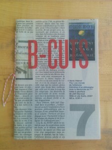 Antic-Ham’s B-Cuts has a similarly acute sensibility. It is a small book, only 14 pages, inkjet printed in a limited edition of 169 copies. It is hand sewn and features a cover cut from the book review section of a French newspaper with the title silkscreened atop the text. The photographs within and the design itself connect this book to Franticham’s oeuvre.
The photographs in book are the usually discarded frames lost to light leaks, skewed perspectives, random subjects, double exposures and other technical lapses in the rush to load a roll or in processing the film. In these photographs, the visual frames end and blend haphazardly. Frames are cut off abruptly, jam one against the next or sit one atop the other in double exposures. This can be jarring, though as often as not the compositions feel highly intentional.
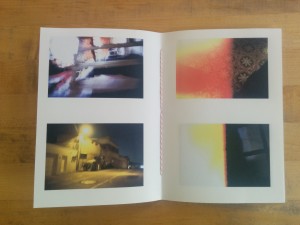 Photography is a multifaceted process, and there is opportunity for creative discovery throughout it.These photographs are primarily a product of Antic-Ham’s treating the editing with as much reverence as the shooting. As much as one creates photographs by framing the real world, it is in the editing that one makes judgements about if and how a photograph “works”. Sometimes there are diamonds to be found in the rough.
B-Cuts is fun and quirky and offers the viewer an opportunity to reframe their conception of what is a good photograph. In the digital rush attention has been primarily directed toward technical perfection. In this new, cleaner process the opportunistic happenstance represented by the beauty of flawed images has been lost. Antic-Ham reminds us remain open to the beauty found in our castoffs and offcuts throughout the photographic process and throughout life.
B-Cuts
Antic-Ham
Edition of 169
2008
Printed Matter’s annual NY Art Book Fair was held at PS1 a couple of weekends ago. It was crowded and noisy. And there were a lot of people there too.
Several weeks before the fair, I noticed on the list of exhibitors one exhibitor from Korea: Antic-ham. I clicked over to the artist’s site–a mix of drawing, collage, printmaking and photography. It is by turns playful, sexy, political and personal. Weaving all of this together is bookmaking. I ordered half a dozen books on the spot, which I enjoyed opening immensely.
At the NYABF, I made a beeline to the Red Fox Press table, which Antic-ham shared with Francis van Meale of Red Fox Press. Together, Francis and Antic-ham are Franticham. They make art as individuals and as a couple. I purchased a couple of their joint books at the fair, of which Franticham’s Polaroid Correspondence was one. It seems like the perfect encapsulation of their relationship and bookmaking. Distance, cross-cultural dialogue, collage, mail art, and Polaroid photography mix with heady emotion.
On the title page of the wire bound volume, the book explains its genesis:
During 6 weeks Francis in Achill Island and Antic-Ham in Seoul exchanged by mail their experiences and feelings with A5 postcards with collage and using Polaroid pictures made with SX-70 cameras and color Silver Shade PX films from the Impossible Project.
Newspaper clippings, packaging, stamps, address labels, drawings and Polaroid prints are collaged together. The Polaroids are captioned with personal notes and dated. These were posted back and forth. They appear to be further collaged in the book making process. They make references to shared experiences in Seoul, hint at a future together in Achill Island and riff on the longing and quotidian realities of the six weeks that lay between the before and the ever after time periods.
Correspondance is a kind of oppositional companion to Oksun Kim’s Happy Together. Kim’s book of photographs of inter-racial Korean/Non-Korean couples is informed by her own inter-racial marriage but maintains a cool detachment through an anthropological process. It examines these relationships. Franticham’s book, in contrast, is entirely personal. It is messy, raw and emotional. Dada and Fluxus sensibilities are at play throughout. Happy Together feels clinical (or, perhaps, too close to home). Correspondence feels exciting, honest, alive.
The physical book furthers this sensibility. Like Franticham’s and Anticham’s other books, Correspondence doesn’t take itself too seriously. The wire binding, handmade collage front cover and roughly printed pages (color copier?) are loose, loving and playful.
[To be clear, their dedication to their art making and book making is entirely serious. While I would consider their art making to be more termite than white elephant, their large screen printed publications are amazing and beautiful, though unfortunately too rich for my budget. I highly recommend checking out these other books, which include London Palm Trees, Grand Bazaar and New York New York, if the opportunity presents itself.]
Franticham’s Polaroid Correspondence is delightfully earnest and heartfelt. Neither making grand claims nor engaging cosmic truths, it takes the reader on a voyeuristic romp through the couple’s long distance creative embrace. This author, for one, wishes them many productive years together.
Franticham’s Polaroid Correspondence
Franticham (Francis van Meale & Antic-Ham)
Red Fox Press
Edition of 69, numbered and signed
2012
I spent a rushed hour swinging through Printed Matter‘s NY Art Book Fair at PS1 this afternoon. The museum was a veritable zoo; to say it was thronged would be an understatement. With all the bumping and brushing of the crowds, I found it difficult to take in the books or to really focus on them. Next year I’ll be sure to go on the Friday when the crowds are thinner and the focus is on seeing rather than being seen. It was a bit of a scene today.
While there were dozens of publishers showing hundreds (thousands?) of books, the highlight of the fair for me was a quick conversation with Anticham and Francis van Meale of the Red Fox Press. I find their books delightful and I bought two to add to the half dozen I already own. Tomorrow’s review will be about one of these books. A future review will look at a broader selection of books by them. Hopefully we can figure out an interview somehow sometime soon.
If you’re in New York you should cancel all of your plans for Sunday and head over to PS1 to check out the fair. It’s hot, noisy and crowded, but it’s worth braving these hassles to see the full breadth of Franticham’s oeuvre. Their new book of screen printed LA-scapes is fantastic (though a bit out of my reach). And there’s plenty of other stuff to see at the fair, something for every taste.
Bad photographer that I am, I didn’t take any pictures. Not even with my cellphone.
We’re on a break here at Korean Photography Books, but I have a quick bonus post for you.
The NY Art Book Fair is coming up. I took a quick look through the list of exhibitors on the off chance there might be a publisher I could reach out to regarding an interview, and lo and behold there is one from Korea. A small publisher. A self-publisher, really.
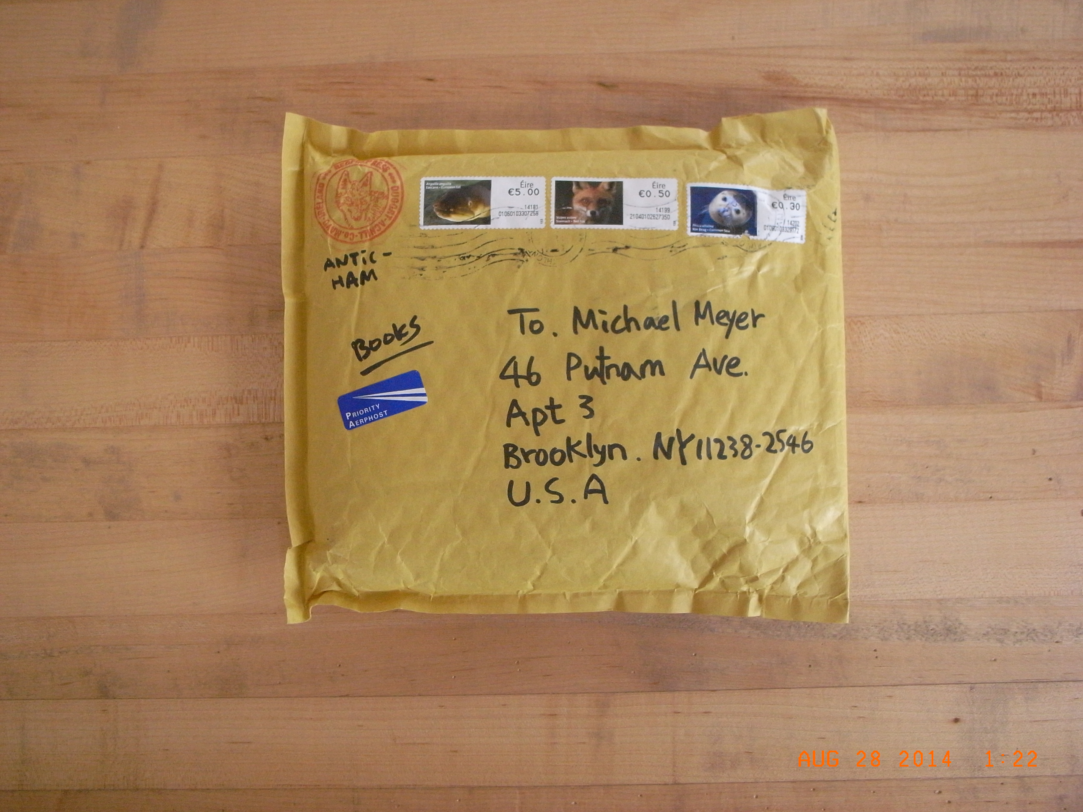
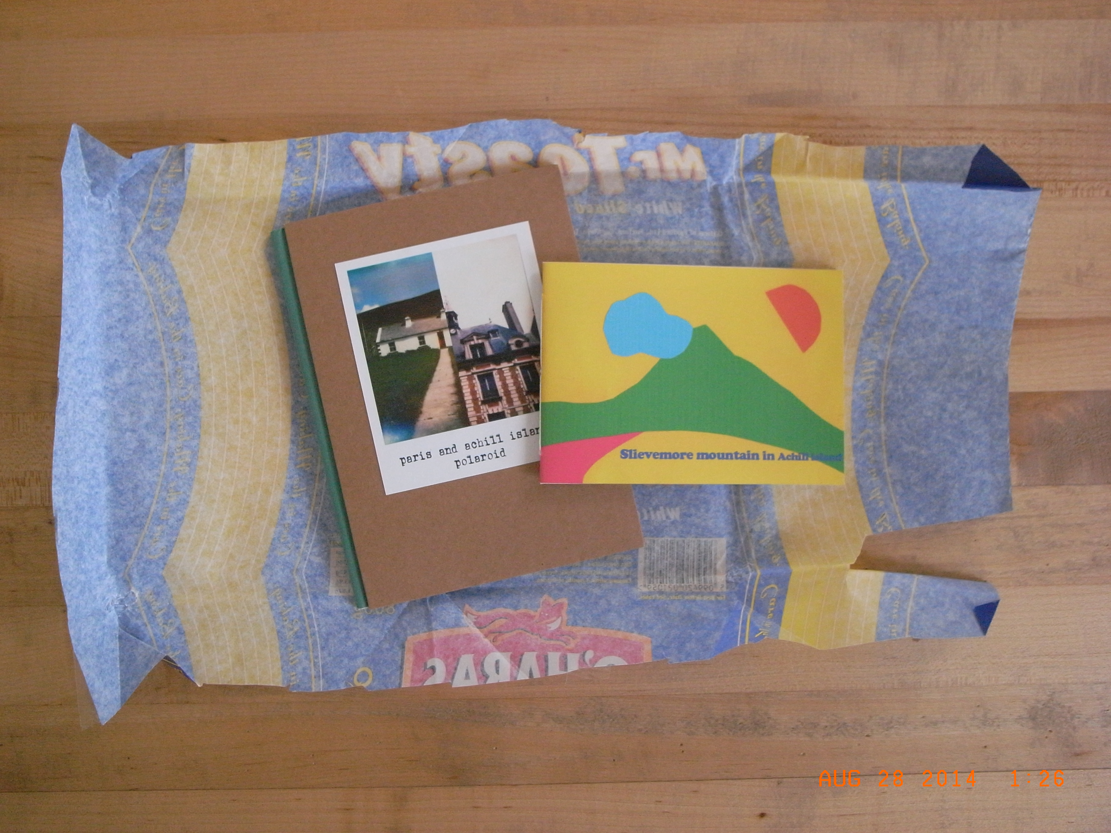
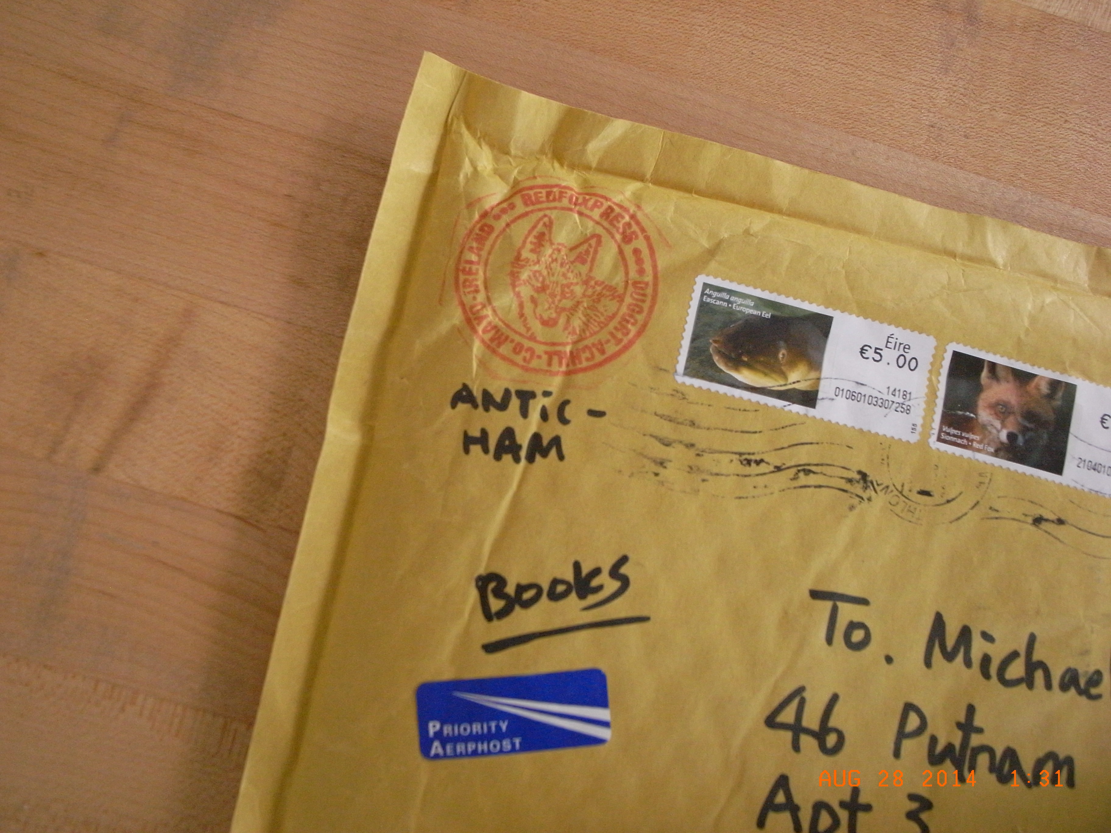
Antic-Ham is a Seoul based artist who makes wonderful artists books by hand. Her books meander through photography, illustration, collage, assemblage and poetry. I purchased a handful of photo centric books through her site. They arrived neatly wrapped–like gifts. I’ll definitely be writing about these books either individually or as a group this fall. In the meantime, everyone loves a good unboxing so below is the unwrapping of the books.


I’m looking forward to visiting the NY Art Book Fair at PS1 in September and hopefully connecting with Antic-Ham–the person and the myth. Antic-Ham, if you’re reading this, I would love to conduct an interview if you can fit one into what I assume will be a very packed schedule.
Several weeks ago I had the pleasure of sitting down with Jaeyu Lee to speak with him about photography, book making and cultural materialism as it relates to both photography and to his design day job. Below is an edited transcript of our conversation.
An Acela Express train is whisking me back to New York City, but I’m already there.
Jaeyulee’s Fragments in Scene is open on my lap. It is suffocating and cacophonous. Photograph after photograph bombards the reader. A compressed tonal scale and a rough half-tone accentuate the visual density of the individual photographs, which run helter-skelter across the gutter. The pace is relentless. There is nowhere for the eye to rest. New York City screams from each page.
Continue reading
This past March, while Ji and I were in Seoul visiting family, I had the opportunity to sit down with Hyojoon, Daiwoong and Eunhye of Corners and talk about how book making fit into their design practice and why they were making books. They were incredibly generous with their time, and very patient with me as I felt my way through this first in a series of interviews. A big thank you to Jimin Han, a very talented artist I met through Sook Jin Jo, who acted as my translator during the interview and generally kept the interview moving along. Thank you also to Yoonsun Jung for her work transcribing and translating the audio.
•
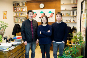
l-r: Daiwoong Kim, Eunhye Kim and Hyojoon Jo of Corners.
•