Category Archives: Conceptual

Like a Program; Kim Sang-Gil

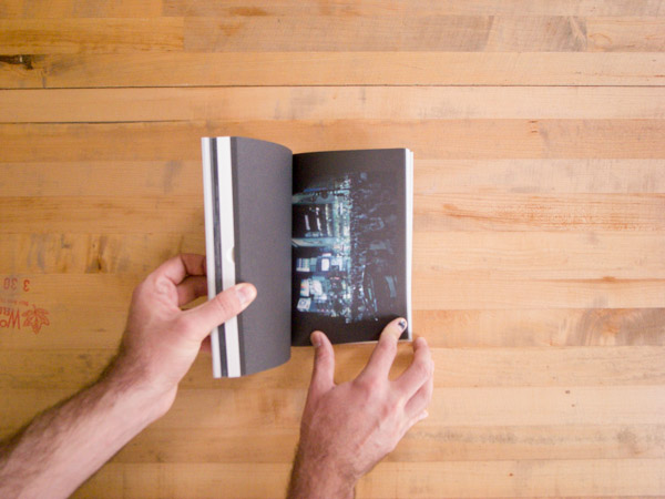
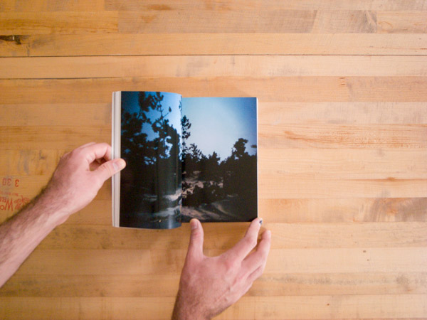
Good photography. Dark, rough printing. Off white paper. Small design flourishes. Wonderful object-ness.

Given my predilections I ought to like this book. I don’t.

My impression is that more and more photo books being made in Korea lately are exquisite objects that mirror and enhance the photography contained within. (Next week’s review will be of one of these.) In the past, I found that many photo books in Korea were simply exhibition catalogs (often beautifully made but still catalogs). Like a Program on a cursory examination appears to be a wonderful object, and it is, but this object-ness is out of whack to the photography within and overwhelmed by the all you can eat buffet of an exhibition catalog that it truly is.

It may be unfair to judge an exhibition catalog for failing as a photo book. Oh well.

Kim Sang-Gil’s photographs limn a porous boundary between artifice and sincerity. Like a Program contains three of Kim’s projects that approach this boundary from different directions and a fourth that is about something (else). The moments in “Motion Picture” appear to be caught from life, but their captions reveal them to be staged. The subjects are models and actors between or in the midst of takes. “Off-line” depicts communities that have come together around shared interests. These interests can be as simple or shallow as brand affiliation and yet the group identity or sense of community is no less sincere than in any other group or community. “Re-model” is photographs of empty commercial interior spaces either waiting to be used or in the process of being made ready for use but that lack the qualities that actually being used will embue them with. An empty space might be intended as an office, but until it is used it is little different than an unused mall interior. The final series in the book is “Display.” This is comprised of details of building design features: a handicap lift rail; an elevator door; a revolving door; a parking elevator system. I do not know how these four photographs relate to the previous three series.

The work in the book, while having a loosely unifying theme, is too broad. Moving from one project to the next is jarring.

The choice to print all of the work in the book in low contrast black and white is odd given that Kim Sang-Gil works in color. The printing is actually quite beautiful in its way, but it is wrong for almost all of the work.

“Off-line_burberry internet community” offers the opportunity for a direct comparison between Like a Program’s grayscale printing and a color presentation. The image appears in glorious glossy color on the cover (and in the interior) of the 2009 exhibition catalog Chaotic Harmony (Museum of Fine Arts Houston and the Santa Barbara Museum of Art, 2009).The flat gray tones in Like a Program dull the image, make it boring.

The images from “Motion Picture” are similarly dulled to death by the monotone printing. These images have subtle color and a cinematic presence–which makes sense given how they were made. Looking at these photographs I am reminded of Philip-Lorca Dicorcia’s Hustlers with their seemingly natural light that bathes everything in the frame with a kind of heightened sense of being real. This heightened sense of the real is at the heart of what “Motion Picture” is about. It is a physical trace of Kim’s capital “I” Idea. Why strip that from the photographs?

This is not a knock on the photography or the photographer (though the buck has to stop somewhere). Motion Picture_inquiry and Motion Picture_the message and Motion Picture_hand clapping are all weirdly wonderful. Off-line_burberry internet community, Off-line b&w sneakers internet community and Off-line_the sound of music internet community are likewise beautifully bizarre. I imagine that large prints from Re-Model would have an amazing presence on the wall. This is good work.

This is a knock on the book: There was obvious care made in the design and printing and yet somehow the design choices are mismatched to the content. The design and printing are good (in and of themselves at least); the photography is good; the combination is not good.

If one has nothing nice to say, we are often told, say nothing at all. Ah… Well. I don’t think my writing this criticism of a book published eight years ago will put any kind of dent in Kim’s reputation. I’m just some dude and he’s an internationally known artist. I have no ax to grind here; I like Kim’s photographs and bought the book because I wanted to like it. It is disappointing that Like a Program occupies the no man’s land that it does: it has lovely object qualities and yet is primarily an exhibition catalog.

Like a Program
Kim Sang-Gil
Project Space Sarubia, Seoul
2005

SSE Project and SSE Zine; Young Pil Yoo

A package arrived from Korea yesterday. New SSE Zines! And stickers and postcards to boot.

SSE Project is an online gallery; each exhibit is also printed as SSE Zine. Given that SSE-P and SSE Zine are a single project in their own right I’m writing this review of the whole venture. While I certainly might have my favorite issues, it is the overarching consistency of SSE-P that I am enamored of. This review, then, is of Young Pil Yoo’s efforts to “offer a wide perspective to the public and help communication between artist and audience.”

In the New York Times a couple of days ago, Holland Cotter had a piece describing “a collection of complaints and a few (very few) ideas for change” that he has regarding the arts in New York City. In his view, big money (the art industry) has again come to the fore in the art world (though one could certainly argue that it is always at the fore) and is distorting the art world in terms of “what kind of art is made, and how art is presented in the media and in museums.” He closes his article with this:

But when the rents get too high, or the economy fails, or art buying falls out of fashion, and the art industry decides to liquidate its overvalued assets and leave? Artists, the first and last stakeholders, will have themselves to fall back on. They’ll learn to organize and agitate for what they need, to let City Hall know, in no uncertain terms, that they’re there. They’ll learn to share, not just on special occasions, but all the time. They’ll learn that art and politics are inseparable, and both can be anything and everything. They’ll learn to bring art back from the brink of inconsequence.

As someone long on questions and short on answers, let me ask: Why not start now?

YP (as Young Pil presents himself in SSE-P and his social media channels) started SSE Project six years ago. He understood Cotter’s concerns (though without the New York City specifics) in 2008 and has created a platform through which young artists can share their work. SSE-P strikes a fine balance between the new world flattening of distribution opportunities presented by the web and old school print media that exists as objects in the real world. YP is putting artists into the world. He is helping them to share all of the time.

SSE-P is a distant less commercial cousin of Jen Bekman’s 20×200. While Bekman’s endeavor aims to make art accessible by way of affordability, YP is looking to make art simply accessible. The website presents each exhibit in full. Social media channels trumpet the exhibits in conjunction with real world launch parties. Artists are linked to directly from the SSE-P site. The only thing SSE-P sells is the zine (and SSE-P stickers and postcards…), and these are priced so cheaply that I suspect they simply cover the cost of printing the next zine. (In Seoul bookstores the zines are generally priced between $6 and $10; online ordering with international shipping is slightly pricier.)

Without a clear metric, it is hard to evaluate how successfully SSE-P is fulfilling its mission–and that isn’t my job, really. However, so as not to be one of those critics writing only to “broadcast names and contribute to fame,” I’ll make a go of it anyway.

“Wide perspective” seems like a good place to start. The latest issue is #48; I have 12 issues on hand. I’ve acquired issues dealing primarily with photography, though of those on hand two are painting and another illustration. The remaining 36, many of which I’ve seen in person and others which I’ve seen only online, are a mixture of painting, drawing, illustration and multimedia. The artists are mostly Korean, though a number of western artists have also worked with SSE-P. The aesthetic range of the presented work is, well, wide: black and white grit from Novo and Yourim Kim documenting tattoo culture; young women in the flush of life from Yina Kim; rough aggressive political paintings from VS; “simple and still” subtle color from Ye Rin Mok. Nam Ji Yeon’s paintings are fucking weird–I’m clearly missing something. Hasisi Park shows and conceals.Son Dong Joo photographs a love letter. SSE-P hits the wide mark.

It is harder to evaluate how well the projects is helping communication between audience and artists. YP has a following of nearly 800 on Twitter. The last opening drew nearly 100 yes RSVPs through Facebook and pictures show a well attended opening. Beyond that weak evidence, I can only guess based on anecdotal evidence: my experience is that the zines are everywhere, though often hard to find: many sell out quickly. My evaluation? Forget the numbers; it is the intent that is most important. YP is trying, and I would say (am saying) that trying is succeeding in this endeavor.

Once again, to no one’s surprise, I’m taken by a small publisher ( / online gallery). YP designs each (or at least most) of the zines himself. The zines are roughly 28 pages, well printed on matte paper, saddle stitched, either 5 3/4″ x 8 1/4″ or 5″ x 7 1/4″ and in an edition of either 500 or 1000. The design is understated, generally, so that the art is front and center. A couple include an accompanying poster.

Lest anyone think I’m gushing here, I’ll note that I skipped the two volumes of Boys on Film and Girls on Film. These publications didn’t do it for me. For completeness’ sake I ought to have simply purchased them through gritted teeth; but, they’re just empty photo calories, and I passed.

If you’re in Seoul, swing by The Book Society, Your Mind or the design shop on the ground floor of the Sangsang Madang building in Hongdae and check out a couple of the zines. Elsewhere in Korea, check in at your nearest hip art shop; you’ll probably find SSE Projects publications. If you’re not in Korea, check out the SSE-P site, follow Young Pil on Twitter (@yp_art) or have a couple of zines shipped to your door. SSE Projects is hot. I’m hooked. You will be too.

2011, 5, 24, Tuesday; Jo Hyo Joon

Tuesday

This book clearly illustrates the precipice along which this blog walks: sitting at the intersection of photographs and text, and as the text is only in Korean, it is beyond my full understanding. This is a flaw of this blog that I am all too aware of. Over-arching ideas, the photographs and physical books I understand. Korean Text and the nuance it might bring often eludes me. I note this because this is a book that I quite enjoy even with my understanding hobbled by my inability to fully appreciate the text. I don’t see this as a fatal flow but certainly one of which I am aware.

2011, 5, 24, Tuesday mines multiple perspectives of a single day. Each of the subjects in the book was in the same place, at the same time and doing the same task. The book is comprised of their individual accounts describing what happened that day; each account is accompanied by a portrait. Though I cannot read the text and despite the fact that the tasks were done for the military, the events described appear to be banal. It is (I assume) the small differences between their accounts that are meaningful.

KoreanPhotographyBooks-121

KoreanPhotographyBooks-127

Each text is accompanied by a portrait of the man who wrote it. The portraits are all snapshots: loose, familiar, affectionate but without affectation. I assume the photographs were made by Jo who designed the book and that they were shot with a point and shoot with a built in flash. They would be better considered alongside Nikki S. Lee’s “snapshots” rather than Terry Richardson’s. When a journal entry runs longer than a page, a photograph of the location sits across from the additional page of text. The opening and closing photographs are all of the location.

Published by Corners, it is no surprise that the printing is rough risograph. The photographs are all in a limited blue tonality. The clipped tones nonetheless convey much and suggest more. The next to last photograph in the book, one of the few that isn’t a portrait, is a broad sky above distant layered hills with a flash-lit fence in the foreground. The regularity of the fence–harshly lit by the flash, sets off the subtlety of the rows of hills and the glow of low clouds below a clear sky above. Where the blue ink blocks up in the dark tones of the hills there is wonderful play between the ink and the paper’s fibers. One can almost see trees, branches and pine needles.

As might be gleaned from the types of books that I have written about (and purchased before doing so) I like small books that delve into small ideas and I like quirky presses that make the most of their limits. Corners is just such a press, and this is just such a book.

2011, 24, 5, Tuesday
Jo Hyo Joon
Corners
2012, 3, 1

London & Berlin; Eunhye Kim

Day two of jury duty and I’m still sitting and waiting. Action is promised soon: I’ll either be on a jury or dismissed… So, another review ahead of schedule.

Today I brought two small books by Eunhye Kim to pass the time. These slim volumes are the kind of quick and to the point books that I love. I attended a workshop on the photobook several years back (TA’d actually) run by Ken Schles and Jeffrey Ladd. Each participant was asked to bring a couple of books that they liked. I brought a handmade book of abstractions by a Japanese photographer and Paul Kooiker slim Seminar. Both present small “i” ideas and do so without fanfare or ostentation.

Both Berlin and London are like that: simple, direct and easy. We have straightforward urban landscapes of two cities printed in rough risograph on cheap paper and saddle stitched with two staples.

Each book is comprised of street photographs made in the titular city. They tend towards the middle distance. They have the air of casual snapshots but suffused with formal compositions. The photographs are quiet; there are no spectacles, no confrontations, no human drama. Winogrand this is not.

In Berlin, the photographs on the front and back covers are the strongest, presenting a promise that the rest of the photographs cannot live up to. Some aspire but none match.

London is much the same, though there are a number of gems within the book: a group of young men playing football in a park; two flower pots on two windowsills; a pair of images following an old woman as she approaches and unlocks her door; a middle aged couple pausing in the middle of a walk with their dogs in the park; a family walking through a park in matching outfits.

These are not masterpieces, but they make no claim to be. At the moment, they are welcome diversions.

Berlin
Eunhye Kim
Published by small thing
Printed by CORNERS
2012
&
London
Eunhye Kim
Published by Small thing
Printed by CORNERS

Utopia / Blow Up, Seung Woo Back

Cover of Utopia / Blow Up by Seung Woo Back

Seung Woo Back’s Utopia / Blow Up comprises his two related series of the same names. I purchased this book on a trip in 2009 and it remains one of my favorites. It is interesting not only for the images themselves, but also the conceptual framework girding them and the physical container they exist in. Each reinforces the others.

The physical book is 36 pages, oversized and printed full color with metallic embossed details on newsprint in an edition of 1000. There is a 3 page insert with essays in both English and Korean by Hye Young Shin and Pyong-Jong Park. Jeong Eun Kim edited the book, and Yeoun Joo Park designed it. U/BU was published in 2009 in collaboration with IANNBOOKS.

Utopia is Back’s fictionalized North Korea; by exaggerating, adding to and dividing the infrastructure in existing images he plays with the notion of an idealized society’s physical structure. His is not a glossy antiseptic ideal. The color palate is muted (exacerbated by the newsprint), the forms verge on the grotesque and unlikely, lighting can be garish and the skies become acidic. If this is what North Korea’s infrastructure might look like if it fulfilled the rhetoric and claims of its propaganda, it would still be a sad place. The streets remain empty. The scale remains crushingly anti-human.

If one reads the book from the opposite direction, Blow Up presents telling details extracted from otherwise anodyne negatives Back created on a month long stay in 2001 as a journalist in North Korea. Accepting the regime’s destruction of his “interesting” or “good” negatives, Back turns to the smallest of details in his remaining negatives to subtly lay bare the lie presented to outsiders. With an obvious nod to Antonioni, Back is looking to find truths that are hidden in plain sight and to question what is presented in an image. The photographs might be a kind of spying, a notion suggested by the military imagery which bind the two projects at the newspaper’s center point.

Alternately, in these images of war material and heavy bombing we can see a dividing line. If one has started reading from left to right, e.g. with Utopia, at this point we move from what might have been to what is

In both projects, Back is exploring the line between reality and fiction in the photographic image. By creating unreal images out of real images, he makes the real more apparent.

Black Midday, Taewon Jang

BlackMidday

Taewon Jang’s Black Midday presents an unassuming face. Aside from a single thumb cut index and the heft of a brick, its exterior presents none of the turmoil within. I almost passed this book by, which would have been a mistake. Once the cover is opened, the book begins to present a rich and out of the ordinary experience full of terror and loss. In it’s colophon, there is this description: “the book examines the psychological situations drawn from reality and fiction, memory and oblivion, absence and presence.”

The book’s 340 pages are broken up into four sections: Text, Generic Landscapes, Plates and Victims.

Text contains correspondences between Jang and various Japanese friends (many of whom are photographers or others in the arts) after the Tohoku earthquake as well as an essay by Suejin Shing, who I have posted on previously.

Generic Landscapes comprises images taken in Japan after the earthquake. The images are dark and intense; they are printed full bleed or with black borders; this section is the only one with a gloss coating. The photographs were taken under moonlight and have an eerie beauty. In opposition to the beauty of the images is the fact of the desolate ruination.

KoreanPhotographyBooks-163

KoreanPhotographyBooks-165

KoreanPhotographyBooks-160

KoreanPhotographyBooks-158

KoreanPhotographyBooks-162

Plates is broken up into two subsections: the first, on uncoated white pages, is a series of prints rephotographed repeatedly in such a way that the viewer’s sense of the image wavers in and out. The image disappears into the vanishing point of perspective. Mixed in with these are photographs of paper artifacts such as business cards, hand written notes or sales brochures that give the address of the plates in the second subsection–a sort of travelogue. The final image of this subsection is the image that has been buried beneath the process of rephotographing: a small building covered in and being subsumed into debris. The second subsection within Plates is printed on black uncoated paper. The images are of interior and exterior spaces that Jang visited while making this work: offices, shops, homes; courtrooms or government hearings; landscapes, people in the street. The damage of the earthquake breaks into this through a photograph of a large ship on dry land and a desolate lot with a framed image from the previous section.

Victims, the final section, is a series of installation shots of mixed media portraits. These portraits–presented first as a thumbnail image for reference, are photographs mounted to wooden forms which have been folded and otherwise manipulated. The portraits are fragmented; the subjects likeness is deformed.

Of all the photography books I’ve acquired in Korea, this is among the most ambitious. We begin with the fear of loss. Jang is reaching out to confirm that those close to him are not lost to him. Conversation confirms existence. The book continues on into terror. The landscape photographs of the sites of the disaster are terrifying in their affirmation of the power and irrational destructiveness of nature. Even at a remove of days, weeks or months, the fear of potentiality or eventuality remains. We cannot remain in a state of terror or shock, however. Plates transforms terror as it dissolves into ongoing everyday life. The rephotographed image is a stand in for the oscillation of fear over time as we are removed from its immediacy. Everyday life eases our mind. We are left with the image to remind us. Victims brings back the terror, but does so in a way that reminds us that this terror is not nature’s alone. These portraits are of Japanese people in New York; they are not victims of the earthquake. They are victims of the artist: it is the artist who has deformed their likeness and associated them with the earthquake.

The earthquake is not the subject of this book. It is our response as human beings that Jang is interested in. How do we see? How do we remember? Do we respond to, create or invent reality?

Dashwood Books in NYC has this book, as does Photo Eye in Santa Fe. It is also easily available at Book Society or Your Mind Bookshop in Seoul.

**This post was first published in a “Book Notes” post on the daily_up.
***I stole the book cover image from Photo-Eye because I haven’t had a moment to shoot a picture of the book. Sorry Photo-Eye.