Category Archives: Typology

Automatic Description, YOON Seungjun

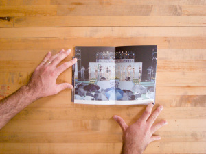
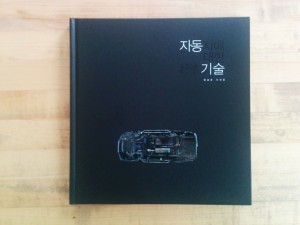
AutomaticDescription01Yoon Seungjun’s Automatic Description is a book of car photographs. These photographs are not your everyday glossy advertisement for this years latest iteration of automotive desire. There is no glitz, no sparkle, no sex appeal. These cars are dead.

These cars are literally dead. Yoon has photographed junked junkers in junkyards. It would be a mistake to label this as ruin porn and set it aside with disdain. Yoon’s working method is more in line with the socially conscious impulses of SebastiĆ£o Salgado or Edward Burtynsky, though without Salgado’s humanity or Burtyksky’s grand scale. His photography is a critical examination of “the space and environment of modern society,” here that is specifically the junkyard behind the façade of contemporary automobile culture in South Korea. If it also happens to be visually arresting and aesthetically appealing so much the better.
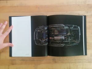
AutomaticDescription02 Automatic Description is broken into chapters that build one upon the other. The book begins with “Anatomical Chart – appropriation,” a typological series of images of individual car’s under carriages shot against a black ground. These photographs reduce the automobile to its basic structural form, minus wheels. We see the body frame with the suspension structures, transmission, driveshaft, and exhaust systems hanging from it. With their wheels removed and reoriented in space, these automobiles are no longer vehicles but rather abstract forms. Looking closely, one can find narratives in the abstraction: oil leaks, broken drive shafts, scrapes, rust and burn (?) marks. There are stories in these forms however banal they might be.
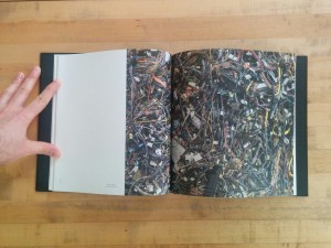
AutomaticDescription03Chapter two, “Anatomical Chart – combination,” moves from individual vehicles to the aggregation of them. Vehicles are no longer individual stories. Instead, they interlock in stacks and heaps. Crumpled cars are crumpled in a pile. Hundreds of gas tanks are mounded together. Wiring harnesses are enmeshed in a chaotic singular mess. Pipes of every description writhe together like so many snakes in a pit. The singular story has given way to a history of multitudes. Yoon brings his camera in close for these photographs. We see no ground; the subject fills the frame. We are again seeing this automotive wreckage as abstraction.
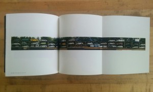
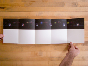
AutomaticDescription04“Scraped Car Chart – parade” is the third chapter and takes us off into the new territory of documentary context. Yoon has pulled back to show us the space in which these cars are resting. We see the rows of racks and risers on which the cars rest. Some of the vehicles are half dismantled; others seem as shiny as new. Sunlight glints off of chrome and polish, still. In the middle of the chapter a gatefold presents a long panoramic image of column after column of junked cars. There are obvious joints in the image; it is not a singular panorama. Yoon has constructed this image–no different than we have constructed this entire infrastructure of disposal (such as it is). Just as the infrastructure of roads, highways and city streets has been built to accommodate the relentless drive of automobile culture so has an infrastructure been built to support the end stage inherent in consumerism. When millions are buying cars, millions are inevitable discarding them as well.

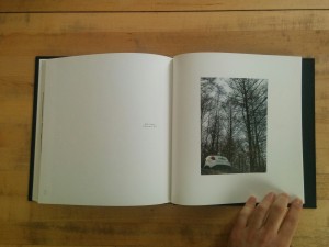
Yoon pulls back, once again, in the last chapter, “Scrapped Car Chart – Goryeojang.” Goryeojang refers to a historical custom in the Goryeo period of taking one’s elderly parents into the mountains and leaving them there to die. There was a movie with this title as well in the early 1960’s in which a son takes his mother to the mountains but breaks the custom by returning home with her. The photographs in this chapter are of cars junked in quasi-wild places. Cherry blossoms bloom above one wrecked SUV. A tangle of scrubby bushes grows up through a bright red wreck of a coupe. A luxury sedan has settled into repose on a hillside; it is surrounded by leafless trees of brownest autumn. A white SUV sits upended into a ditch; we see only its tail end with barren trees towering above it. In the chapter’s final photograph the wrecked hulks of a Bongo and Porter intermingle in the background; they are nearly obscured by the thick tangle of branches and new buds in which they have become buried. The organized infrastructure of the preceding chapter is nowhere to be seen. Instead, automobile culture has intruded upon nature. This intrusion marks a breakdown in order that, perhaps, signifies a culture losing its traction and sliding out of control.
AutomaticDescription05

As a member of the photography collective Dream Flower Factory (mentioned here), Yoon shares the collective’s socially minded conscious. This conscious is evident in these photographs. Yoon lures us in with the abstract beauty of the first chapters but is never himself seduced. The title of the fourth chapter makes his concerns crystal clear. Not only are we uncomfortable with the custom he references, but we then must transfer this discomfort to our car culture. We no longer leave our elders in the mountains to die; perhaps one day we will no longer leave our vehicular refuse in the woods to rust away either. If this comes to pass, it will not be a kindness to our elders that drives us, but instead a kindness to future generations.

Automatic Description
Yoon Seungjun
Publisher: Park Seonsoon
Published by: Photodot
July 1, 2014
Photo Edited by: Yoon Seungjun & Choi Yeonha
Written by: Choi Yeonha
Translation to English: Jaeeun Kwak & Grace Yoon
Designed by: Han Jeongyeon
Printed by DaeHyun Printing & Publishing
Jeski ABC Book, Jeski.org

A quick review for a small book.

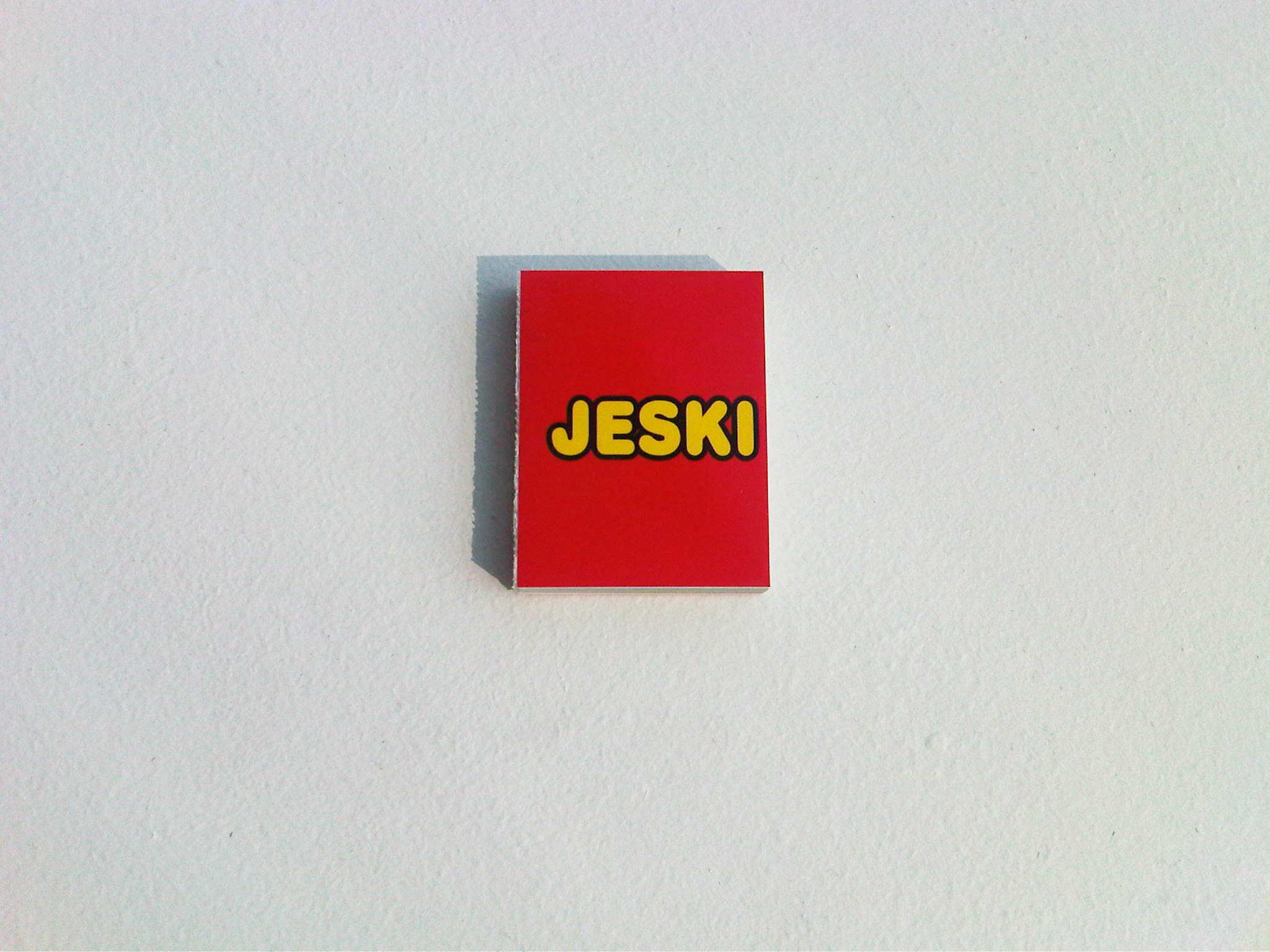
Jeski ABC Book; apologies to Jeski for hot-linking this image.

ABC Book is a miniature (~4cm x ~5.5cm) tome that uses bright colors and a bubbly font to present a potpourri of Jeski’s advertisements and public service announcements. It doesn’t actually contain the entire alphabet–English, Korean or otherwise. Selected words, which aren’t even in alphabetical order, are illustrated by images as a set up for presenting one of Jeski’s projects.

The projects playfully position the photographs in real world spaces making them into clever or humorous adverts or public service announcements: A pair of out stretched hands illustrates the word “Help;” turning the page we see these hands become a cafeteria tray liner exhorting a comfortable worker taking her lunch to donate to City Harvest. “God” is illustrated by the God of Michelangelo’s Creation of Adam. Turning the page God has been installed on an SVA elevator door; going one page further we see a student pressing the elevator button and meeting God’s finger. He becomes Adam at his creation, albeit an Adam in cargo shorts.

This is a clever and fun book full of clever and fun adverts, but in the end it is simply a clever and fun advert for Jeski’s quirky sensibility and envy inducing client list.

ABC Book
Jeski
2013

OPEN to CLOSE, TOGOFOTO

OPEN to CLOSE is a good example of not judging a book by its cover, though not in the way that one would ordinarily invoke that phrase. The fold-out covers, half printed in metallic ink, with its graphic outlines of various window shapes invites curiosity. It draws one in. The photographs of windows within, though, disappoint.

The minimal design of OPEN to CLOSE breaks the book into 8 chapters with chapter headings consisting of light blue spreads each with a different silhouettes of a window. Each chapter is also marked by a layout shift.

The two photographs that open the book hold much promise: a straight on view of a window set into a brick wall, its panes thrown open, sun streaming across the three flowers potted on its sill; a straight on view of a pebbled glass window set into a tiled wall follows. These two photographs are tightly composed and set a typological tone. The six photographs that follow these two begin to lose this tone as they lose the rigorous composition of photos one and two. And then it all goes to hell.

One window, two windows, three windows. Centered, pushed to the edge. Ground, no ground. Straight on, skewed. Isolated as an architectural or compositional element, incidental in a scene. Sometimes the windows are doors. If each chapter took a different approach, that would be one thing. Instead, it’s all helter skelter with only a general and inconsistent pulling back to define the visual narrative. The design struggles mightily to make something of the photographs. It cannot, however, overcome the deluge. A tighter edit would have made for a more cohesive and focused narrative. As the book stands, I have no idea what it is about. What ought I be able to see through these photographs? That buildings have windows? So what?

Design that extends the photography is common in most contemporary photo books. I’m thinking of books like Seung Woo Back’s Memento (or Utopia/Blow-Up), KyungJa Jeong’s In Between Something and Nothing & inVisible / Suspended Landscape, or Lee Duegyoung’s Two Faces. With OPEN to CLOSE there’s nothing but the design to give shape and meaning; the photographs bring nothing, providing neither a window on a greater truth nor a door to increased understanding.

OPEN to CLOSE will look good on your shelves. The only reason to OPEN it, though, is to CLOSE it.

OPEN to CLOSE
Photos: TOGOFOTO
Publisher: Storage Book&Film
Editing: Ang
Design: The Object
2013

Cosmetic Girls, Hein-Kuhn Oh

Half a lifetime ago at NYU, I took a film class on post-colonialism. I remember few specifics of the course other than watching The Battle of Algiers and reading Franz Fanon’s Black Skin, White Masks and The Wretched of the Earth. What has stuck with me was the idea that societal systems create tiers of privilege. Reading theories of the way oppression works and seeing this play out in real life through film made privilege, and it’s cousin bias, very real to me. To this day I am aware of my own biases and the privileges that I enjoy–as well as the discomfort that they can elicit.

Hein-Kuhn Oh’s Cosmetic Girls elicits just such a discomfort related to bias and privilege. I’d seen the book on the shelves of bookstores for a couple of years before I could bring myself to purchase it. It seemed like a book I ought to have on my shelves, but I feel dirty looking through it. The photographs don’t sexualize the girls in them but certainly do objectify those girls. The photographs make these girls into something to be looked at–and the photographer has done so meticulously and mercilessly. The photographs are unflinching. No detail goes unnoticed. (And it is entirely proper to refer to the subjects as girls; none are older than 23, most much younger.) There is an apparent male gaze.

Let it be said, though, that this is not the male gaze of Miroslav Tischy or Terry Richardson. It would be a mistake to lump Oh in with these two. Oh’s interest is anthropological inquiry–he is primarily fascinated by the value Korean society places on girls and young women. His intentions are more to do with representation than with the girls themselves. Read that again; it is the minor chords that run through his work that are discomfiting rather than an explicit raunchiness or misogyny.

His earlier Ajumma project (past review here) was a humorous but nonetheless direct and unflinching examination of middle aged Korean women. One might read the photographs as simply a look at “ajumma style” if not for the the central hot spot lighting that focuses attention on the women’s faces and the confrontational gaze of the women makes these works far more about the women than any overarching concern with style.

Consider the street style books Fruits by Shoichi Aoki or Scott Schumann’s The Sartorialist: in these books the photographs are about fashion on the streets. The subjects are generally smiling or upbeat; they seem to be enjoying being photographed. The photographs themselves are nearly style-less; there is no obvious hand of the photographer at work. Both photographers seem genuinely enthusiastic and excited by their subjects. The photographs are endearing and fun if somewhat vacuous.

In contrast, Oh’s photographs are brutal. He controls absolutely the environment in which the photographs are made. He controls the space. He controls the background. He controls the lighting. He controls the framing. The subjects are found on the street and invited to the studio to be photographed (an assistant not Oh himself makes these invitations). The subjects may have come to the studio willingly, but they look at the camera uneasily. None of the girls wear shoes (except in three photographs made outside of the studio). In some photographs the photographer has closed in on small details or just the girl’s legs. There is a kind of implicit misogyny.

Oh himself says that the kind of typological method that he has employed is “highly unethical” and a “cruel field”. He has chosen this means of representation because his subjects have chosen entertainers as their role models. He in turn makes his choices in regards to “a certain lighting, viewing angle and convention of photographic representation.” Nevermind that the convention he has chosen bears little resemblance to the highly stylized and idealized convention of photographic representation employed with celebrities.

Never mind that nowhere in Cosmetic Girls do we see the “numerous middle aged male fans known as samchon (Korean for ‘uncle’) and obba (Korean for ‘older brother’) [who] are enchanted by a variety of sexy girl groups that have gained popularity….” Instead it is the “sensitive girls” who “learn girliness from [these girl groups]” who are spread through the pages of Cosmetic Girls. Oh concludes his statement with this line: “The girls we can recognize are merely their facade and images.”

The photographs indeed depict a facade, but it is not that of the girls. These girls may wear make up, they may have had petit surgeries, and they may be conspicuously conscious of their appearances, but the facade here is not theirs. Whatever ten dollar words Oh wants to trot out talking about the photographs, it is in his use of typological processes and his stylistic decisions that he has constructed the most apparent facade: that of his own male gaze. In young women’s choice of entertainers as role models he sees a crevice in the societal facade and is picking at that crevice. As we peer through the crevice he has worried open, however, what we see is a male artist staring back.

Cosmetic Girls
Hein-Kuhn Oh
Edited by Jeong-eun Kim
Editorial Assistants Mi-rae Song, Vo-ram Lee
Designed by studio Dwyane Wade
Translation Jee-sun Park, Young Kang, Meeky Song, Cecilia J. Park
Printed and bound in Korea by Munsung
Digital Image Calibration Tae-yoon Kim, Kyung-sub Shin, Jae-woo Choi, Sang-kyun Ahn, Won-jung Jun, Hyo-joong Yoon, Hein-kuhn Oh
Published by IANNBOOKS
Published on the occasion of the exhibition Hein-kuhn Oh, <Cosmetic Girls>, Kukje Gallery
Catalogue planning by Kukje Gallery
© 2010

ajumma, Hyoung Kuhn Oh

The very first Korean word that I learned was “ajumma.” That makes no sense; why not “ahn nyong ha se yo” or “sarang hea yo”? I don’t know; the word must have just come up somehow. Anyway, let’s talk ajumma, Hyoung Kuhn Oh’s ajumma.

I got this book on my first trip to Korea. It should never have ended up in my basket. The cover was tatty; the title was difficult to read against the dark cover stock; some of the signatures were starting to fall out; the printing is flat and dark. The photographs are, however, poignant and funny and a little sinister. The book is not without its charms (and two essays with English translations…).
Continue reading

The Tedious Landscape II, Kim Yunho

KoreanPhotographyBooks-146

Workroom does good design. Every photobook I’ve come across that was designed by them feels right. Kim Yunho’s The Tedious Landscape is from Workroom’s Lájka Series. In Korean, the name reads phonetically as “Lah Ee Ca Series”; Leica Series. I’m not sure how or why it has re-transliterated to “Lajka.” Odd.

Moving on.

The Tedious Landscape II is, as might be obvious, the second in a series of projects. In The Tedious Landscape, Kim explored the outskirts. What does the country look like outside of the major cities?

The photographs in this book are of pageants, which often have the underlying goal of celebrating and promoting local specialty products. As most of these products are natural products or produce, these pageants tend to be put on in more rural regions or smaller towns or villages. As Kim Kyewon notes in the essay that closes the book, “Major cities do not have particular specialty products, and if they did, they would not need to promote them in such a way.” The Tedious Landscape II, then, extends Kim’s exploration of the periphery.

Another astute observation in Kim Kyewon’s essay is that though these photographs are of beauty pageants (whether the contestants are female, male, old or young), there are no beauties in the photographs. The scenes are photographed from a distance. In each, there is the whole stage filled with the full complement of contestants as well as other participants in the pageants–judges, audience members, photographers and assorted hangers-on. There is little action; the contestants in most of the photographs seem to be simply standing there, waiting.

In an earlier post, I spoke about the challenge of writing about work that I can’t fully understand as an outsider. There will always be aspects that are not apparent to me. An essay like Kim Kyewon’s can be invaluable in coming to a more complete understanding of a photographer’s intentions. I note this because I am going to steal (but attribute) an idea from Kim’s essay that is important to the work but that I would not have come up with myself.

KoreanPhotographyBooks-148

The goal of these pageants is to promote the local specialty good. The contestants become double symbols not only as the most beautiful but also as a stand in for the local product. The pageant winners from one region are indistinguishable from the pageant winner from the next region. “The form in which they serve as symbols is repeated nationwide and results in a tedious [landscape].” (Kim uses the word “destiny” here, but as he earlier invoked the idea of topography, I think “landscape” is more appropriate.)

KoreanPhotographyBooks-151

KoreanPhotographyBooks-153

While in total the photographs may describe a tedious landscape, the individual images are rich with cultural detail, daily life and comedy. One of my favorite images is 395-800: 16 women stand on a rain slicked stage, one of them is speaking at the microphone, the others are standing in near identical poses and watching with a smile. The audience is hidden by their scrum of umbrellas. In another image, #355-601, 10 bodybuilders stand around on stage while a photographer and video crew record the winner being awarded his trophy. The non-winners stand around more or less awkwardly; the scene has ended but they’ve not been released from it yet. The audience here is only an ajashi with a camera and a handful of children fascinated by the spectacle before them. In #534-801 the audience is again huddled in the rain, this time wearing ponchos. On stage, six older women stand before drums as part of a traditional performance; a photographer crouches stage right. The front of the stage is draped with a mural of a field of flowers; at the image’s horizon line we are suddenly onto the stage. The top of the frame is kaleidoscopic tumble of lights, trusses and risers.

The book itself is roughly octavo sized, perfect bound with plain board covers glued front, rear and on the spine, and with a 3/4 height dust jacket with a panoramic image that wraps the book (technically this might be a belly band, but it feels more like a short dust jacket). The pages are heavyweight, nearly cardstock, which combined with the perfect binding allows them to lay flat but puts stress on the binding. The layouts are a mix of paired images across from one another and double truck spreads. Both layouts push the images right to the top where they bleed off of the page. Kyewon Kim’s essay comes after the plates and is on a different lighter paper stock. It is in both Korean and English. After the essay comes a list of plates and the artist’s C.V..

This is a tightly designed book of well considered and well made photographs. The clear and concise essay that gives context and added meaning to the photographs is a welcome bonus.

The Tedious Landscape II
Kim Yunho
Published by workroom press
Edited and Designed by workroom
Essay by Kim Kyewon
Translation by Kim Jeimin
First published 1 August 2008
Printed in Korea

I Am Going to the Barber Shop; Jee Youn Kim

When I was at NYU, one of my professors, Deb Willis, had been working at that time on a series of photographs in her mother’s beauty shop. In trying (unsuccessfully) to track down these images in reference to this review, I instead came across a slew of ethnographic photographic projects taken in barber shops. One might trace this back to Walker Evans if not further. It seems that the concerned photographer can hardly stay away from them. And why not? They are a focal point of social interaction, community narratives and larger cultural forces. They are like physical message boards; a Facebook feed in the real world.

Jee Youn Kim’s I Am Going to the Barber Shop takes a different tact from the more usual concerned documentary mode of portrayal that barber shops receive. One might classify these photographs as typological ethnography. While much of her other work is more strictly typology, her photographs of barbers bends towards a more traditional portraiture or documentary mode while keeping a standard composition between images. Our attention is split between the differences moving from barber to barber and the narrative specificity of each. I am reminded of Jan Bannings’ photographs of bureaucrats, though Kim is much more uniform in her composition.

The photographs are deadpan: we see the barber full length in the center of the frame with his shop behind him. The barbers are all ajashis, middle aged men, with the exception of one woman. They are also all photographed alone, again with one exception: a man with his young son. Each photograph is captioned with the name of the barbershop, often eponymous, and a narrative about the barber: how long they have been in the business, an anecdote or similar. The tone of this is friendly and conversational in poetically tinged language.

The book opens with a short essay by An Do Hyun and a statement from Kim before moving on to the photographs. Both essays are in Korean only. As we near the end of the book a spread of photographs of barbershops without a barber in front leads to several portraits in color and then to two spreads of color documentary photographs: exteriors, haircuts taking place, implements of the trade, customers and ephemera. The final pages are an index of the images with biographical and photographic info for each barber’s photograph, Kim’s C.V. and a letter written to Kim.

The books’ printing is a little rough on off white paper. The soft cover is an unbleached paper flecked with fibers. A line of red and blue slashes runs down the spine mirroring the barber pole that is in many photographs within. A small photographs and the title are tucked into the top right corner of the cover.

I Am Going to the Barber Shop is an engaging book of quiet portraits with an overarching typological framework. One could find as much enjoyment from either aspect as from their convergence.

I Am Going to the Barber Shop
Jee Youn Kim
2005
Archive Books