Category Archives: Urban Landscape

The Memories of Floating Times, Kim Youngsoo

The topic of urban housing has lately been popping up across all of the media that I consume. Given that fact, I was planning to write about Chanmin Park’s Blocks today as it would fit the trend. When I went to pull it off of the bookshelf, I pulled another book instead. The Memories of Floating Times just called to me to take it down off the shelf. I am not sure why this unassuming book that I’d never taken much note of grabbed my attention today, but it did. Blocks will have to wait another week.

The Memories of Floating Times isn’t so off topic from urban housing. Two articles I came across today seem particularly apropros lead ins to TMoFT: Stan Banos on his Reciprocity Failure blog linked to this PBS NewsHour segment on how Google’s busing of workers has become a hot button issue in regards to gentrification in San Francisco; at the NY Times, this article lays out how a young state assemblyman and his protege helped keep a Lower East Side (NYC) lot vacant for nearly half a century in order ostensibly to maintain the demographic make up of a neighborhood in order to solidify their political base.

How do we get from San Francisco and New York to Korea? TMoFT‘s very brief introductory text in English (there is a much more comprehensive text in Korean) describes the photographs in the book as capturing “the vivid realities of the back streets’ scenery of Korean society when it had just entered into rapid industrialization.” What comes after the photographs in this book is a welcoming of the kind of gentrification being bemoaned in San Francisco and an abhorrence of the kind of delay and foot dragging represented by Silver and Rapfogel in New York. The pace of building has been swift (if not always without dissent or missteps)

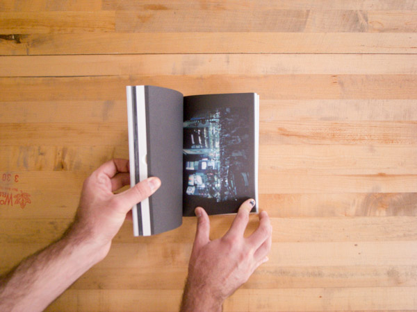
After a lengthy essay, the photographic plates begin. We are first greeted by a boy in his early(?) teens with a black eye staring rather balefully directly into the camera. He is followed by two delivery boys, one holding a still common delivery container for Chinese food and the other with a roll of newspapers tucked under his arm. The portraits continue: a barista (this isn’t last week?!), two students carrying leather briefcases that scream “Yuppie!”, a topless woman, a cop, a mailman, an ajashi, a woman in a hanbok, a monk smoking a cigarette, an ajumma, a motorcycle deliveryman, a man with a contorted face, a man in a dirty camouflage shirt and rubber gloves, a bearded old man in traditional Korean garb, a clean shaven old man in western garb, a young girl in a hanbok, a chef who looks away. All but a handful are three quarter length formal portraits in front of a gray studio backdrop. Like all of the photos on the book, they are taken on 35mm film and printed (and reproduced in the book) with the filed out film carrier showing a rebate running around the photograph.

We move outdoors; more portraits: an ajashi in an alley, two women cooking behind him; a taxi driver draped nonchalantly on the hood of his taxi; a motorcycle cop, traffic dense behind him; a bell hop standing tall; a soldier also standing tall; an ajashi in a dirty button down shirt with enormous lapels; a hip young(ish) woman in a leather jacket standing in front of racks of cloths looking fiercely into the camera; a man through a narrow window; a man in a record shop (or radio studio?); a man behind a barred window; a man in front of a fenced off area; a bartender, a woman, a boy holding a tiger mask over his face; a little person, hands in his pockets; a cobbler, his glasses askew; three men selling watches out of doors; a goateed man wearing a dock workers cap selling wind-up toys; an old man holding a creased Korean flag; a lunch counter waiter sitting on the ground on a folded newspaper outside of his booth; a man in jacket and slacks sitting slackly on the ground and covering his face with his hand; a poor person in dark rags hunched over a square bin, his head down, his back to a wall of heavy stone blocks; a man without shoes laying on the ground with his head in a large basket; a man in tattered cloths leaning against a pole that splits the photograph left and right, his back to the camera, a more affluent crowd walking towards the camera left of the pole; a man splayed on the ground (drunk? fallen?) wrapped around a pole. I could be just as easily cataloging the people I saw on the street in Seoul two weeks ago as those portrayed in Kim’s photographs. I am reminded, too, of August Sander, though without the formality or pomp.

Objects, one tightly composed still life per spread on the right hand page: dead bird, fish heads, shoes, dead plant, tattered kettle, ice covered cigarette advert, vinyl and hand lettered sign; rough metal surface rich with texture.

And now vignettes: a stack of books held under an arm; the train of a wedding dress splayed on a curb; a memorial; a door with a cross; the torn remnant of a paper poster pasted on a pole; a cafe; an old door; a door with six padlocks; burlap flaps over windows; a worn out chair; a worn out easy chair in a dilapidated building; a radio tied to the wall; another dead plant; a bare light bulb above cooking utensils; a rudimentary kitchen; a broken clock beside a flue(or an oven?); a pigeon alighting from garbage cans; a brick corner; an outdoor platform; urinals (the first image in the book to run across the gutter); a well (?); a make shift wooden foot bridge crossing a stream; a bus painted entirely white; inside the white bus; another bus resting headlong against a pile of boxes; another old bus shoved to the side of the road surrounded by bushes and covered with a tarp; yet another dilapidated bus burnt out and resting on its side; a burnt out car without wheels; a pile of cardboard and carts in front of a mural; a cart leaning against a pine tree; a sagging patched shingle wall; canvas tents and canvas fence with tall buildings in background. The American photographer Walker Evans comes to mind when I look at these images.

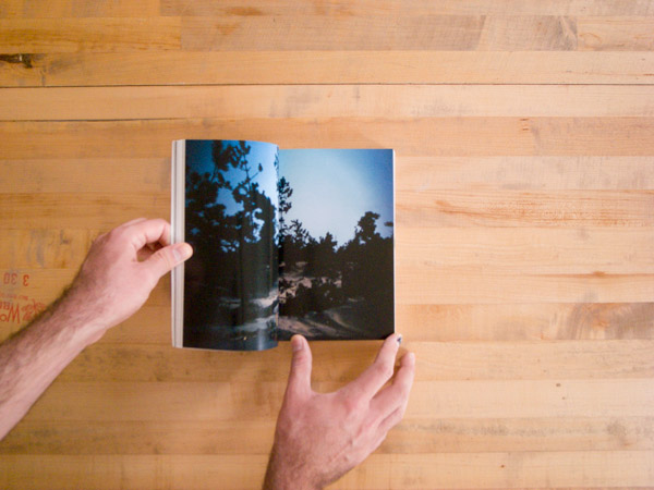
More vignettes: bedding, patterned, plain, plaid, folded and wrapped; a tangle of traditionally roofed buildings; an aperture through a variegated, patched and improvised building; a low slung concrete building, its corrugated steel roof leading back to the traditional roof of the building behind it; an alleyway and an electric pole; looking out over the roofs of a knotted neighborhood; refuse and debris; the narrow side elevation of a building; a stairway; layered roofs; an alleyway curving into the light; a door beneath a rock; a door from a cockeyed angle; the side of a building with a pole beside it; the side of a building dappled by the shadow of sunlight filtering through the branches of a tree and with a pole in front of it; a corrugated steel fence; two discarded sofas, a wall and a tree; building seen from a low vantage point; building seen from a high vantage point; rain falling on traditional tiled roofs; looking downhill on a tight knot of traditional tiled roofs; hazy view of tile roofed buildings seen from above; second hazy view of tile roofed buildings with a hazier set of buildings further in the distance; a canal with a new road and contemporary concrete block building behind it (this is the second photograph that runs across the gutter); two trees behind a wall (also running across the gutter).

The book’s final chapter comprises more photographs of buildings. I am going to conclude this review with a few thoughts on one image, the first image, in this chapter. The photographs is of a partially roofed outdoor market. We are in the first of two arcades, looking through it towards the second. Above us, the roof is missing a number of it’s corrugated fiberglass panels. The second three story arcade is similarly roofed. The photographic frame compresses it’s three delta roof line so that it merges and blends into the second story of the arcade we are in. The center of the photograph is a clear, paper white, blown out section of sky. It is shaped like an invading UFO from Asteroids. This clean space brings to mind–in my mind, the future. In the midst of the clutter of the present, an image of the future is being constructed. In the midst of the clutter of these images is the foundation of the coming future that is now the present.

The Memories of Floating Time
Kim Youngsoo
Essay by
Published by Youl Hwn Dang Publisher
1997
Printed in Korea

In Between, Taeyoung Kang

As usual, I returned from Seoul with a suitcase full of books. Because of my limited time for browsing for books during my brief trips, I generally err on the side of caution and buy a book if I see some detail that I think bodes well: a design flourish, a single image that catches my eye, a weight or density. This generally works well for me. Sometimes it doesn’t.

Taeyoung Kang’s In Between is full of promise. The simple and distinctive Aprilsnow Press’ cover design with a photo tipped into the bright red linen is an opening salvo. It calls out from the book shelf. On a cursory glance through, there are numerous wonderfully composed and engaging photographs.

A WB Yeats quote from “Sailing to Byzantium” sets the book’s tone: “Whatever is begotten, born and dies.” The first several pictures take this cue and run with it. The first picture is two empty shell sitting beside several small plants in loose soil; the caption tells us this is in a cemetery. It is followed by a pair of landscapes of the tombs in Gyung-ju; in the first, two boys wearing white back to back stepping away from one another as though dueling; in the second, picture there is only one boy, crouching. The next picture is a boy playing in a ruin; he appears to levitate off the ground, his head poking into a window in the ruin. From this strange and slightly unsettling opening, the book begins to wander.

The wandering is literal and figurative. We are brought to France, back to Korea, then on to Mauritius, Switzerland, Hong Kong, the US, Turkey, Jordan, Italy, Germany, Syria and England. All are revisited throughout the book. It is a whirlwind world tour of the everyday: street scenes, still life vignettes, grand landscapes and portraits.

Though we may travel the world, we are not among a family of man. This is not some grand statement of unity. Instead we are in a space of “between-ness”. In our shifting location we are never “here”; we are always moving between. The photographs hover between light and dark: a young girl on the edge of a pool of light steps out into the dark surround; a boy hides behind a lamp post’s silhouette before a luminous background of dirt; a man directly under a light in a restaurant covers his face; a young woman at a bar sits in a pool of light looking out at the crowd surrounding her recede into darkness. We are often divided from the subjects we view: they are half hidden by other objects in the scene; they are partly erased by reflections in glass; or they are covered by shadow. Or the we catch a moment between moments: a pair of people in mid-step, their weight neither still on the top step or yet on the bottom step; a man leaning over to lift a brazier of coals, his hand pulling on its handle but not yet taking its weight.

This is a book that I wanted to like it and expected to. There are many lovely images and as an object the book is nicely designed, printed and put together. It looks great on my book shelf. Any number of the photographs would look wonderful framed on the wall. However, the wandering is too great. We cover too much territory. A third of the images could have been left on the editing table. Flipping through the book too many images pull me from the rhythm and disrupt the flow. I can’t find reason for transitions between images; I’m not sure what I am meant to come to understand through reading this book.

In Between
Taeyoung Kang
with text by Kay Jun
Edited and Designed by Kay Jun, Jeong Jae-wan
Proofread by Kang Young-gyu
Translated by Angelina Gieun Lee
Printed by Munsung Printing
Published by Aprilsnow Press
First edition January 2013

Walk Zine Project, Storage Book&Film

Browsing through the shelves at Your-Mind Bookshop last night (I’m in Seoul unexpectedly for a week), I noticed that among the various designations of book type, generally, broken down by content medium, there was also a “Travelogue” designation. This was one of the only designations that was a genre rather than a medium. On this shelf journalistic text met illustration met design met photography met music met poetry. Looking at this shelf, it struck me that this travelogue genre is a bit like the road trip genre in the States.

As in any genre, there is a clear set of assumptions and expectations. It is the small tweaks to the formula that make a book interesting. Recent examples reviewed here include Eunhye Kim’s Berlin and London rough risograph books and Oh SeBeom’s mixture of photographs, diary, and mapping in 31 Days 807.3km. Oh’s book is particularly effective at matching good content to good design to create an effective and enticing whole.

Storage Book&Film‘s Walk zine project is what the project title suggests: walks taken through foreign places. We might read them as either a single walk through a city or as a mediated archetypal walk through that place. Simply designed–both in their layout and physical form, the zines leave the photographs to stand or fall on their own. Your-Mind had three of these zines: Walk Seoul, Walk Paris and Walk Nice. (This may be the entire series to date.) The first is from COZYSACOZY (Sanpo) and the second two are from TOGOFOTO.

TOGOFOTO tends towards open landscapes. Even the close-ups are from mid-distance. In Nice it is the beaches and walkways overlooking them that holds his attention. In Paris, it is store fronts, landmarks, crowds and tourists. In both locations, when we see people we see over their shoulder. We are part of a crowd looking.

COZYSACOZY moves in and out from detail to distance and back to detail. Shop interiors, food, nature in the city, vignettes. There are few people; they are either seen at a distance or truncated to a hand holding a flower, shoes in fallen leaves, boots walking past a merchant’s stall.

These are the rules: Uplifting Color; Respectful Distance; Suggestion; Directness; Wonder. COZYSACOZY’s Tumbler heading text is a good summation of the essence of the travelogue:

one scene +
one scene +
one scene …
become
my life.

There is nothing revolutionary here. An appropriate description of these zines might be bourgeoisie. The photographs are nice and show much, but they make me feel little. The cover image of Walk Nice is a couple sitting on a bench under a trellis looking out over the ocean. This is a good metaphor for the project as a whole: looking out onto the world and seeing nice light through a clean structure. The cover image of Walk Seoul suggests another good metaphor: a pair of cupped hands presenting the viewer a single flower petal. Both possible metaphors fall down though. As there are too many photographs of the same nothing. The single petal, the stand out image, is lost among the crush. And the structure appears clean and clear but gives us too little narrative.

I’ll look forward to seeing where this zine goes. I suspect that good things are in store once it hits its stride.

Two Faces, Lee Duegyoung

Sometimes, the answers are all right in front of you. And at other times, small things obscure them.

An aside before the actual review: Lee Duegyoung’s Two Faces includes a list of notes by critic Lim Geun-jun that give detailed descriptions of his previous projects and working methods. Lim’s very clear description of Lee’s “Teheranno” as panoramic composites made from photographs taken from a helicopter with a downward facing camera to mimic satellite imagery clarifies for me the images I mentioned last week as a stand out in the 2012 Seoul Photo Festival. I had not connected them in my mind to Two Faces because Lee’s name was transliterated differently in the SPF catalog. For my part, I have always transliterated names as they are transliterated in the publication and will continue to do so despite the obvious possibility for missed connections. On to the review.

Lee Duegyoung maintains an incredible consistency of good ideas coupled with masterful execution and high-quality book design. Given his past exhibits and publications, it is little wonder that Two Faces is such a strong book. I may be faulted for wearing my heart on my sleeve here, but so be it. I like this book. Two Faces is one of the most engaging Korean photo books I have acquired recently. Both the content and design are outstanding; as a bonus the texts are clearly written and available in both Korean and English.

Two Faces comprises two panoramic photographs of the north and south banks of the Han River as it runs through Seoul. Lee composited roughly 13,000 photographs taken over four days from multiple river boats into two panoramic images. The two panoramas run essentially unbroken opposite from one another, top and bottom, across the accordion pages of the book. The book places the reader almost in the prow of a boat from which he can look left and right at the two banks of the Han. The “accordion” is perfect bound along one edge preventing the reader from opening it up to peruse long stretches of the panoramas.

Due to the inevitable perspective shifts caused by shooting from a moving platform, some tall buildings away from the river’s banks appear multiple times in slightly shifted positions. This gives an experiential edge to the photographs. Just as an actual viewer on a river cruise might espy the same edifice from multiple angles over the course of the journey, so too is the reader treated to this experience. Any sense of an absolute recording of the river is broken, the panoramas present a view that is spatial and temporal and hint at a continuum of possible views.

Lim notes that one of Lee’s influences is Ed Ruscha’s trilogy of artists books: Every Building on the Sunset Strip, Twenty-Six Gasoline Stations and Thirty-Four Parking Lots. This makes perfect sense to me, though the incredible breadth of Lee’s effort brings to my mind another project: Eugene Smith’s Pittsburgh. in Two Faces Lee has taken an equally ambitious target but rather than get bogged down in endless possibility has brought the work to a magnificent completion through a tightly focused conceptual framework and equally tight physical form. I’m sure there’s a jazz metaphor here, but I’m not a jazz guy.

The physical form effectively contributes to the conclusion of Lee’s Hangang trilogy by referencing the previous projects. The cover presents us with a complete foreshadowing of the work within: the panoramas have been compressed into the length of the wraparound cover. This calls to mind the time compressed video that accompanied the exhibition of Lee’s Hangang Project II – 25 Bridges. Lim notes the video, and I take take his note a step further to explicitly make the connection with Two Faces‘s cover. So too would I point out the somewhat obvious connection of the book’s accordion form to his 69 Snack Booths catalog which also employed an accordion form. These small formal and technical echoes that tie project to project create a sense of structured completeness.

I’ll end with a small personal detail that I enjoy: in the panorama that tracks the north bank of the Han, Lee has photographed my mother-in-law’s apartment building under construction shortly before she would have moved in.

Singular concept.
Tight design.
A work fully thought through.

Two Faces
Lee Duegyoung
Written by: Lim Guen-jun and Rhee Z-Won
Translated by: Choi S. Min and Kim Sung
Edited and Designed by: Suki and Min
Specter Press, Seoul
Edition of 700
2010

Nakgol Project, Architectural Photographers of Korea

The city of Seoul holds an annual Seoul Photo Festival. In 2012 the festival’s theme was “A Thousand Villages, A Thousand Memories.” Given my interest in the ways that urban planning, urban infrastructure, daily routine, memory and image making intersect this show was hard to resist.

The intermingling of professional works with personal snapshots was handled with aplomb. Rather than reduce the personal work by elevating it to professional stature, these private documents were treated as vernacular ephemera and presented as such. In fact, while there was much good professional work in the exhibit, the tight spaces that the Seoul Art Museum’s first floor was carved up into made its presentation cramped. In comparison, the vernacular snapshots held up very well in the small rooms.

Among the standouts in the 2012 show: Dueg Young Lee’s satellite composites (or aerial photographs?) of Seoul street grids; Se Kown Ahn’s photographs of the excavation of Cheonggyecheon; Ki Chan Kim’s black and white photographs of Seoul in the early 80’s full of fun and energy; and Han Chungshik’s documentary photographs from the 70’s. The Dream Flower Factory and Union of Workers for Producing Non Waste community projects were also wonderful. (I’m a year late in noting all of this as now even the 2013 Seoul Photo Festival has concluded…)

There was one standout, in particular, for me: the Nakgol Project by the Architectural Photographers of Korea. This was an unassuming, slim, softbound book of rough halftones. The book was presented in the show as a book: one could flip through the book itself, mounted to a shelf, or follow the book’s spreads mounted on the wall. The book’s dense, tightly composed photographs depict Nakgol, an area of unlicensed shacks in an isolated hilly Seoul neighborhood, as it existed in 2001. The photographs are like an extension of Yong Kim’s photos from the 60’s (not his advertising work) or Han Chungshik’s photos from the 70’s, both of which were earlier in the exhibition.

The photographs in the catalog are dated 2001-2002, though the book appeared to have been published in 2001. Between 2002 and 2006, the neighborhood (which one might also have described as a “squatter settlement”) was redeveloped into a series of apartment blocks. Having witnessed the extreme rate of change in Seoul, this book reads both like a document meant to save the memory of the place and as one meant to hasten the process of redevelopment. The book preserves the place while simultaneously presaging its doom or rebirth depending on one’s particular vantage point.

One might consider this book in relation to Se Kown Ahn’s photographs of Cheonsgyecheon’s “re-development.” The Nakgol Project depicts an “old” Seoul about to be replaced with a modern Seoul, which in this case means a developed Seoul. In Ahn’s photographs, the process is reversed: the concrete and rebar of previous decades’ development are being removed to renew an ancient public waterway. Modern in this case is what once was. I ought to note that the comparison isn’t perfect as Cheongsyecheon is very much a modern space designed and utilized with contemporary values; but, its essence and origin is ancient.

Nakgol Project is the 2012 Seoul Photo Festival’s theme in compact form. It presents multiple ways of seeing a place. We can read into it the memory of a place that once was; a living space engaged by its inhabitants; or, an opportunity to advance the city forward. It is quite an achievement.

Nakgol Project
Architectural Photographers of Korea
2001 or 2002

(I have no other information; no link to the book, no link to the APoK… if anyone knows where I can find a copy of this publication or a link to the creators, I would very much appreciate either.)

Like a Program; Kim Sang-Gil

Good photography. Dark, rough printing. Off white paper. Small design flourishes. Wonderful object-ness.

Given my predilections I ought to like this book. I don’t.

My impression is that more and more photo books being made in Korea lately are exquisite objects that mirror and enhance the photography contained within. (Next week’s review will be of one of these.) In the past, I found that many photo books in Korea were simply exhibition catalogs (often beautifully made but still catalogs). Like a Program on a cursory examination appears to be a wonderful object, and it is, but this object-ness is out of whack to the photography within and overwhelmed by the all you can eat buffet of an exhibition catalog that it truly is.

It may be unfair to judge an exhibition catalog for failing as a photo book. Oh well.

Kim Sang-Gil’s photographs limn a porous boundary between artifice and sincerity. Like a Program contains three of Kim’s projects that approach this boundary from different directions and a fourth that is about something (else). The moments in “Motion Picture” appear to be caught from life, but their captions reveal them to be staged. The subjects are models and actors between or in the midst of takes. “Off-line” depicts communities that have come together around shared interests. These interests can be as simple or shallow as brand affiliation and yet the group identity or sense of community is no less sincere than in any other group or community. “Re-model” is photographs of empty commercial interior spaces either waiting to be used or in the process of being made ready for use but that lack the qualities that actually being used will embue them with. An empty space might be intended as an office, but until it is used it is little different than an unused mall interior. The final series in the book is “Display.” This is comprised of details of building design features: a handicap lift rail; an elevator door; a revolving door; a parking elevator system. I do not know how these four photographs relate to the previous three series.

The work in the book, while having a loosely unifying theme, is too broad. Moving from one project to the next is jarring.

The choice to print all of the work in the book in low contrast black and white is odd given that Kim Sang-Gil works in color. The printing is actually quite beautiful in its way, but it is wrong for almost all of the work.

“Off-line_burberry internet community” offers the opportunity for a direct comparison between Like a Program’s grayscale printing and a color presentation. The image appears in glorious glossy color on the cover (and in the interior) of the 2009 exhibition catalog Chaotic Harmony (Museum of Fine Arts Houston and the Santa Barbara Museum of Art, 2009).The flat gray tones in Like a Program dull the image, make it boring.

The images from “Motion Picture” are similarly dulled to death by the monotone printing. These images have subtle color and a cinematic presence–which makes sense given how they were made. Looking at these photographs I am reminded of Philip-Lorca Dicorcia’s Hustlers with their seemingly natural light that bathes everything in the frame with a kind of heightened sense of being real. This heightened sense of the real is at the heart of what “Motion Picture” is about. It is a physical trace of Kim’s capital “I” Idea. Why strip that from the photographs?

This is not a knock on the photography or the photographer (though the buck has to stop somewhere). Motion Picture_inquiry and Motion Picture_the message and Motion Picture_hand clapping are all weirdly wonderful. Off-line_burberry internet community, Off-line b&w sneakers internet community and Off-line_the sound of music internet community are likewise beautifully bizarre. I imagine that large prints from Re-Model would have an amazing presence on the wall. This is good work.

This is a knock on the book: There was obvious care made in the design and printing and yet somehow the design choices are mismatched to the content. The design and printing are good (in and of themselves at least); the photography is good; the combination is not good.

If one has nothing nice to say, we are often told, say nothing at all. Ah… Well. I don’t think my writing this criticism of a book published eight years ago will put any kind of dent in Kim’s reputation. I’m just some dude and he’s an internationally known artist. I have no ax to grind here; I like Kim’s photographs and bought the book because I wanted to like it. It is disappointing that Like a Program occupies the no man’s land that it does: it has lovely object qualities and yet is primarily an exhibition catalog.

Like a Program
Kim Sang-Gil
Project Space Sarubia, Seoul
2005

London & Berlin; Eunhye Kim

Day two of jury duty and I’m still sitting and waiting. Action is promised soon: I’ll either be on a jury or dismissed… So, another review ahead of schedule.

Today I brought two small books by Eunhye Kim to pass the time. These slim volumes are the kind of quick and to the point books that I love. I attended a workshop on the photobook several years back (TA’d actually) run by Ken Schles and Jeffrey Ladd. Each participant was asked to bring a couple of books that they liked. I brought a handmade book of abstractions by a Japanese photographer and Paul Kooiker slim Seminar. Both present small “i” ideas and do so without fanfare or ostentation.

Both Berlin and London are like that: simple, direct and easy. We have straightforward urban landscapes of two cities printed in rough risograph on cheap paper and saddle stitched with two staples.

Each book is comprised of street photographs made in the titular city. They tend towards the middle distance. They have the air of casual snapshots but suffused with formal compositions. The photographs are quiet; there are no spectacles, no confrontations, no human drama. Winogrand this is not.

In Berlin, the photographs on the front and back covers are the strongest, presenting a promise that the rest of the photographs cannot live up to. Some aspire but none match.

London is much the same, though there are a number of gems within the book: a group of young men playing football in a park; two flower pots on two windowsills; a pair of images following an old woman as she approaches and unlocks her door; a middle aged couple pausing in the middle of a walk with their dogs in the park; a family walking through a park in matching outfits.

These are not masterpieces, but they make no claim to be. At the moment, they are welcome diversions.

Berlin
Eunhye Kim
Published by small thing
Printed by CORNERS
2012
&
London
Eunhye Kim
Published by Small thing
Printed by CORNERS

Utopia / Blow Up, Seung Woo Back

Cover of Utopia / Blow Up by Seung Woo Back

Seung Woo Back’s Utopia / Blow Up comprises his two related series of the same names. I purchased this book on a trip in 2009 and it remains one of my favorites. It is interesting not only for the images themselves, but also the conceptual framework girding them and the physical container they exist in. Each reinforces the others.

The physical book is 36 pages, oversized and printed full color with metallic embossed details on newsprint in an edition of 1000. There is a 3 page insert with essays in both English and Korean by Hye Young Shin and Pyong-Jong Park. Jeong Eun Kim edited the book, and Yeoun Joo Park designed it. U/BU was published in 2009 in collaboration with IANNBOOKS.

Utopia is Back’s fictionalized North Korea; by exaggerating, adding to and dividing the infrastructure in existing images he plays with the notion of an idealized society’s physical structure. His is not a glossy antiseptic ideal. The color palate is muted (exacerbated by the newsprint), the forms verge on the grotesque and unlikely, lighting can be garish and the skies become acidic. If this is what North Korea’s infrastructure might look like if it fulfilled the rhetoric and claims of its propaganda, it would still be a sad place. The streets remain empty. The scale remains crushingly anti-human.

If one reads the book from the opposite direction, Blow Up presents telling details extracted from otherwise anodyne negatives Back created on a month long stay in 2001 as a journalist in North Korea. Accepting the regime’s destruction of his “interesting” or “good” negatives, Back turns to the smallest of details in his remaining negatives to subtly lay bare the lie presented to outsiders. With an obvious nod to Antonioni, Back is looking to find truths that are hidden in plain sight and to question what is presented in an image. The photographs might be a kind of spying, a notion suggested by the military imagery which bind the two projects at the newspaper’s center point.

Alternately, in these images of war material and heavy bombing we can see a dividing line. If one has started reading from left to right, e.g. with Utopia, at this point we move from what might have been to what is

In both projects, Back is exploring the line between reality and fiction in the photographic image. By creating unreal images out of real images, he makes the real more apparent.

Black Midday, Taewon Jang

BlackMidday

Taewon Jang’s Black Midday presents an unassuming face. Aside from a single thumb cut index and the heft of a brick, its exterior presents none of the turmoil within. I almost passed this book by, which would have been a mistake. Once the cover is opened, the book begins to present a rich and out of the ordinary experience full of terror and loss. In it’s colophon, there is this description: “the book examines the psychological situations drawn from reality and fiction, memory and oblivion, absence and presence.”

The book’s 340 pages are broken up into four sections: Text, Generic Landscapes, Plates and Victims.

Text contains correspondences between Jang and various Japanese friends (many of whom are photographers or others in the arts) after the Tohoku earthquake as well as an essay by Suejin Shing, who I have posted on previously.

Generic Landscapes comprises images taken in Japan after the earthquake. The images are dark and intense; they are printed full bleed or with black borders; this section is the only one with a gloss coating. The photographs were taken under moonlight and have an eerie beauty. In opposition to the beauty of the images is the fact of the desolate ruination.

KoreanPhotographyBooks-163

KoreanPhotographyBooks-165

KoreanPhotographyBooks-160

KoreanPhotographyBooks-158

KoreanPhotographyBooks-162

Plates is broken up into two subsections: the first, on uncoated white pages, is a series of prints rephotographed repeatedly in such a way that the viewer’s sense of the image wavers in and out. The image disappears into the vanishing point of perspective. Mixed in with these are photographs of paper artifacts such as business cards, hand written notes or sales brochures that give the address of the plates in the second subsection–a sort of travelogue. The final image of this subsection is the image that has been buried beneath the process of rephotographing: a small building covered in and being subsumed into debris. The second subsection within Plates is printed on black uncoated paper. The images are of interior and exterior spaces that Jang visited while making this work: offices, shops, homes; courtrooms or government hearings; landscapes, people in the street. The damage of the earthquake breaks into this through a photograph of a large ship on dry land and a desolate lot with a framed image from the previous section.

Victims, the final section, is a series of installation shots of mixed media portraits. These portraits–presented first as a thumbnail image for reference, are photographs mounted to wooden forms which have been folded and otherwise manipulated. The portraits are fragmented; the subjects likeness is deformed.

Of all the photography books I’ve acquired in Korea, this is among the most ambitious. We begin with the fear of loss. Jang is reaching out to confirm that those close to him are not lost to him. Conversation confirms existence. The book continues on into terror. The landscape photographs of the sites of the disaster are terrifying in their affirmation of the power and irrational destructiveness of nature. Even at a remove of days, weeks or months, the fear of potentiality or eventuality remains. We cannot remain in a state of terror or shock, however. Plates transforms terror as it dissolves into ongoing everyday life. The rephotographed image is a stand in for the oscillation of fear over time as we are removed from its immediacy. Everyday life eases our mind. We are left with the image to remind us. Victims brings back the terror, but does so in a way that reminds us that this terror is not nature’s alone. These portraits are of Japanese people in New York; they are not victims of the earthquake. They are victims of the artist: it is the artist who has deformed their likeness and associated them with the earthquake.

The earthquake is not the subject of this book. It is our response as human beings that Jang is interested in. How do we see? How do we remember? Do we respond to, create or invent reality?

Dashwood Books in NYC has this book, as does Photo Eye in Santa Fe. It is also easily available at Book Society or Your Mind Bookshop in Seoul.

**This post was first published in a “Book Notes” post on the daily_up.
***I stole the book cover image from Photo-Eye because I haven’t had a moment to shoot a picture of the book. Sorry Photo-Eye.