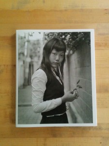
Park Sung Jin’s KID Nostalgia is a collection of sensitive, square format, black and white portraits of South Korean youth in school uniform taken between 2001 and 2009. The subjects are set center frame with side street or back alleyway urban scenes surrounding them. The portraits are roughly evenly split between waist up and full length views. The black and white is the soft gray of a subtle, classic aesthetic that doesn’t call attention to itself. The books uses a simple layout in which each portrait is presented individually on the right hand page of a spread.
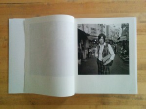
With a few exceptions, Park’s subjects gaze directly through the camera towards the viewer. This gaze is direct but not confrontational. In fact, there is a kind of softness to this eye contact. While there are the outward signs of youthful rebellion–cigarettes, mussed hairstyles and punked-out uniforms, the youths’ eyes belie a certain reticence. They hold themselves with an awkwardness that suggests naivete or innocence. There is longing and insecurity. There is intensity, too; so much so that they seem ready to burst into flame. These cool kids smolder.
Photographs are of their maker as much as of what stood before the lens. The choices that one makes in selecting a subject, deciding how to depict and frame that subject and ordering the resulting pictures in series all are decided by and define the maker’s state of mind. Though born in Seoul (where many of these photographs were taken), he came to New York City in 1987 at the age of 17. In New York, Park found “a place where every conceivable race [lives] side by side, but they don’t actually mix… Instead they live within their own identities.” Park notes that Kid Nostalgia is, in a sense, his “trying to find [his] own forgotten roots.”
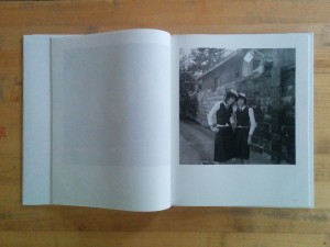 One comparison that springs readily to mind when viewing Kid Nostalgia is with Hein-Kuhn Oh’s Girls Act. The subject matter is quite similar, and the black and white aesthetics are even similar. The photographs come from entirely different mindsets, though, and these differences are apparent in the details. In Park’s “남산동 2005” for an example, the camera has been fitted with a slightly wide lens and positioned at the subject’s eye level. This even footing grants an instant conversational familiarity and shows the subject within an environment. Oh’s photographs, such as “Jin-hee Han, age 17, 2003,” are shot from a low vantage point. The viewer looks up at the subject, who becomes monumental. Oh’s low vantage point and longer lens places the horizon low in the frame, minimizing the subject’s relationship to her surroundings by placing her against the relatively neutral ground of the sky. The lighting is different, too: Park’s light is soft and coming from behind the subjects; it is probably the filtered light of an overcast sky. Oh’s light is hard, directional and frontal–direct flash on axis with the Oh’s lens.
These subtle differences in how the photographers use similar black and white materials to depict similar subjects limn a critical divide between them. Oh looks outward with a critical gaze and a clear concept (both Girl Act specifically and in his work broadly) that is as direct and hard as the light in “Jin-hee Han, age 17, 2003.” This concept can loosely be defined as the way that social markers of identity both bind groups of people together but also alienate and limit those same people.In contrast, Park looks inward. His vision relies on his subjects being their “raw and fresh” selves. In fact, it is precisely his subjects’ refusal to play by the rules, their skulking about on the “periphery” that makes these kids such powerful avatars for Park. The soft light that suffuses Park’s photographs denotes a kind of romanticism–it caps the subjects of “남산동 2005” with halos such that one might read them as mischievous alternative saints.
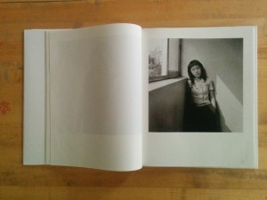 For all Park’s talk about his subjects’ rawness, the photographs are remarkably chaste. This is not Elle Perez’s ghettopunk and not even within shouting distance of Dash Snow’s Polaroids. These kids may be full of excitement and energy but that energy never breaks the photographic surface. Park treats the youth with incredible sensitivity but imbues them with a nostalgia that is unlikely their own. It is the nostalgia of someone looking back. One wonders how these kids might depict themselves.
Kid Nostalgia is, physically, simply appointed. It’s design is minimal and straightforward, mirroring the subtle aesthetics of the photographs while relying on them to carry their own weight. The heavyweight glossy dust jacket features the image “가리봉동 2005” on the front; the title, photographer’s name and publisher in English and Korean are on the spine; and a UPC code on the back. The book’s hardcover boards are a cheap glossy white with only the title and UPC code on the blindingly bare front cover and title, photographer’s name and publisher in English and Korean on the spine. The plates are nicely but not luxuriously printed on paper stock thin enough that a reader can nearly read the photographs through each page’s backside. The production quality of the book will not win any awards, though it does its job in delivering the photography simply and without fuss.
KID NOSTALGIA: Portraits of South Korean Youth
Park Sung Jin
Edited by Kim Kwangchul
Translation by Colin Mouat
Design by Gang Moonsik
Printed by Sinsago Hi-techj
propaganda press (site, contact)
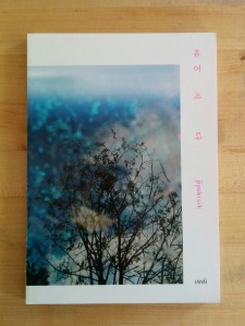
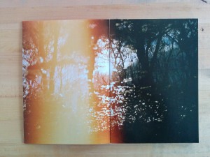
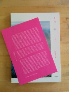
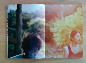
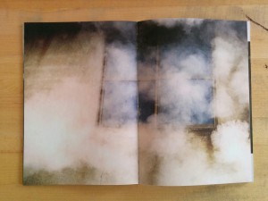
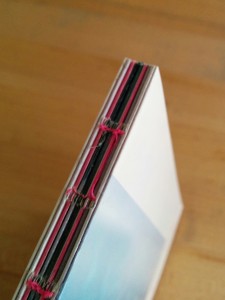
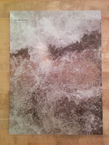 Let’s start with the conclusion: Kyoungtae Kim’s On the Rocks is an amusing, clever and honest book but not a grand one. That conclusion can be drawn from its subject matter: close-up macro photographs of small, everyday stones–roughly 2cm to 10cm in length. The bulk of the book is single pages in which each stone, floating in studio limbo, is enlarged to fill the page. Every singular stone is richly textured, wonderfully abstract and evocative–and yet humdrum.
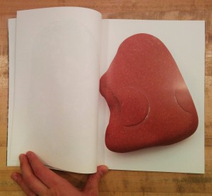 Those three facts make me think the book came out of two questions: 1. When I travel to Europe, what can I bring back with me? 2. Now that I’ve got all these stones and pebbles sitting around, what can I do with them?
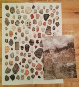
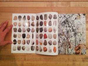 The photographs are also placed in grids in which the stones are seen relative to one another. On the inside covers, the stones are scaled to a single uniform size and printed in grids. In a nice touch, one must open the inside flap of the cover (onto which the full bleed cover image does not extend) to reveal the grids. A similar gridded spread follows the colophon page; on this grid the stones are scaled relative to one another and there is a scale so that one can determine how large each stone is in reality. This grid is repeated on a pull out poster on which the stones are printed life size (at 1:1 scale).
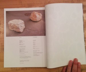 There is one outlier image. At the top of the colophon page is a photograph of two rocks sitting heavily on a paved street. These are


 One comparison that springs readily to mind when viewing Kid Nostalgia is with Hein-Kuhn Oh’s Girls Act. The subject matter is quite similar, and the black and white aesthetics are even similar. The photographs come from entirely different mindsets, though, and these differences are apparent in the details. In Park’s “남산동 2005” for an example, the camera has been fitted with a slightly wide lens and positioned at the subject’s eye level. This even footing grants an instant conversational familiarity and shows the subject within an environment. Oh’s photographs, such as “Jin-hee Han, age 17, 2003,” are shot from a low vantage point. The viewer looks up at the subject, who becomes monumental. Oh’s low vantage point and longer lens places the horizon low in the frame, minimizing the subject’s relationship to her surroundings by placing her against the relatively neutral ground of the sky. The lighting is different, too: Park’s light is soft and coming from behind the subjects; it is probably the filtered light of an overcast sky. Oh’s light is hard, directional and frontal–direct flash on axis with the Oh’s lens.
  For all Park’s talk about his subjects’ rawness, the photographs are remarkably chaste. This is not Elle Perez’s
