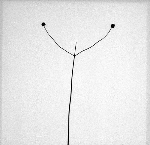
Several years ago, my wife and I talked our way into a gallery in the Samcheong-dong neighborhood of Seoul that had just closed for the day. Ji adores the work of photographer Byung-Hun Min, whose work was on display at the gallery, and wanted to inquire about a print. She was ready to spend some money on one but was stopped in her tracks by the prices: approximately $20,000. Though the prints (from Min’s Snowland series) were breathtakingly beautiful, we bought a couple of books instead.
Weed was one of those books. It is understated. The beauty of its design trickles down to the smallest details. Thought it would be wrong to call this book a masterpiece, it is masterfully done. The selection of photographs and their presentation is a nearly perfect encapsulation of Hun’s photography. The photographs in Weed do not present an overview or retrospective of Min’s oeuvre. Rather they are a singular and specific project from which the entirety of his photographic pursuit can be extrapolated.
Weed comprises photographs of weeds that Min made during daily morning walks over a five year span at his studio on the outskirts of Seoul. Just as the weeds sprout from whatever unlikely crevice they can gain purchase on, so too does Min find opportunity in an unlikely subject. Weeds are not Bae Bien-U’s majestic pine trees through which ancient echos reverberate nor even Min’s own haunting, minimalist, grand landscapes. These are simply everyday weeds behind the plastic sheeting of greenhouses and poking through the cracks of concrete walls. They are as quotidian a subject as one might imagine. And yet, Min makes of them something far greater.
Two photographers out of the Western canon come to mind: Karl Blossfeldt and Harry Callahan. They have nothing to do directly with Min’s photography. They come out of entirely different traditions but provide several counterpoints from which we can better understand Min’s Weed.
Blossfeldt’s 19th century photographs grow from the seeds of 18th century scientific observation. His methodology for photographing natural plant forms was rigorous. Plants were each photographed in profile against a light gray background. Everything is in focus and sharply rendered. They are highly factual. According to a press release from the Whitechapel Gallery regarding an exhibit of these photographs, they were used primarily as teaching tools until Blossfeldt published them as the seminal Urformen der Kunst in 1928. The minimalist compositions were intended entirely in service of the subject being most clearly described.

The minimalism of Callahan’s mid-20th century photographs is entirely different. His work is less about the subject than the medium through which it is seen. A plant seen framed against the sky and a portrait of the photographer’s wife are equally austere in their reduction of photographic form. Callahan reduces and reduces and reduces towards the limits of photographic representation.


Min’s photographs do not operate in these ways. While his routine of daily photography might have an echo of Blossfeldt’s rigor, he is not concerned with factual recording primarily. And though he might reduce compositions to their minimum as Callahan did, Min allows a struggle between his subject matter and the form of their representation. Rather than set his weeds before a neutral ground, Min allows the ground to come to the fore. The weeds press and push against not only the plastic sheeting and through the concrete walls but also against and through the bounds of the photographic surface. The edges and surface imperfections that were the hallmarks of Polaroid Type-55, which Min has employed for much of this series of photographs, blend with the surfaces and weeds which are depicted within the emulsion.
Blossfeldt may have seen the plant as an artistic structure complete in its own artfulness, but the nature that produced that artfulness is buried by the process of representation. Nature has been made clean and neat. Likewise, Callahan created photographic playgrounds that subverted the subject by their representation. In their extreme reduction, the photographs were about their own form as much as the subject depicted.
Min’s photographs embody the fervor of life. The division between form and subject begins to break down–as though the weeds themselves could break forth from the photographic surface. They do not submit themselves to their representation but instead struggle mightily against it as they struggled mightily out from between mortised stone or against a greenhouse window.
The design of Weed is simple in its presentation of these photographs. There is enough struggle within the photographs; to struggle against overbearing design would demean them. Any treatment other than simple would have been inappropriate. The photographs are presented generally one to a spread with the image on the right hand page and a negative number as caption on the left hand page–though there are several spreads across which two images square off. The dominant color is gray: gray cover, translucent gray title page, gray text and gray photographs. The reproduction of the photographs is extremely true to Min’s low-contrast, gray printing style. The design choices are an extension of this photographic style. (I make this judgement based on prints from the Snowland series I have seen and the reproductions of those images in a sister volume to Weed, Snowland.) My one complaint is that the images are small, only slightly larger than a contact print from a 4×5 Type 55 negative.
Though the subject matter of Weed is outside the core of my photographic interests, I find it fascinating. In looking at the photographs I find new questions for my own photography and my process. I look at my own photographs and consider the interaction of form and subject. I look at familiar photographs from the canon and consider them anew. I might not live with one of Min’s prints on my wall, but his photography is ever present. Min is a photographer’s photographer and produces photographs full of insight and grace.
Weed
Byung-Hun Min
Homi Publishing House
Book design by Creé Associates
Printed by Munsung Printing Co.
2006
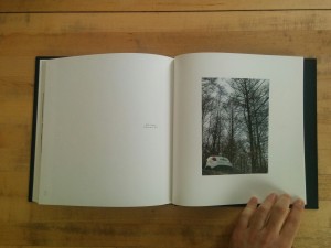
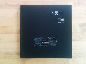 Yoon Seungjun’s Automatic Description is a book of car photographs. These photographs are not your everyday glossy advertisement for this years latest iteration of automotive desire. There is no glitz, no sparkle, no sex appeal. These cars are dead.
 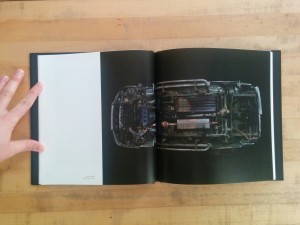 Automatic Description is broken into chapters that build one upon the other. The book begins with “Anatomical Chart – appropriation,” a typological series of images of individual car’s under carriages shot against a black ground. These photographs reduce the automobile to its basic structural form, minus wheels. We see the body frame with the suspension structures, transmission, driveshaft, and exhaust systems hanging from it. With their wheels removed and reoriented in space, these automobiles are no longer vehicles but rather abstract forms. Looking closely, one can find narratives in the abstraction: oil leaks, broken drive shafts, scrapes, rust and burn (?) marks. There are stories in these forms however banal they might be.
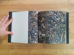 Chapter two, “Anatomical Chart – combination,” moves from individual vehicles to the aggregation of them. Vehicles are no longer individual stories. Instead, they interlock in stacks and heaps. Crumpled cars are crumpled in a pile. Hundreds of gas tanks are mounded together. Wiring harnesses are enmeshed in a chaotic singular mess. Pipes of every description writhe together like so many snakes in a pit. The singular story has given way to a history of multitudes. Yoon brings his camera in close for these photographs. We see no ground; the subject fills the frame. We are again seeing this automotive wreckage as abstraction.
 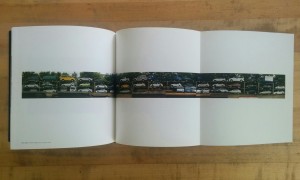 “Scraped Car Chart – parade” is the third chapter and takes us off into the new territory of documentary context. Yoon has pulled back to show us the space in which these cars are resting. We see the rows of racks and risers on which the cars rest. Some of the vehicles are half dismantled; others seem as shiny as new. Sunlight glints off of chrome and polish, still. In the middle of the chapter a gatefold presents a long panoramic image of column after column of junked cars. There are obvious joints in the image; it is not a singular panorama. Yoon has constructed this image–no different than we have constructed this entire infrastructure of disposal (such as it is). Just as the infrastructure of roads, highways and city streets has been built to accommodate the relentless drive of automobile culture so has an infrastructure been built to support the end stage inherent in consumerism. When millions are buying cars, millions are inevitable discarding them as well.
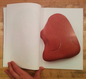
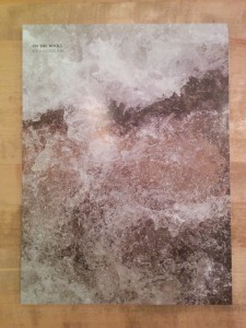 Let’s start with the conclusion: Kyoungtae Kim’s On the Rocks is an amusing, clever and honest book but not a grand one. That conclusion can be drawn from its subject matter: close-up macro photographs of small, everyday stones–roughly 2cm to 10cm in length. The bulk of the book is single pages in which each stone, floating in studio limbo, is enlarged to fill the page. Every singular stone is richly textured, wonderfully abstract and evocative–and yet humdrum.
 Those three facts make me think the book came out of two questions: 1. When I travel to Europe, what can I bring back with me? 2. Now that I’ve got all these stones and pebbles sitting around, what can I do with them?
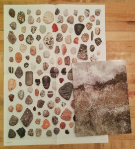
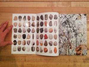 The photographs are also placed in grids in which the stones are seen relative to one another. On the inside covers, the stones are scaled to a single uniform size and printed in grids. In a nice touch, one must open the inside flap of the cover (onto which the full bleed cover image does not extend) to reveal the grids. A similar gridded spread follows the colophon page; on this grid the stones are scaled relative to one another and there is a scale so that one can determine how large each stone is in reality. This grid is repeated on a pull out poster on which the stones are printed life size (at 1:1 scale).
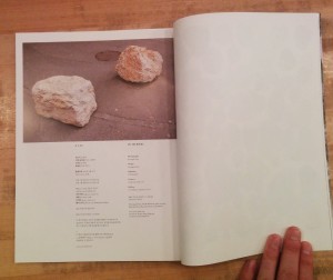 There is one outlier image. At the top of the colophon page is a photograph of two rocks sitting heavily on a paved street. These are
