Bright Shadow opens with a photograph of the Mongolian steppe. The horizon line is low in the frame, marked by mountains in the blue distance. The brown of dry grassland stretches out to meet the mountains. The land is receding; it is falling out of focus. A cloud filled blue sky dominates the picture, or would if a pair of truck mirrors in the foreground weren’t breaking the frame. The mirrors mar and distort the steppe caught in their surfaces.
We come to the city. It is seared by sunlight. The sky is blue and dark. There is no ground; buildings seem to sprout from their own concrete. A billboard advertising an apartment complex, still under development, promising elegance and luxury, dominates the photograph. We are in Mongolia.
A bolt of yellow: a woman in a yellow shirt and large white sunglasses is transformed by the photographer’s flash, which overpowers the sun. The background is dark (a trick of balancing the ambient and flash exposures in favor of the flash). More portraits of people picked out of their surroundings by the photographer’s flash follow: a middle aged, large bellied, man in a dress shirt; security guards; a young man with a hip haircut and popped collar; three young women, one looking away; two soldiers in their fatigues; a rancher in his chaps; construction workers; businessmen (or gangsters). The portraits are full of strong color and hard light. They bring to mind Hein Kuhn Oh’s ajumma portraits as well as Philip Lorca Dicorcia’s strobe lit street portraits and Bruce Gilden’s aggressive street photography.
The portraits are interrupted by a series of full bleed double truck urban landscapes in grainy black and white. Cars commingle. Cranes loom over rising buildings. A fountain’s spray dissipates into a gust of wind. The flash lit portraits continue: a man in uniform; a young man, hip; a young couple; a boy and a teen.
And then there comes a break: a black and white portrait of a young girl in some sort of costume–Mongolian? Korean? Play?. A second black and white portrait follows: an older, heavy set Native American woman with blotchy skin and thick fingers. Another portrait, this one in color: a Native American woman (neither young nor old) who looks away from the camera. We return to black and white: another woman, cropped tightly, her collar bones and upper chest are bare. And then color: a stark portrait of a Korean woman wearing a nurses uniform sitting before an off-white wall and staring intently into the lens. Three Korean boys look uneasily into the camera. A Mongolian family, four people covering three generations, stands on a plaza before what appears to be a government building; they stand erect. The husband’s face is marked with anxiety; he pulls his son in towards himself. The son looks off to his left away from the camera. The mother smiles; there is pride mixed with bemusement. The grandmother, leaning on her cane, wears a traditional costume with two government medals pinned to it. She looks towards the lens but not into it–perhaps she is looking beyond it. This family is followed by a group portrait of Korean healthcare workers; or maybe they are Mongolian.
The book ends with a final portrait: a tightly cropped photograph of an older Native American woman’s softly lit, wrinkle-etched, face. Her eyes are moist. In them we see the photographer’s reflection.
Interspersed throughout the book are roughly printed pages with multiple black and white documentary photographs. They are not only of Mongolians but also of the Korean diaspora and Native Americans. They depict daily life, rituals, landscapes, and portraits. In these mash-ups Sohn plays his hand.
When I say that Sohn has played his hand, I mean that this book engages his broader interest in the historical, societal and economic stories of the Mongoloid race told through the visual arts. (This is paraphrased from his bio. As this parenthetical note probably makes clear, I am uncomfortable with the word “Mongoloid”.) Sohn’s work is interpretive rather than documentary. Though this book is ostensibly about the effects of rapid economic expansion in Mongolia, the mash-ups and closing sequence present tangential forays into origin myths, the Korean Diaspora, racial affiliation and historical or colonial injustices. How could one talk about the effect of rapid economic expansion without also speaking to these other ideas? They feed one another.
As noted in Kay Jun’s essay that concludes the book, Sohn is both a photographer and an anthropologist by training. His previous books, The Circle Never Ends and Close Encounters of the Fourth World, pair photographs with essays and seek to bring into the light the stories of Native Americans. In “Bright Shadow” Sohn drops all text and “attempt[s to] touch on [the] complexity of history of humanity only through the prism of photographed images” according to Kay. This is a particularly photographic endeavor, and one that steps away from an objective stance. This is apparent from the first image of the out of focus landscape that comes into focus in the mirrors’ reflections. Though in focus, this reflection is distorted by the curves of the mirror. With this opening, Sohn is stating that he is no more objective than the mirrors. His perspective and his interests inform (or distort) what is before his camera.
Sohn is entirely transparent in this. His camera is not invisible. Instead, it makes itself known in the pop of the flash. The portraits are stories that build within a larger Story. When we come to the crux of the narrative, rapid economic development creating unforeseen societal consequences, we shift into black and white. Our world goes gritty. When we’re following his free associates between parallel stories not only does the aesthetic style shift into a traditional documentary mode but also the paper selection, printing and design shifts. These shifts are too rapid in the final sequence where they feel awkward, heavy handed. I find that the ending presents a tangle compared with the puzzle that the rest of the book puts forth.
As an object, Bright Shadow is lovely. It’s cover boards are beautifully wrapped in some kind of rice (?) paper with metallic flecks. The cover is bare except for the Aprilsnow Press logo embossed in the lower right corner. The photographer’s name, the book’s title and the publisher’s name are embossed on the spine. The printing quality is very good. The design is sparse and yet entirely appropriate to the themes that run through the book. There a few design flourishes such as the red, yellow and black ribbon page markers. Kay’s essay is enlightening, if not perfectly translated. There is a discussion between Sohn, Lee Young June and Kim Nam Soo, as well, though it is not translated into English.
Much like Jaeyu Lee’s Fragments in Scene, I find this book a wonderful agglomeration of anthropological process and visual communication. While it is highly conceptually driven like much contemporary Korean photography, Sohn’s integration of cross-practice methodologies and reliance on purely visual storytelling (leaving aside Kay’s essay and the discussion) gives the viewer rich opportunities to make broad connections and find their own insights from the work. It’s conceptual drive is expansive rather than reductive. In the end, this overwhelms the book, which falls apart in its final sequence. None-the-less, it is an interesting and engaging book.
Bright Shadow
Sohn Sung Hyun
texts: Sohn Sung Hyun, Lee Young June, Kim Nam Soo, Kay Jun
Edited and Designed by Kay Jun, Jeong Jae Wan
Proofread by Kang Young-gyu
Translated by Angelina Gieun Lee
Transcribed by Lee Hyunsong
Printing and Binding by Munsund Printing
Published by Aprilsnow Press
2013
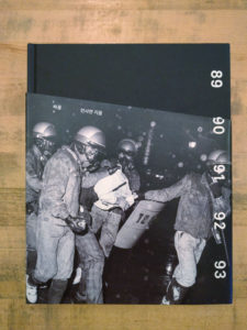 My last visit to Seoul came at an interesting time. My own country had just elected an orange-hued charlatan (but much loved by some, apparently) to its highest office, sparking immediate protests. Seoul was in the midst of weekly and growing protests each Saturday against an expanding presidential scandal. And multiple elections were approaching in Europe with right-wing parties gaining ground in polls. There are many people marching in the streets lately who want to see change. With all of this as a background, I came across Park Seung-hwa’s Protest published by Listen to the City in The Book Society’s stacks.
 The photographs run the gamut from dramatic confrontation to quiet determination. There are individuals acting alone and huge crowds of people acting in concert. We are shown moments of grace and moments of violence. On one page protesters look down from a rooftop at the police below. On the next page it is the police who are on the roofs looking down on the people below. The one constant is a sense of confrontation and anger, at turns explosive and subdued. The content of the photographs is mirrored by the divided compositions in contrasty and grainy yet richly rendered black and white.
  Park draws from his own work as well as the work of the four other photographers who formed the National Photography Research Society (민족사진연구회). These five photographers, Kwon San-Ki, Park Seung-hwa, Song Hyeok, Lee Sohye, Lim Seok Hyun, came together photographing the protests. They gathered around an older photographer, Park Yong-su. Their efforts, specifically as culminated in the publication ofProtest, are a kind of extension of Park Yong-su’s 1989 book The Road of the People (민중의 길), in which he documented the events between the 1985 sit-in demonstration at the American Cultural Center in Seoul and Chun Doo-hwan’s going to Baekdamsa in 1988. Despite this added context, a straight documentary reading remains problematic.
 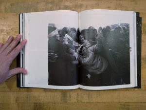 Park’s introduction to Protest is helpful in reframing these photographs. He reveals that the contemporary making of the book, was an effort to “uncover [his] faded passion and shell of belief” represented by photographs made over two decades earlier. These photographs are personal. They project “a kind of political intention” and come from a “‘biased’ point of view.” The photographs are at once “records, commemorations and, in a way, propaganda.”
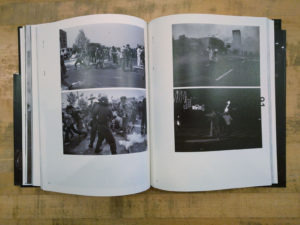 Protest then is a lament or reckoning rather than a dry documentation. It is a sober reconsideration of that time and where the flow of time has ultimately led. Despite having “walked so far away from the days of the photos…the day [Park] has dreamed of during those old days has yet to come.” He asks that the there be no mention of a “legendary saga” when reading these photos and notes that “the past [is] often glorified under the astute compromise.” We all, in order to live our lives in some measure of comfort, make compromises in our beliefs and actions; Park subtly suggests that if we are honest with ourselves, perhaps our compromises are really betrayals of our convictions.
  In a similar vein, the book presents a kind of critique of photo-journalism and documentary photography. Park defines photographs as a “record of facts.” And yet he goes on to say that a myriad of photos can be created of a single scene. “These photos are all based on facts but far away from the truth.” Park does not claim to be publishing any kind of definitive view of these events. He goes so far as to call attention to the other photographers who were photographing these same events and whose photographs, if they could have been included in the book, would have made for “a finer and richer record.”
 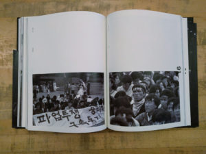 These photographs and Park’s view of their creation and value are appropriate to consider here in America in light of the protests happening in the present day. As may be self evident but certainly worth reiterating: protest in and of itself won’t bring about change. Those bodies in the streets lifting their voices may create the changes they seek or may simply gratify their desire to speak their piece. In order to effect change there must be concrete political action being taken before and after the marches, protests and demonstrations. Desiring change does not necessarily create change. It requires long years of hard work. It is equally likely that in thirty years we will look back and wonder where it all got them. Compromises for our own comfort will leave us “wandering around, or rather drifting away.”
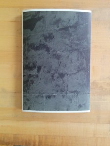 Despite the grand subject and lofty conceptual framework, Kyoungtae Kim’s Cathedral de Lausanne 1505–2022 is a rather modest affair in both its design and material construction. The brief text by Kyungyong Lim on the rear cover is short, to the point and written in language that a layperson can understand. The sum of these choices is an approachable and engaging book that encourages the reader to reconsider his or her reading of iconic landmark buildings.
 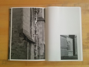 The interior pages are an alternating mix of uncoated heavyweight stock and lightweight coated stock. The heavyweight pages generally contain sections of wall where either a stone is marked with the date of its replacement or sections of stone where repair work is being done. These photographs are all relatively tight close ups and printed full page. The lightweight coated pages contain longer views of either work sites or larger sections where renovations have been completed and are printed roughly quarter page. The book closes with two scenic shots of the cathedral from either end–these are printed back to back on the lightweight stock and the images ghost into one another through the paper.
 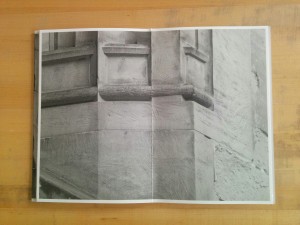 As I wrote about Kim’s
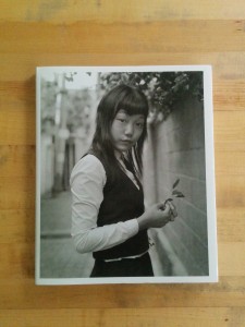
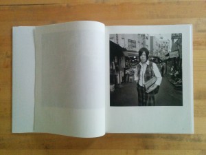
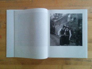 One comparison that springs readily to mind when viewing Kid Nostalgia is with Hein-Kuhn Oh’s Girls Act. The subject matter is quite similar, and the black and white aesthetics are even similar. The photographs come from entirely different mindsets, though, and these differences are apparent in the details. In Park’s “남산동 2005” for an example, the camera has been fitted with a slightly wide lens and positioned at the subject’s eye level. This even footing grants an instant conversational familiarity and shows the subject within an environment. Oh’s photographs, such as “Jin-hee Han, age 17, 2003,” are shot from a low vantage point. The viewer looks up at the subject, who becomes monumental. Oh’s low vantage point and longer lens places the horizon low in the frame, minimizing the subject’s relationship to her surroundings by placing her against the relatively neutral ground of the sky. The lighting is different, too: Park’s light is soft and coming from behind the subjects; it is probably the filtered light of an overcast sky. Oh’s light is hard, directional and frontal–direct flash on axis with the Oh’s lens.
 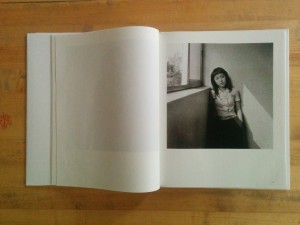 For all Park’s talk about his subjects’ rawness, the photographs are remarkably chaste. This is not Elle Perez’s