This review is being written to the clack of steel on steel as I ride Amtrak from Charlottesville, VA to New York City. My origin and destination stations today are practical rather than civic architecture. Train stations that proclaim civic greatness and interconnectedness such as Washington, DC’s Union Station or New York City’s former Pennsylvania Station (demolished in 1963) are from a past era. Today scant political weight is given to the civic value of this country’s physical plant. And yet, public buildings have not ceased to carry enormous cultural freight and communicate copious civic meaning.
Jumping geographic and cultural tracks: Though no longer functioning as a train station, as civic architecture the Old Seoul Station remains a politically and culturally potent structure. Designed by Tsukamoto Yasushi and finished in 1925, the station stood as both a product and a symbol of the Japanese occupation. While some civic buildings from this period were demolished, in 1947 the station was very practically renamed and continued to function as Seoul’s main rail hub until 2004 when Korail’s new Seoul Station* was completed. In 2011 the old station reopened as Culture Seoul Station 284, a cultural center with space for performances, exhibits and events. The name alludes to the station’s position as an intersection of historical, spatial, cultural and civic symbolism.
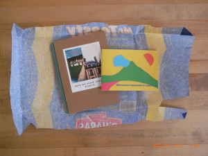
 Corners (interview, review 1, 2), has undertaken a “Railway Library” of three books. The first book in this series is 경성역 (Gyeongseong Station). It is focused on a nuts and bolts representation of the Old Seoul Station. It begins with an essay, describing the physical building and the history of its construction and use, followed by a barebones timeline of the station from the construction of the first station building in 1900 through the renaming of the 1925 building in 1947. The blurb on Corner’s website describes using the railroad as a filter for critical cultural and historical examination.
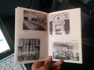
The meat of the book is archival photographs of the station that detail the ostentatious grandeur and Western influence of its multitudinous architectural styles. The building is clearly a statement. Like any colonial architecture, the function of the building was as much cultural and political as practical. The same can be said of the photographs. It is telling that only a single train appears in any of the photographs and then only incidentally; nor are there any photographs of any of the functional aspects of the building: switches, signals, or other mechanical infrastructure. There are only two photographs showing the tracks of the station; these are, like the single train, incidental to the architectural view behind them. The importance of the building was not in its function as transportation infrastructure but in its function as a cultural and political symbol.
 We are shown the station as a particular set of physical facts; we are not shown the base function of the building or the complex web of human interaction that sustains it. It is a grand, modern and industrial physical fact. We do not see any planning sessions nor a groundbreaking ceremony. We do not see workers constructing the building nor installing the interior decoration. We do not see people manning (nor patronizing) the barber’s chair. We do not see people sitting down to dinner in the restaurant nor anyone in the kitchen preparing meals. With exception of the first and last photographs in the book we see no people; in these we are shown two crowds. In the first we see a crowd facing away seated inside the main dining room during the dedication or opening ceremony. In the second we see the hoi polloi stretching to Namdaemun and facing us; the caption ambiguously describes “citizens” filling the street outside the station without describing the purpose or occasion of their doing so. The cultural implications of this representation were certainly as intentional as the architecture itself.
 Photographs are not simple carriers of absolute fact. Photographers make a host of decisions about what to record and how to do so. These photographs are not the simple documents that they purport to be. They are as much a depiction of the colonial system of which they are a functional aspect as the station they show. The decisions of what is shown and how it is shown are made by editors and designers as well. The designer, Jo Hyo Joon, made a conscious decision to use these particular photographs and to present them in the way that he has. It is an interesting decision to choose to situate a process of reconciliation or reclamation on such contested ground. It is as though Jo is letting us know that every square inch of the conversation will be contested ground.
Corner’s continued use of the Risograph printing process is another interesting choice. Taken in the first half of the twentieth century, the photographs in this book appear to have been shot and printed with a variety of techniques. The clipped corners suggest dry plate negatives (dry plate materials were certainly used by the Japanese authorities at this time). The odd shapes of some images suggest albumen prints, and silver gelatin materials were almost certainly used for the later photographs. These photographic processes create richly beautiful objects. The Risograph printing eliminates the differences between these techniques’ visual styles. They become artifacts; their creation as functional government documents is emphasized.
경성역 is not so much a book of photography as a book of political and cultural critique that uses photography to make its argument. It is clear that these photographs are telling us something about the world but it is up to the reader to examine these facts critically in order to come to terms with the Old Seoul Station and its past, present and future meaning in the fabric of Korean culture and history. The stage is set for additional books in the Railway Library.
디자인 : 조효준
년도 : 2014
출판사 : 코우너스
크기 : 12 x 18.8 cm
인쇄 : 리소그라프
제본 : 실 가격
*The new Seoul Station represents a contemporary example of exactly the kind of civic-minded architecture discussed above.
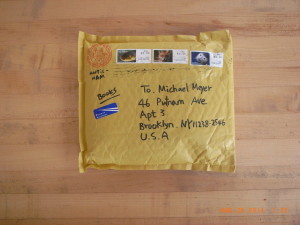
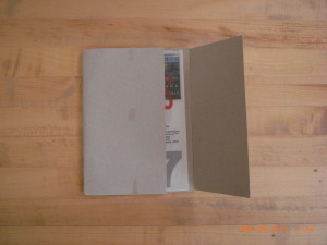
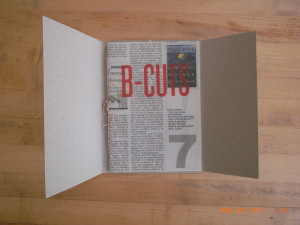
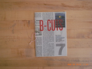
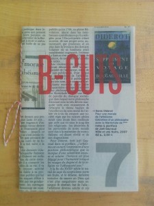 Antic-Ham’s B-Cuts has a similarly acute sensibility. It is a small book, only 14 pages, inkjet printed in a limited edition of 169 copies. It is hand sewn and features a cover cut from the book review section of a French newspaper with the title silkscreened atop the text. The photographs within and the design itself connect this book to Franticham’s oeuvre.
 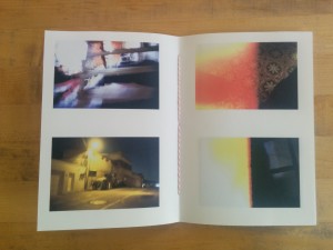 Photography is a multifaceted process, and there is opportunity for creative discovery throughout it.These photographs are primarily a product of Antic-Ham’s treating the editing with as much reverence as the shooting. As much as one creates photographs by framing the real world, it is in the editing that one makes judgements about if and how a photograph “works”. Sometimes there are diamonds to be found in the rough.
 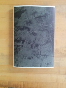 Despite the grand subject and lofty conceptual framework, Kyoungtae Kim’s Cathedral de Lausanne 1505–2022 is a rather modest affair in both its design and material construction. The brief text by Kyungyong Lim on the rear cover is short, to the point and written in language that a layperson can understand. The sum of these choices is an approachable and engaging book that encourages the reader to reconsider his or her reading of iconic landmark buildings.
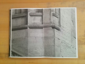
 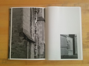 The interior pages are an alternating mix of uncoated heavyweight stock and lightweight coated stock. The heavyweight pages generally contain sections of wall where either a stone is marked with the date of its replacement or sections of stone where repair work is being done. These photographs are all relatively tight close ups and printed full page. The lightweight coated pages contain longer views of either work sites or larger sections where renovations have been completed and are printed roughly quarter page. The book closes with two scenic shots of the cathedral from either end–these are printed back to back on the lightweight stock and the images ghost into one another through the paper.
  As I wrote about Kim’s
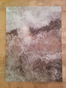 Let’s start with the conclusion: Kyoungtae Kim’s On the Rocks is an amusing, clever and honest book but not a grand one. That conclusion can be drawn from its subject matter: close-up macro photographs of small, everyday stones–roughly 2cm to 10cm in length. The bulk of the book is single pages in which each stone, floating in studio limbo, is enlarged to fill the page. Every singular stone is richly textured, wonderfully abstract and evocative–and yet humdrum.
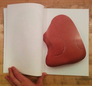 Those three facts make me think the book came out of two questions: 1. When I travel to Europe, what can I bring back with me? 2. Now that I’ve got all these stones and pebbles sitting around, what can I do with them?
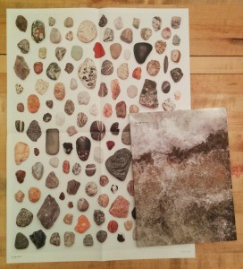
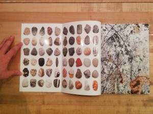 The photographs are also placed in grids in which the stones are seen relative to one another. On the inside covers, the stones are scaled to a single uniform size and printed in grids. In a nice touch, one must open the inside flap of the cover (onto which the full bleed cover image does not extend) to reveal the grids. A similar gridded spread follows the colophon page; on this grid the stones are scaled relative to one another and there is a scale so that one can determine how large each stone is in reality. This grid is repeated on a pull out poster on which the stones are printed life size (at 1:1 scale).
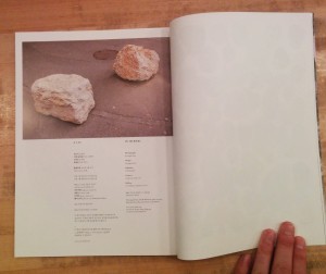 There is one outlier image. At the top of the colophon page is a photograph of two rocks sitting heavily on a paved street. These are