Back in June 2015, Jörg Colberg posted a weekly photobook review at CPhMag.com that he prefaced with some thoughts relevant to readers of Korean Photography Books. I reached out to Jörg, and he was gracious enough to expand on those thoughts in a brief conversation. The conversation took place via e-mail in early July; it has not been edited except for the addition of links to articles he refers to.
Michael N. Meyer (KoreanPhotographyBooks): Could you sketch out, very briefly, your background, and your roles within the photography world for any readers of this blog who might not know who you are?
Jörg Colberg: I have a background in theoretical astrophysics (computational cosmology). Now, I’m probably most widely known through my website CPhMag.com, which is the latest version of what used to be a blog (“Conscientious”) and which focuses on contemporary photography. I earn my living through teaching photography, as one of the core faculty of the fairly new Limited Residency Photography MFA Program at Hartford Art School, besides the occasional essay or interview for a publication. I’m also currently working on a book about photobooks, albeit not a survey book, but rather a book about how to approach photobook making.
KPB: You sum up the preface to a recent post, Photobook Reviews (W21/2015), with an offhanded comment about all of the books on photobooks and the increasing balkanization created by such publications. You ask this as a kind of joke, but I suspect you made light of it only because to do otherwise would require an entire blog post of its own or indeed an entire book. I’d like to orient this conversation around the reasoning of your preface: that there are a helluva lot of photobooks being produced, that photographers are not going to stop producing these books, and that consumers, critics and academics will need to find strategies to deal with this wealth of material. Furthermore, much of this material is outside of what might be considered the mainstream canon–which brings up questions of the usefulness of a shared canon and the limits of slicing photography into ever thinner slivers.
JC: Given how heavily fragmented the photobook world is, slicing and dicing it up even further might be of limited utility. It certainly won’t do much to expand the photobook out of its rather narrow confines (you’ll see the same faces at every photobook festival). I’m saying that the photobook world is fragmented, based on my own experience with it. See, for example this. I look at a lot of books, and I know a lot of people who do the same. But it’s often surprising how few books we all share as having heard of. And almost none of them are part of whatever a mainstream canon might even be.
KPB: What strategies do you use to create order and logic of the flood of titles being published? I’m thinking personal strategies specifically, but as a follow up, would you define your role as critic as helping your audience find order in the swirling chaos of photobooks or photography more broadly?
JC: I’m not sure I have a strategy. I basically react to books I see, hear of, or find in whatever way (I get a lot of submissions from people). I can’t afford traveling to all those festivals, and even if I could, I doubt I’d go. The flood of titles doesn’t worry me too much. It’s exciting, and there are always surprises. But of course, the vast majority of published photobooks are really not very good at all.
As a critic, I see my role as someone critically examining photobooks and photography. Of course, that’s a circular way to talk about this (isn’t that what critics do? But then, you’d be surprised to see the number of people who think it’s criticism when you copy some text from a press release and add a little bit of a description). But I think that’s a difficult enough task, and it’s hard to do it well. I do believe (or at least hope) that examining books critically and helping others approach them will ultimately help everybody find some sort of order. I personally wouldn’t necessarily attempt to identify an order, given it would be my order, and there are already enough people who proclaim how things work (without explaining too much why they make their choices).
KPB: What importance, if any, is there in broadening the pool of work under consideration by identifying cultural histories of one kind or another that aren’t being seen or written about? In your role as critic or educator do you feel any responsibility for actively doing this? (How fascinating might that very photography history “North-Eastern Lithuanian” that you jokingly mention in your post be? It might also be a dead end or a stultifying backwater, but how would we know until someone looks and writes usefully about it?)
JC: There are various cultural strands that people are following currently. My main problem with something like a “North-Eastern Lithuanian” history is that if it stays that, it’s of very limited utility. Last year, I moderated a panel on what was billed as “Japanese photography,” and the members of the panel agreed very quickly that thinking about “Japanese photography” as something that was completely different than, say, “German photography” was really not very helpful. So I think there’s nothing wrong with a “North-Eastern Lithuanian” history of photobooks – as long as it tells us more about photobooks and photography history in general, and doesn’t just carve out yet another niche.
So yes, in my role as critic and educator I do attempt to bring things always to the photography at the core, because that is, after all, what we have at the core. All the rest, all those things we see, those assumptions, that ideology we bring to it – that’s just piled on. I know I got my own ideology, but I do think it’s very important not to confuse ideology with what’s in the pictures.
KPB: Diverse fields of academic inquiry have tended towards dissecting smaller and smaller slices of the world. To what extent is it still useful to seek an overarching picture of a global history of photography? Asked another way–is an agreed upon canon still useful?
JC: I would probably argue along the lines of something I wrote about what I thought good criticism for me amounted to: an attempt to make sense, an attempt to bring useful criteria to the table that can then be used to get to a deeper understanding of photography. Whether or not we need an agreed-upon canon I don’t know. There is something to be said for the work John Szarkowski did, however limited it was. After all, he did attempt to make sense of things, something that cannot be said about the people who are now curators at MoMA. Why we can’t have a group of people who do that I don’t know.
But the canon(s) aside, the moment you know how to approach photography, you understand a lot more about photography, regardless of whether you’re aware of the (or a) canon. And that then is what I spoke of earlier concerning “Japanese photography” (or “German photography” or whatever else). I suppose this really boils down to knowing of a canon really only means something if you can read pictures. Otherwise, it’s just like knowing that 1812 was some special moment in US history, but you don’t really know much else.
There are a large variety of topics that keep propping up in photography’s history, and it certainly is important to be aware of them. We don’t need to be constantly re-inventing the wheel. And regardless of whether we agree with how history has been written, to understand it (and possibly re-write it) we need to know what went on and why (and what it means in terms of the pictures).
I don’t know whether this answers your question. In the end, it all boils down to the question “What is in the picture?” If you can’t give a good answer for that, your knowledge of a history or canon of photography is useless.
KPB: Jörg, thank you so much for taking the time to share your perspective and understanding.
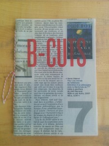 Antic-Ham’s B-Cuts has a similarly acute sensibility. It is a small book, only 14 pages, inkjet printed in a limited edition of 169 copies. It is hand sewn and features a cover cut from the book review section of a French newspaper with the title silkscreened atop the text. The photographs within and the design itself connect this book to Franticham’s oeuvre.
 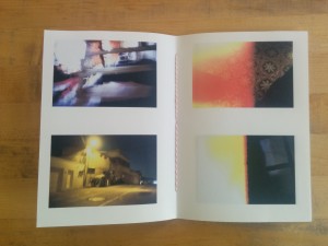 Photography is a multifaceted process, and there is opportunity for creative discovery throughout it.These photographs are primarily a product of Antic-Ham’s treating the editing with as much reverence as the shooting. As much as one creates photographs by framing the real world, it is in the editing that one makes judgements about if and how a photograph “works”. Sometimes there are diamonds to be found in the rough.
 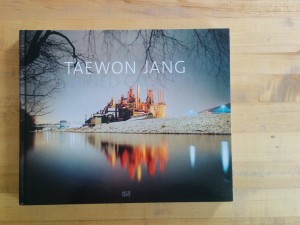 Photographing at night exposes the world in a new light. We are able to see things in ways that we cannot during daylight hours. Taewon Jang has gone out into the darkness to photograph stalled construction projects, remnants of abandoned factories and the nocturnal glow of functioning industrial sites so that we can see them, literally, in a different light.
 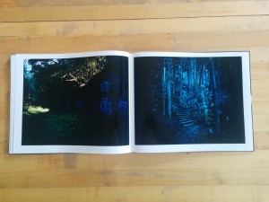 Jang began making photographs in Korea and Japan of stalled construction sites. Over the seven year period during which he photographed, he expanded his subject matter to include abandoned factories and functioning industrial sites as well as expanded his geographic area to include the United States. In total, he has photographed almost 400 different sites. Seventy-seven of these appear in Stained Ground.
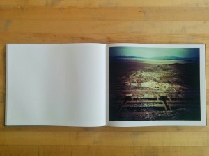 He describes the way his subjects evolved over the course of the seven year project in an interview with Suejin Shin included in the book: “In the beginning, I concentrated on the specific topography or the architecture, or perhaps a structure, or construction equipment, thinking that these elements could reveal the strange tension I felt at the site[s]… But then as I continued working on this project for a long time, I came to realize that what I saw was only a very small part of a larger picture… the places I photographed have changed beyond recognition or have even vanished from the map.”
 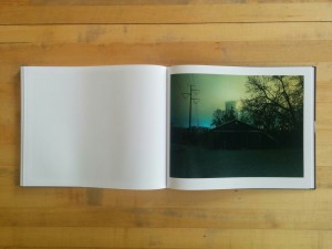 In the background the cooling towers of a power plant hover in a haze of brackish yellow clouds. Running from the foreground to the background in the left of the frame are high-tension power lines. They run straight back to a patch of blue cloud along the far horizon. The path to our current state has run along a line of iterative steps. Each successive revolution has brought the next. Photographically, the book ends with “SG K #420, 2007”. This photograph is one of only a handful that includes people and is the only photograph in which people are central. A group of 9 men (I assume they are men) are in a line in the center of the frame. They are dwarfed by the night around them. Five stand while four crouch or sit huddled on the ground. A line of hills run along the horizon and are dark against a multicolored sky. The ground on which the men are set is orange and indistinct. It is unclear if this is where perhaps some original industrial beginning occurred or where and how we’ll be left at some point in the future after our industry has run us to ground.
 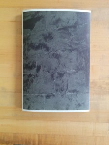 Despite the grand subject and lofty conceptual framework, Kyoungtae Kim’s Cathedral de Lausanne 1505–2022 is a rather modest affair in both its design and material construction. The brief text by Kyungyong Lim on the rear cover is short, to the point and written in language that a layperson can understand. The sum of these choices is an approachable and engaging book that encourages the reader to reconsider his or her reading of iconic landmark buildings.
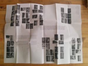
 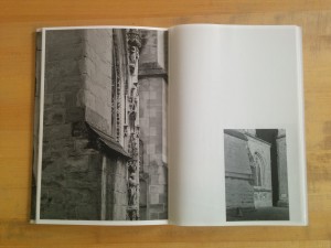 The interior pages are an alternating mix of uncoated heavyweight stock and lightweight coated stock. The heavyweight pages generally contain sections of wall where either a stone is marked with the date of its replacement or sections of stone where repair work is being done. These photographs are all relatively tight close ups and printed full page. The lightweight coated pages contain longer views of either work sites or larger sections where renovations have been completed and are printed roughly quarter page. The book closes with two scenic shots of the cathedral from either end–these are printed back to back on the lightweight stock and the images ghost into one another through the paper.
 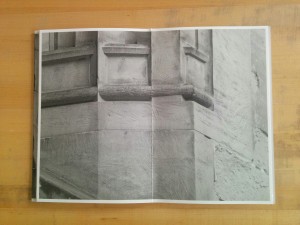 As I wrote about Kim’s
 Photographs are rich in physical facts: what someone wore, where someone stood, who they stood beside, what they were doing. Snapshots serve to jog our memories of why the physical world was in this state and how we felt about the experience of being in that place at that time. Unmoor snapshots from the personal memories that give them specific meaning and they become mysteries open to interpretation and invention.
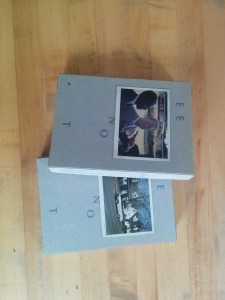
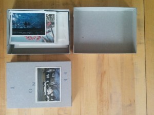
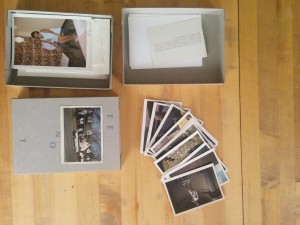
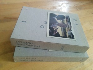
 This is a conceptual performance of sorts. Back poses a question and allows his chosen editors and then we, the readers, to work out the answer to it. Back collected over ten thousand vintage personal snapshots from across the US and selected 2,700 to print. These prints were then presented to eight people (one being Back himself) who were asked to select a set of eight images. These people were invited to add text to photographs if they wished. Memento One and Two are each a cardboard box containing half of the selected photographs. The “prints” are snapshot sized offset reproductions, but their varying paper base colors and surface textures mimics the feeling of flipping through a stack of old photographs. Some photographs are annotated with dates or captions in English or Korean while others are unadorned with text. Several images repeat–often with different text on them. One image of two men skeet shooting towards the ocean appears three times. As readers, we are free to rearrange and mix and match our own sets of images.
 Memento One & Two